According to a recent report by eMarketer, Facebook is experiencing a resurgence among Gen Z users, while TikTok is gaining traction with baby boomers.
Despite these shifts, both platforms maintain a stable core user base.
Facebook’s Gen Z Renaissance
Facebook’s seeing unexpected Gen Z growth despite overall decline. U.S. Gen Z users are projected to increase from 49.0% (33.9M) in 2024 to 56.9% (40.5M) by 2028.
Key drivers:
Utility: Event planning, niche groups, and Marketplace appeal to younger users.
Demo shift: ~36% of Gen Z are still under 18, many just entering the social media space.
E-commerce potential strong: 75.0% of Gen Z Facebook users (15-26) bought on Marketplace last year.
However, Gen Z still trails Gen X and millennials in user numbers and time spent on the platform. Interestingly, time on Facebook is decreasing for users under 55, suggesting a shift in how younger generations interact with the platform.
TikTok’s Boomer Boom
TikTok’s Gen Z market is saturated, but it’s seeing surprising growth among boomers.
Projections show a 10.5% increase in U.S. boomer users next year, from 8.7M to 9.7M.
This modest uptick underscores TikTok’s accessibility and its appeal to older adults who want to stay culturally relevant and connected with younger relatives.
While boomers are the fastest-growing demographic, TikTok adoption rates are rising steadily across all generations, indicating the platform’s broad appeal.
Shifting Social Media Landscape
Facebook use continues to decrease across all generations except Gen Z, highlighting the platform’s evolving role in the social media ecosystem.
This trend, coupled with TikTok’s growth among older users, suggests a blurring of generational lines in social media usage. Platforms that can adapt to changing user demographics while maintaining their core appeal will be best positioned for long-term success.
Implications For Marketers
Platforms and users are constantly changing. Brands must adapt or risk losing ground to competitors.
TikTok’s boomer growth opens up new avenues for brands targeting older demographics, but marketers should be mindful of the platform’s primarily young user base.
For Facebook marketers, the growing Gen Z user base presents new opportunities, especially in e-commerce via Marketplace. However, decreasing time spent on the platform means content needs to be more engaging and targeted.
Action items:
Audit strategy: Check content appeal across age groups and platforms.
Diversify: Create multi-faceted strategies for different demographics while maintaining brand identity.
Leverage analytics: Track engagement by age group and adjust tactics.
Test and optimize: Experiment with content formats and messaging for each platform.
Stay current: Follow platform updates and demographic trends.
Stay flexible and update strategies as user demographics and preferences change.
Brands that can reach across generations while respecting platform-specific norms will likely see the most success in this changing landscape.
Google published a video that disclosed five insights about Google Trends that could be helpful for SEO, topic research and debugging issues with search rankings. The video was hosted by Daniel Waisberg, a Search Advocate at Google.
1. What Does Google Trends Offer?
Google Trends is an official tool created by Google that shows a representation of how often people search with certain keyword phrases and how those searches have changed over time. It’s not only helpful for discovering time-based changes in search queries but it also segments queries by geographic popularity which is useful for learning who to focus content for (or even to learn what geographic areas may be best to get links from).
This kind of information is invaluable for debugging why a site may have issues with organic traffic as it can show seasonal and consumer trends.
2. Google Trends Only Uses A Sample Of Data
An important fact about Google Trends that Waisberg shared is that the data that Google Trends reports on is based on a statistically significant but random sample of actual search queries.
He said:
“Google Trends is a tool that provides a random sample of aggregated, anonymized and categorized Google searches.”
This does not mean that the data is less accurate. The phrase statistically significant means that the data is representative of the actual search queries.
The reason Google uses a sample is that they have an enormous amount of data and it’s simply faster to work with samples that are representative of actual trends.
3. Google Cleans Noise In The Trends Data
Daniel Waisberg also said that Google cleans the data to remove noise and data that relates to user privacy.
“The search query data is processed to remove noise in the data and also to remove anything that might compromise a user’s privacy.”
An example of private data that is removed is the full names of people. An example of “noise” in the data are search queries made by the same person over and over, using the example of a trivial search for how to boil eggs that a person makes every morning.
That last one, about people repeating a search query is interesting because back in the early days of SEO, before Google Trends existed, SEOs used a public keyword volume tool by Overture (owned by Yahoo). Some SEOs poisoned the data by making thousands of searches for keyword phrases that were rarely queried by users, inflating the query volume, so that competitors would focus on optimizing on the useless keywords.
4. Google Normalizes Google Trends Data?
Google doesn’t show actual search query volume like a million queries per day for one query and 200,000 queries per day for another. Instead Google will select the point where a keyword phrase is searched the most and use that as the 100% mark and then adjust the Google Trends graph to percentages that are relative to that high point. So if the most searches a query gets in a day is 1 million, then a day in which it gets searched 500,000 times will be represented on the graph as 50%. This is what it means that Google Trends data is normalized.
5. Explore Search Queries And Topics
SEOs have focused on optimizing for keywords for over 25 years. But Google has long moved beyond keywords and has been labeling documents by the topics and even by queries they are relevant to (which also relates more to topics than keywords).
That’s why in my opinion one of the most useful offerings is the ability to explore the topic that’s related to the entity of the search query. Exploring the topic shows the query volume of all the related keywords.
The “explore by topic” tool arguably offers a more accurate idea of how popular a topic is, which is important because Google’s algorithms, machine learning systems, and AI models create representations of content at the sentence, paragraph and document level, representations that correspond to topics. I believe that’s what is one of the things referred to when Googlers talk about Core Topicality Systems.
Waisberg explained:
“Now, back to the Explore page. You’ll notice that, sometimes, in addition to a search term, you get an option to choose a topic. For example, when you type “cappuccino,” you can choose either the search term exactly matching “cappuccino” or the “cappuccino coffee drink” topic, which is the group of search terms that relate to that entity. These will include the exact term as well as misspellings. The topic also includes acronyms, and it covers all languages, which can be very useful, especially when looking at global data.
Using topics, you also avoid including terms that are unrelated to your interests. For example, if you’re looking at the trends for the company Alphabet, you might want to choose the Alphabet Inc company topic. If you just type “alphabet,” the trends will also include a lot of other meanings, as you can see in this example.”
The Big Picture
One of the interesting facts revealed in this video is that Google isn’t showing normalized actual search trends, that it’s showing a normalized “statistically significant” sample of the actual search trends. A statistically significant sample is one in which random chance is not a factor and thus represents the actual search trends.
The other noteworthy takeaway is the reminder that Google Trends is useful for exploring topics, which in my opinion is far more useful than Google Suggest and People Also Ask (PAA) data.
I have seen evidence that slavish optimization with Google Suggest and PAA data can make a website appear to be optimizing for search engines and not for people, which is something that Google explicitly cautions against. Those who were hit by the recent Google Updates should think hard about the implications of what their SEO practices in relation to keywords.
Exploring and optimizing with topics won’t behind statistical footprints of optimizing for search engines because the authenticity of content based on topics will always shine through.
Research shows that name-dropping AI in marketing copy might backfire, lowering consumer trust and purchase intent.
A WSU-led study published in the Journal of Hospitality Marketing & Management found that explicitly mentioning AI in product descriptions could turn off potential buyers despite AI’s growing presence in consumer goods.
Key Findings
The study, polling 1,000+ U.S. adults, found AI-labeled products consistently underperformed.
Lead author Mesut Cicek of WSU noted: “AI mentions decrease emotional trust, hurting purchase intent.”
The tests spanned diverse categories—smart TVs, high-end electronics, medical devices, and fintech. Participants saw identical product descriptions, differing only in the presence or absence of “artificial intelligence.”
Impact on High-Risk Products
AI aversion spiked for “high-risk” offerings, which are products with steep financial or safety stakes if they fail. These items naturally trigger more consumer anxiety and uncertainty.
Cicek stated:
“We tested the effect across eight different product and service categories, and the results were all the same: it’s a disadvantage to include those kinds of terms in the product descriptions.”
Implications For Marketers
The key takeaway for marketers is to rethink AI messaging. Cicek advises weighing AI mentions carefully or developing tactics to boost emotional trust.
Spotlight product features and benefits, not AI tech. “Skip the AI buzzwords,” Cicek warns, especially for high-risk offerings.
The research underscores emotional trust as a key driver in AI product perception.
This creates a dual challenge for AI-focused firms: innovate products while simultaneously building consumer confidence in the tech.
Looking Ahead
AI’s growing presence in everyday life highlights the need for careful messaging about its capabilities in consumer-facing content.
Marketers and product teams should reassess how they present AI features, balancing transparency and user comfort.
The study, co-authored by WSU professor Dogan Gursoy and Temple University associate professor Lu Lu lays the groundwork for further research on consumer AI perceptions across different contexts.
As AI advances, businesses must track changing consumer sentiments and adjust marketing accordingly. This work shows that while AI can boost product features, mentioning it in marketing may unexpectedly impact consumer behavior.
Cumulative Layout Shift (CLS) is a Google Core Web Vitals metric that measures a user experience event.
CLS became a ranking factor in 2021 and that means it’s important to understand what it is and how to optimize for it.
What Is Cumulative Layout Shift?
CLS is the unexpected shifting of webpage elements on a page while a user is scrolling or interacting on the page
The kinds of elements that tend to cause shift are fonts, images, videos, contact forms, buttons, and other kinds of content.
Minimizing CLS is important because pages that shift around can cause a poor user experience.
A poor CLS score (below > 0.1 ) is indicative of coding issues that can be solved.
What Causes CLS Issues?
There are four reasons why Cumulative Layout Shift happens:
Images without dimensions.
Ads, embeds, and iframes without dimensions.
Dynamically injected content.
Web Fonts causing FOIT/FOUT.
CSS or JavaScript animations.
Images and videos must have the height and width dimensions declared in the HTML. For responsive images, make sure that the different image sizes for the different viewports use the same aspect ratio.
Let’s dive into each of these factors to understand how they contribute to CLS.
Images Without Dimensions
Browsers cannot determine the image’s dimensions until they download them. As a result, upon encountering anHTML tag, the browser can’t allocate space for the image. The example video below illustrates that.
Once the image is downloaded, the browser needs to recalculate the layout and allocate space for the image to fit, which causes other elements on the page to shift.
By providing width and height attributes in the tag, you inform the browser of the image’s aspect ratio. This allows the browser to allocate the correct amount of space in the layout before the image is fully downloaded and prevents any unexpected layout shifts.
Ads Can Cause CLS
If you load AdSense ads in the content or leaderboard on top of the articles without proper styling and settings, the layout may shift.
This one is a little tricky to deal with because ad sizes can be different. For example, it may be a 970×250 or 970×90 ad, and if you allocate 970×90 space, it may load a 970×250 ad and cause a shift.
In contrast, if you allocate a 970×250 ad and it loads a 970×90 banner, there will be a lot of white space around it, making the page look bad.
It is a trade-off, either you should load ads with the same size and benefit from increased inventory and higher CPMs or load multiple-sized ads at the expense of user experience or CLS metric.
Dynamically Injected Content
This is content that is injected into the webpage.
For example, posts on X (formerly Twitter), which load in the content of an article, may have arbitrary height depending on the post content length, causing the layout to shift.
Of course, those usually are below the fold and don’t count on the initial page load, but if the user scrolls fast enough to reach the point where the X post is placed and it hasn’t yet loaded, then it will cause a layout shift and contribute into your CLS metric.
One way to mitigate this shift is to give the average min-height CSS property to the tweet parent div tag because it is impossible to know the height of the tweet post before it loads so we can pre-allocate space.
Another way to fix this is to apply a CSS rule to the parent div tag containing the tweet to fix the height.
#tweet-div {
max-height: 300px;
overflow: auto;
}
However, it will cause a scrollbar to appear, and users will have to scroll to view the tweet, which may not be best for user experience.
If none of the suggested methods works, you could take a screenshot of the tweet and link to it.
Web-Based Fonts
Downloaded web fonts can cause what’s known as Flash of invisible text (FOIT).
A way to prevent that is to use preload fonts
and using font-display: swap; css property on @font-face at-rule.
With these rules, you are loading web fonts as quickly as possible and telling the browser to use the system font until it loads the web fonts. As soon as the browser finishes loading the fonts, it swaps the system fonts with the loaded web fonts.
However, you may still have an effect called Flash of Unstyled Text (FOUT), which is impossible to avoid when using non-system fonts because it takes some time until web fonts load, and system fonts will be displayed during that time.
In the video below, you can see how the title font is changed by causing a shift.
The visibility of FOUT depends on the user’s connection speed if the recommended font loading mechanism is implemented.
If the user’s connection is sufficiently fast, the web fonts may load quickly enough and eliminate the noticeable FOUT effect.
Therefore, using system fonts whenever possible is a great approach, but it may not always be possible due to brand style guidelines or specific design requirements.
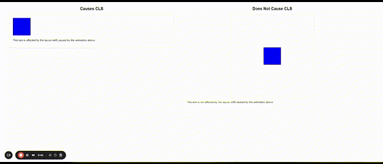
CSS Or JavaScript Animations
When animating HTML elements’ height via CSS or JS, for example, it expands an element vertically and shrinks by pushing down content, causing a layout shift.
To prevent that, use CSS transforms by allocating space for the element being animated. You can see the difference between CSS animation, which causes a shift on the left, and the same animation, which uses CSS transformation.
CSS animation example causing CLS
How Cumulative Layout Shift Is Calculated
This is a product of two metrics/events called “Impact Fraction” and “Distance Fraction.”
CLS = ( Impact Fraction)×( Distance Fraction)
Impact Fraction
Impact fraction measures how much space an unstable element takes up in the viewport.
A viewport is what you see on the mobile screen.
When an element downloads and then shifts, the total space that the element occupies, from the location that it occupied in the viewport when it’s first rendered to the final location when the page is rendered.
The example that Google uses is an element that occupies 50% of the viewport and then drops down by another 25%.
When added together, the 75% value is called the Impact Fraction, and it’s expressed as a score of 0.75.
Distance Fraction
The second measurement is called the Distance Fraction. The distance fraction is the amount of space the page element has moved from the original to the final position.
In the above example, the page element moved 25%.
So now the Cumulative Layout Score is calculated by multiplying the Impact Fraction by the Distance Fraction:
0.75 x 0.25 = 0.1875
The calculation involves some more math and other considerations. What’s important to take away from this is that the score is one way to measure an important user experience factor.
Here is an example video visually illustrating what impact and distance factors are:
Understand Cumulative Layout Shift
Understanding Cumulative Layout Shift is important, but it’s not necessary to know how to do the calculations yourself.
However, understanding what it means and how it works is key, as this has become part of the Core Web Vitals ranking factor.
Breadcrumbs are a navigational feature for your website, and they can greatly impact SEO and user experience.
Many websites still don’t implement breadcrumbs, which is a huge mistake. Not only do breadcrumbs impact SEO, but they are also pretty easy to implement.
Here’s what you need to know about breadcrumbs, how they impact SEO, and common mistakes to avoid.
What Are Breadcrumbs In SEO?
Breadcrumbs are automated internal links that allow users to track their location on a website and their distance from the homepage.
You’ll usually find them at the top of a website or just under the navigation bar.
Just like internal links, they help keep users on a website and help them find the information they are looking for. If they feel disoriented, they can use breadcrumbs links to go one level up and continue their journey on the website rather than clicking a browser’s back button.
Here’s an example of breadcrumbs from eBay’s website:
Screenshot from eBay, June 2024
It shows exactly what categories I clicked on to land on the page I am viewing.
The breadcrumbs make it easy to backtrack to a previous page if I need to.
4 Common Types Of Breadcrumbs
Not all breadcrumbs are created equal!
There are four main types of breadcrumbs, each with their own purpose.
Before adding breadcrumbs to your site, determine which type will be the best fit for user experience.
The most common type of breadcrumbs that tell users where they are in the site structure and how to get back to the homepage.
For example: Home > California > San Francisco
Screenshot from cars.com, June 2024
2. Attribute-Based Breadcrumbs
These breadcrumbs are commonly used on ecommerce sites to show what attributes the user has clicked.
For example: Home > Shoes > Hiking > Womens
Screenshot from eBay, June 2024
Please note how smartly eBay handles breadcrumbs for attributes when the trail is too long.
It shows the last three items following the home page and truncates previous ones under a three-dot menu; you can see all previous items in the breadcrumbs upon clicking.
3. Forward Or Look-Ahead Breadcrumbs
This type of breadcrumb not only shows the user’s current path within a website’s hierarchy but also provides a preview of the next steps they can take.
Here is an example from the Statista website, which illustrates how useful it can be by giving users a preview of other sections of the subsection.
Screenshot from Statista, June 2024
4. History-Based Breadcrumbs
This type of breadcrumb is rarely used and shows users what other pages on the site they have visited, similar to a browser history.
For example, if you were searching for SEO news and read three different articles, the breadcrumbs might look like this: Home > SEO article 1 > SEO article 2 > Current page.
But I recommend avoiding this because it may confuse users. Users may navigate to the same destination through different journeys, which means you will show a different breadcrumb structure each time, confusing users.
If you’re unsure breadcrumbs are worth the hassle (spoiler, they totally are!), then you’ll want to read the section below.
1. Breadcrumbs Improve UX
Breadcrumbs make it easier for users to navigate a website and encourage them to browse other sections.
For example, if you want to learn more about Nestle, you head to its site and end up on the Nestle company history page.
Screenshot from Nestle, June 2024
Using its breadcrumbs, you can easily navigate back to About Us, History, or even its homepage.
It’s a handy way to help users easily find what they are looking for – and hopefully draw them deeper into your website.
2. Keep People Onsite Longer
Bounce rate is not a ranking factor. But keeping users from bouncing can still help SEO as it helps users click and navigate through the website, an engagement signal that Google uses for ranking purposes.
Say, you are looking for a new pair of sneakers on Adidas’s website.
Screenshot from Adidas, June 2024
Using Adidas’s breadcrumbs, you can easily navigate back to the boots category and look for a different pair.
This is great for Adidas because it will likely keep you from returning to Google and landing on another shoe website.
That’s the power of the humble breadcrumb!
A case study on Moz shows what happened when it added breadcrumbs to a site and made several other changes.
Sessions drastically increased in just a few months.
Screenshot from Moz, June 2024
Granted, they also added meta descriptions and eliminated a few other UX issues, but breadcrumbs also played a part.
3. Breadcrumbs Improve Internal Linking
Breadcrumbs are not just a navigational utility; they play a crucial role in enhancing a website’s internal linking structure. Google uses breadcrumbs to determine the relationship between different pages which are deeper in the site structure.
As discussed, breadcrumbs make site navigation easier, but they do a lot more so as Google displays rich snippets in the search results.
Screenshot from Google.com
But this doesn’t happen until you markup your breadcrumbs with structured data so Google can pick it up and surface it in search engine results pages (SERP).
Here is a JSON-LD structured data code example for a breadcrumb that matched the rich snippet from the screenshot:
Here is a breakdown of each attribute in the breadcrumb JSON-LD schema.
Attribute
Description
@context
This tells search engines where to find the definitions of the structured data
@type
Defines the type of schema used, in this case, “BreadcrumbList”
itemListElement
An array of list items representing a breadcrumb.
itemListElement[position]
Indicates the position of the breadcrumb in the list, starting from 1.
itemListElement[item]
The URL of the breadcrumb’s target page
itemListElement[name]
The visible name of the breadcrumb as it appears to users.
Please note that you can’t game Google by having structured data on the website without having an actual breadcrumb visible to users.
If Google detects such manipulations, violating Google’s guidelines, you may get a manual penalty. However, that doesn’t cause a drop in rankings, but your website will not be eligible for any kind of rich snippets in search results.
So, the golden rule is that every schema markup you have on the website has to exist on the page and be visible to users.
4 Common Mistakes When Using Breadcrumbs For SEO
Implementing breadcrumbs is a straightforward way to improve a site’s SEO and provide better UX.
However, sometimes, implementing breadcrumbs could cause more harm than good.
Here are a few breadcrumb mistakes you’ll want to avoid.
1. Don’t Go Too Big or Too Small – Aim For Just Right
Breadcrumbs should be easy to see but unobtrusive.
A slightly smaller font is fine, but too small text will be hard to see and hard to click on mobile devices.
Position them at the top of the page, beneath the hero image, or just above the H1 title so they are easy to find.
2. Don’t Just Repeat Your Navigation Bar
If the breadcrumbs just duplicate what is already in your navbar, they might not serve any additional purpose.
There’s no need to add more coding (and take up room!) if it doesn’t help.
3. Don’t Ditch Your Navigation Bar In Favor Of Breadcrumbs
While you don’t want to repeat navigation, you also don’t want to rely entirely on breadcrumbs.
They serve as a supplement, not a replacement for other navigational features.
4. Use The Right Type Of Breadcrumbs
Location breadcrumbs are the most common type, but they might not be the best choice for your site.
Don’t use location breadcrumbs if your site doesn’t use a nested structure where most pages fit under a few categories.
In that case, history-based breadcrumbs might be more beneficial.
How To Implement Breadcrumbs In WordPress
Breadcrumbs are an incredibly useful navigation element for both users and search engines — and they are easy to add to your site.
Here are a few ways to add these useful features to your site.
Screenshot from Yoast SEO, June 2024
Use Yoast SEO: If you already use Yoast, adding breadcrumbs will only take a few steps. Simply log in and follow these steps to implement breadcrumbs.
WordPress Plugins: If you use WordPress, there are several plugins that can add breadcrumbs in a few steps. I like Breadcrumb NavXT because it is easy to implement and generates locational breadcrumbs that can be customized as needed.
WooCommerce Breadcrumb Plugin: If you have an ecommerce site that uses Woocommerce, consider using their breadcrumb plugin, which allows you to restyle the built-in WooCommerce breadcrumbs.
Finally, your site builder or WordPress theme might have a built-in breadcrumb feature.
Shopify, Wix, or Squarespace sites have built-in features you can enable on their settings page.
Breadcrumbs Are An Easy-to-Grasp Way To Navigate Your Website
Think of breadcrumbs as the butter to your bread. The Kermit to your Miss Piggy. The animal sauce to your In N’ Out burger.
You get the point.
Breadcrumbs are a simple change that can help your site stand out on the search results page.
Though they won’t guarantee a significant boost to SERPs, they are helpful to users and search engines alike.
As an added bonus, breadcrumbs are easy to implement using a plugin like Yoast.
In just a few clicks, you could make your site easier to navigate and maybe rank higher in SERPs.
Google’s Gary Illyes confirmed a common observation that robots.txt has limited control over unauthorized access by crawlers. Gary then offered an overview of access controls that all SEOs and website owners should know.
Common Argument About Robots.txt
Seems like any time the topic of Robots.txt comes up there’s always that one person who has to point out that it can’t block all crawlers.
Gary agreed with that point:
“robots.txt can’t prevent unauthorized access to content”, a common argument popping up in discussions about robots.txt nowadays; yes, I paraphrased. This claim is true, however I don’t think anyone familiar with robots.txt has claimed otherwise.”
Next he took a deep dive on deconstructing what blocking crawlers really means. He framed the process of blocking crawlers as choosing a solution that inherently controls or cedes control to a website. He framed it as a request for access (browser or crawler) and the server responding in multiple ways.
He listed examples of control:
A robots.txt (leaves it up to the crawler to decide whether or not to crawl).
Firewalls (WAF aka web application firewall – firewall controls access)
Password protection
Here are his remarks:
“If you need access authorization, you need something that authenticates the requestor and then controls access. Firewalls may do the authentication based on IP, your web server based on credentials handed to HTTP Auth or a certificate to its SSL/TLS client, or your CMS based on a username and a password, and then a 1P cookie.
There’s always some piece of information that the requestor passes to a network component that will allow that component to identify the requestor and control its access to a resource. robots.txt, or any other file hosting directives for that matter, hands the decision of accessing a resource to the requestor which may not be what you want. These files are more like those annoying lane control stanchions at airports that everyone wants to just barge through, but they don’t.
There’s a place for stanchions, but there’s also a place for blast doors and irises over your Stargate.
TL;DR: don’t think of robots.txt (or other files hosting directives) as a form of access authorization, use the proper tools for that for there are plenty.”
Use The Proper Tools To Control Bots
There are many ways to block scrapers, hacker bots, search crawlers, visits from AI user agents and search crawlers. Aside from blocking search crawlers, a firewall of some type is a good solution because they can block by behavior (like crawl rate), IP address, user agent, and country, among many other ways. Typical solutions can be at the server level with something like Fail2Ban, cloud based like Cloudflare WAF, or as a WordPress security plugin like Wordfence.
A website accessible to consumers with disabilities is both good for business and legally compliant. Here are eight new and time-honored books to help ensure your ecommerce site meets modern accessibility standards.
Released just last week and already an Amazon bestseller in the “Web Services” category, this hefty tome provides step-by-step recipes to help front-end developers build key website components in an accessible manner. The author, an experienced developer and consultant, explains the “why” and the “how” of creating an inclusive front-end for your site.
This updated edition of an Amazon bestseller explains how to find and fix website accessibility issues and improve a site for all users — not just those with disabilities. It offers tools and checklists to help ensure your site is compliant and ready for the modern, inclusive web.
Georgakas clearly and concisely reviews the fundamentals of web accessibility. He breaks down web design components, explains “what helps with what,” and provides plenty of examples. The book focuses on WCAG 2.1 and 2.2 guidelines and provides an overview of the laws that govern website accessibility in various parts of the world.
This encyclopedic, heavily illustrated book is near the top of Amazon’s lists for “User Experience and Website Usability” and “Business Research and Development.” It presents the core principles for thinking about UX through real-world case studies. Each principle is presented in a convenient two-page format: definitions, examples, and guidelines are on the left page, and example images and explanatory graphics are on the right.
A handy pocket version with the same two-page format is coming in September.
Though not specifically about web design, this new 176-page manifesto in the Norton Stories series challenges conventional thinking about technology and disability. It is already widely acclaimed. Shew, an associate professor at Virginia Tech, researches how disability is represented in technological narrative and imagination.
A practical guide to the strategies developed and used by Google’s innovative Product Inclusion and Equity team, “Building for Everyone” covers the best processes and practices for limiting risk and boosting profitability through inclusive design, with case studies from across industries. The author is Google’s product inclusion head and the founder of the EquityArmy community of innovators who are passionate about making the world more inclusive through design.
Even though web technology changes rapidly, design and accessibility principles are timeless. This book is widely recommended, including by Steve Krug, author of the classic web usability bible, “Don’t Make Me Think.”
Designing with accessibility in mind makes your site more inclusive for everyone, regardless of disability experience. Kalbag explains how to plan, evaluate, and test accessible design and write clear copy, create well-structured information architecture, and design thoughtfully.