

Content maintenance strategy: 6 tips for a cleaner website
If you’ve been working on your website for a couple of years, chances are that your website has become a giant collection of posts and pages. When writing a post, you might find out you’ve already written a similar article (maybe even twice), or you might get a feeling that you’ve written something related that you can’t find anymore. This can become even more complex when you’re not the only one writing for this website. Cleaning up your older content can be overwhelming; that’s why regular content maintenance is key. In this post, we’ll give you some tips to create a good content maintenance strategy!
Key takeaways
- Regular content maintenance is crucial for managing a vast collection of posts and pages on your website.
- Reserve dedicated time for content audits and pruning to prevent confusion for site visitors and competition between similar articles.
- Utilize data from Google Analytics and Search Console to assess content performance and decide what needs updating, merging, or deleting.
- Focus on monitoring key content that drives conversions or ranks well in search engines, and enhance internal linking to improve visibility.
- Employ tools like Yoast SEO Premium to streamline the content maintenance process, ensuring your website remains organized and effective.
1. Reserve time for content maintenance
It might be tempting, especially if you love writing, to keep on producing new content and never look back. But if you do this, you might be shooting yourself in the foot. Your articles that are very similar to each other can start competing with each other in the search results. Having too much content that isn’t structured can also confuse site visitors; they might not know where to go on your website. And the more content you get, the more overwhelming cleaning up your content becomes. So, don’t wait too long with the implementation of a proper content maintenance strategy.
It’s a good idea to plan regular SEO audits and reserve some time for content pruning. How often you should do that depends on a few factors, such as the amount of content you already have, how often you publish new articles, and how many people you have on your editorial team.
At Yoast, we try to plan structured sessions with our content team to improve existing content. We create lists or do an audit (more on that later) and start cleaning up. But in addition to these sessions, we also improve and update blog content in our usual publication flow. When we encounter articles that need updates, we add them to our backlog, assign them to a team member, and update or even republish them on our blog.
2. What does the data say?
When you sit down to actually go through your content and tidy up, it’s sensible to base your decisions on data. Apart from looking at the content on the page itself, you should answer the following questions:
- Does the page get any traffic?
- Does it have value (meaning that the visitor completed one of your goals during the same session on your site)?
- How is the engagement?
- How long do people stay on this page?
This kind of data can all be found in Google Analytics. If you go to Reports > Engagement > Pages and screens in the left-hand menu, you’ll get a nice overview of the traffic on your pages. You can even export this to a spreadsheet to keep track of what you did or decided to do with a page.
If you want to know how your articles perform in the search results, Google Search Console is a great help. Especially the performance tab tells you a lot about how your pages perform in Google. It tells you the average position you hold for a keyword, but also how many impressions and clicks your pages get. Check out our beginner’s guide to Google Search Console.
There are a number of tools that make this process easier by providing a list of your content and how it performs. This makes it easier to compare how certain (related) articles rank and get their traffic. One tool we like to use at Yoast is the content audit template by ahrefs. This gives you insights into which content is still of value to your site and which low-quality content is dragging you down. It will give you advice (leave as is/manually review/redirect or update/delete) per URL. Of course, we wouldn’t recommend blindly following such automated advice, but it gives you a lot of insight and is a great starting point to take a critical look at your content.
3. Always keep an eye on your most important content
While it’s not harmful if some older posts escape your attention while working on new content, there are posts and pages that you always need to keep an eye on. You’re probably already monitoring pages that convert, whether that’s in terms of sales, newsletter subscriptions, or a contact or reservation page. But you might also have pages that do (or could do) really well in the search engines. For instance, some evergreen, complete, and informative posts or pages about topics you’re really an expert on. This is the content you want to keep fresh and relevant, and regularly link to. These are the posts and pages that should end up high in the search results.
In Yoast SEO Premium, you can mark these types of guides as cornerstone content. This will trigger some specific actions in Yoast SEO. For instance, if you haven’t updated a cornerstone post in six months, it gets added to the stale cornerstone content filter. You’ll find that filter in your post overview. It helps you stay on top of your SEO game by telling you whether any important content needs an update. Ideally, your score should be zero there. If you do find some articles in this filter, it’s time to review those. Make sure all the information is still correct, add new insights, and perhaps check competitors’ posts on the same topic to see if you’re not missing anything.
4. Improve your internal linking
A content maintenance activity that is often highly underrated is working on your internal linking. Why invest time in internal linking? Well, first and foremost, because the content you link to is of interest to your readers and helps you keep them on your site. But these links help search engines, such as Google, crawl your content and determine its importance. An article that gets a lot of links (internally or externally) is deemed important by Google. It also helps Google understand what content is related to each other. Therefore, internal linking is an important part of a cornerstone content strategy. All your pages, but especially the evergreen guides we discussed above, need attention, regular updates, and lots of links!
So it’s good to link to your other posts while writing a new one. The internal linking suggestions tool in Yoast SEO Premium makes this super easy for you. But while it’s quite common to link to existing content from our new articles, don’t forget that those new articles also need links pointing to them. At Yoast, we regularly check whether our new posts have enough links pointing to them, especially if we want them to rank!
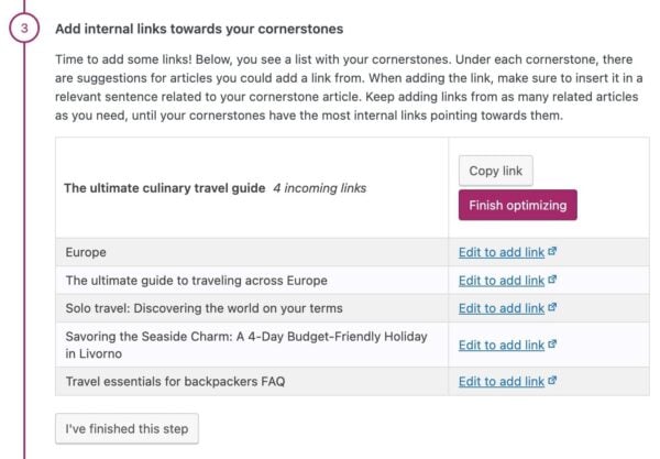
Implementing a cornerstone strategy
But what about the cornerstone content we discussed above? How do you make sure your most valuable content gets enough links? If you want to focus on these articles, Yoast SEO Premium has just the tool for you: the Cornerstone workout. In a few steps, it lets you select your most important articles and mark them as cornerstones. Then, it shows you how many internal links there are pointing to this post. Do you feel this isn’t in line with the number of links it should have? We’ll give you suggestions on which related posts to link from. And in just a few clicks, you can add the link from the right spot in the related post:
As you probably (hopefully!) don’t change your cornerstone strategy every month, it’s not necessary to do this workout every month. If you have a vast amount of content that performs quite well, checking this, let’s say, every 3 or 6 months, you should be fine. However, if you’re starting out, publishing a lot of new content, or making big changes to your site, you should probably do this workout more often. As your site grows, your focal point might change, and this workout will help you make sure you stay focused on the content you really want to rank.
5. Clean up the attic once in a while
We mostly discussed your best and most important content until now. But on the other side of the spectrum, we have your older (and more lonely) content that you haven’t touched in a while. Announcements of events that took place years ago, new product launches from when you just started, and blog posts that simply aren’t relevant anymore. These posts keep filling up your attic, and at one point, you should clean your attic thoroughly. You don’t want people or Google to find low-quality pages or pages showing outdated or irrelevant information and get lost up there.
There are some ways to go about this. You can, of course, go to your blog post archive and clean up while going through your oldest post. Never just delete something, though! Take a closer look at the content and always check whether a post still gets traffic in Google Analytics. In doubt whether you should keep it? Read our blog on updating or deleting old content to help you with that choice. And, if you think a post is irrelevant and you want to delete it, you should either redirect it to a good equivalent URL or have it show a 410 page, indicating that it’s been deleted on purpose. You can read all about properly deleting a post here.
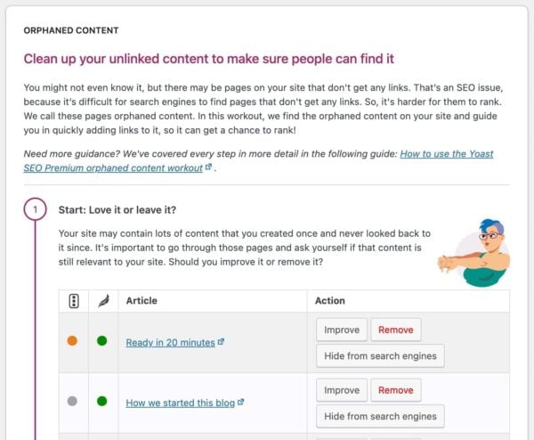
Cleaning up orphaned content
Yoast SEO Premium also has an SEO workout to help you maintain old and forgotten content: the Orphaned content workout. It lists all of your unlinked content for you. Because you never or hardly linked to these pages, we can assume they’re pages you’ve once created but never looked back at. Or, they don’t fit into your current content strategy anymore. That’s why this is a good place to start cleaning up! With the workout, you can go through the posts and pages one by one and consider: is this post not relevant anymore? Then delete and redirect the URL to a better destination in a few clicks! Is it still relevant but outdated? Then update it and start adding links to it from related posts. Did you just forget to link to this post? Then start adding some links! The workout takes you by the hand through all these steps, so it’s easy to keep track of your progress.
How often should you do this workout? It’s hard to make a general statement about this because it very much depends on the amount of old content you have, how good your internal linking is, and how much new content you’re creating. If you have a bigger site, it will probably be quite a time investment when you do it for the first time. But if you maintain it and do this workout regularly, on a monthly basis, for instance, you will get it done faster every time!
6. Check your content per topic/tag
When you have a lot of similar articles, they can start competing with each other in the search engines. We call that content or keyword cannibalization. That’s why it’s good to look at all the articles you have on a certain topic from time to time. Do they differ enough? Are they right below each other in Google’s search results on page 2? Then you might have to merge two articles into one to make that one perform better. Depending on the size of your site, you can look at this on a category or tag level or even on smaller subtopics.
In the aforementioned post, we describe in detail how to go about this content maintenance process of fixing keyword cannibalization. In short, you’ll have to create an overview of the posts on that topic. Then look at how all of these articles perform with the help of Google Search Console and Google Analytics. This will help you decide what to keep, merge, or delete!
Content maintenance: you need time and tools!
As you might have already noticed, content maintenance can be quite a task. But if you do it regularly and use the right tools, it gets easier over time. And the easier it gets, the more fun! Who doesn’t want a tidied-up website? It will make you, your site visitors, and Google very happy. So, don’t wait too long to implement a good content maintenance strategy and use the right tools to make your life easier!
Read more: Your website needs SEO maintenance! »
Unlock our SEO workouts with Yoast SEO Premium
Get Yoast SEO Premium and enjoy access to all our best SEO tools, training and SEO workouts!
Keep reading: What is site structure and why is it important? »
