Ahrefs released a public dashboard that tracks how much referral traffic websites receive from Google Search versus ChatGPT, with monthly updates.
The first dataset covers three complete months across 44,421 sites connected to Ahrefs’ free Web Analytics tool.
The Early Numbers
For July, the dashboard reports Google at 41.9% of total web traffic across the cohort and ChatGPT at 0.19%.
Month over month, Google grew 1.4% and ChatGPT grew 5.3%.
The prior month showed the reverse pattern: Google +6.8% and ChatGPT +1.6%. These swings show growth rates can vary by month even as Google’s share remains far larger. Ahrefs Traffic Analysis
The dashboard states:
“ChatGPT is growing 3.8x faster than Google.”
It adds:
“With 5.3% monthly growth vs Google’s 1.4% in the latest month, AI-powered search continues to evolve rapidly.”
And:
“ChatGPT now drives measurable referral traffic to websites, representing a new channel that didn’t exist 2 years ago.”
How The Data Is Collected
To keep the time series comparable, the tracker includes only sites that appear in all months. As the page explains:
“Our analysis tracks sites that appear in all months, ensuring statistically significant and reliable growth metrics.”
The page also lists the last update timestamp and confirms monthly updates.
Important Caveats
The dashboard measures referral traffic that arrives with a referrer.
Some AI systems and in-app browsers add noreferrer or otherwise strip referrers, which can undercount AI-originating visits.
Ahrefs has documented this analytics blind spot when measuring AI assistants and Google’s AI Mode. Keep that limitation in mind when comparing “AI search” activity to traditional search.
Scope matters too. The cohort is limited to sites using Ahrefs Web Analytics. Earlier Ahrefs research across different samples found AI referrals around 0.17% of the average site’s traffic, which is directionally consistent with the 0.19% shown here.
Looking Ahead
Google still sends the overwhelming share of visits in this dataset, and that reality should anchor your priorities. At the same time, ChatGPT’s July growth suggests an emerging, measurable channel you can evaluate with real data.
Use the tracker to watch how both lines move over time and adjust your testing accordingly.
Google’s Barry Pollard recently explained why website owners see different Core Web Vitals scores in Chrome User Experience Report (CrUX) versus Google Search Console.
The short answer: both tools can be correct because they measure different things.
Pollard addressed the issue on Bluesky after questions about sites showing 90% “good” page loads in CrUX but only 50% “good” URLs in Search Console. His explanation can help you decide which metrics matter for your SEO work.
CrUX vs. Search Console
CrUX and Search Console measure performance differently.
CrUX counts page views and reflects how real Chrome users experience your site across visits. Every visit is a data point. If one person hits your homepage ten times, that’s ten experiences counted.
In Pollard’s words:
“Most CrUX data is measured by ‘page views’.”
He added:
“Users can visit a single page many times, or multiple pages once. 90% of your ‘page views’ may be the home page.”
Search Console works differently. It evaluates individual URLs and groups similar pages, giving you a template-level view of page health across the site. It’s a different lens on the same underlying field data sourced from CrUX.
Google’s documentation confirms: CrUX is the official Web Vitals field dataset, and the Core Web Vitals report in Search Console is derived from it and presented at the URL/group level.
Why Both Metrics Matter
Should you focus on page views or individual pages? That depends on your goals.
Pollard puts the choice on you:
“Should you care about ‘page views’ or ‘pages’? Well that’s up to you!”
High-traffic pages affect more people, so they often deserve first priority. They also tend to run faster because they get more attention and caching.
But don’t ignore slower pages. As Pollard suggested:
“Maybe they’d be visited more if not so slow?”
The best approach uses both views. Keep popular pages fast for current visitors, and improve slower sections to raise overall site quality and discoverability.
Action plan
When CrUX looks good but Search Console shows many problem URLs, it usually means your most-visited pages are fine while long-tail sections need work. That’s useful direction, not a conflict.
Start with the pages that drive the most sessions and revenue, then work through other templates so URL-level health catches up. As you assess changes, always check what each tool is counting and over which time window.
Looking ahead
Don’t panic when the numbers don’t align. They’re showing you different views of the same reality: user experiences (CrUX) and page health by URL/group (Search Console). Use both to guide your roadmap and reporting.
Google says the new Trends API is opening to a “quite small” set of testers at first, with access expanding over time. The company formally announced the alpha at Search Central Live APAC.
On Bluesky, Google Search Advocate John Mueller tried to set expectations for SEO professionals, writing:
“The initial pilot is going to be quite small, the goal is to expand it over time… I wouldn’t expect the alpha/beta to be a big SEO event :)”
Google’s own announcement also describes access as “very limited” during the early phase.
What Early Testers Get
The API’s main benefit is consistent scaling.
Unlike the Trends website, which rescales results between 0 and 100 for each query set, the API returns data that stays comparable across requests.
That means you can join series, extend time ranges without re-pulling history, and compare many terms in one workflow.
Data goes back 1,800 days (about five years) and updates through two days ago. You can query daily, weekly, monthly, or yearly intervals and break results down by region and sub-region.
At the launch session, Google showed example responses that included both a scaled interest value and a separate search_interest field, indicating a raw-value style metric alongside the scaled score. Google also said the alpha will not include the “Trending Now” feature.
Why There’s High Interest
If you rely on Trends for research, the consistent scaling solves a long-standing pain point with cross-term comparisons.
You can build repeatable analyses without the “re-scaled to 100” surprises that come from changing comparator sets.
For content planning, five years of history and geo breakdowns support more reliable seasonality checks and local targeting.
Looking Ahead
The small pilot suggests Google wants feedback from different types of users. Google is prioritizing applicants who have a concrete use case and can provide feedback.
In the meantime, you can continue to use the website version while preparing for API-based comparisons later.
Google has released an open-source Model Context Protocol (MCP) server that lets you analyze Google Analytics data using large language models like Gemini.
Announced by Matt Landers, Head of Developer Relations for Google Analytics, the tool serves as a bridge between LLMs and analytics data.
Instead of navigating traditional report interfaces, you can ask questions in plain English and receive responses instantly.
A Shift From Traditional Reports
The MCP server offers an alternative to digging through menus or configuring reports manually. You can type queries like “How many users did I have yesterday?” and get the answer you need.
Screenshot from: YouTube.com/GoogleAnalytics, July 2025.
In a demo, Landers used the Gemini CLI to retrieve analytics data. The CLI, or Command Line Interface, is a simple text-based tool you run in a terminal window.
Instead of clicking through menus or dashboards, you type out questions or commands, and the system responds in plain language. It’s like chatting with Gemini, but from your desktop or laptop terminal.
When asked about user counts from the previous day, the system returned the correct total. It also handled follow-up questions, showing how it can refine queries based on context without requiring additional technical setup.
You can watch the full demo in the video below:
What You Can Do With It
The server uses the Google Analytics Admin API and Data API to support a range of capabilities.
According to the project documentation, you can:
Retrieve account and property information
Run core and real-time reports
Access standard and custom dimensions and metrics
Get links to connected Google Ads accounts
Receive hints for setting date ranges and filters
To set it up, you’ll need Python, access to a Google Cloud project with specific APIs enabled, and Application Default Credentials that include read-only access to your Google Analytics account.
Real-World Use Cases
The server is especially helpful in more advanced scenarios.
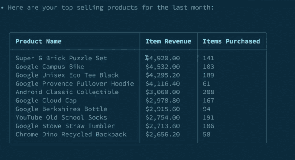
In the demo, Landers asked for a report on top-selling products over the past month. The system returned results sorted by item revenue, then re-sorted them by units sold after a follow-up prompt.
Screenshot from: YouTube.com/GoogleAnalytics, July 2025.
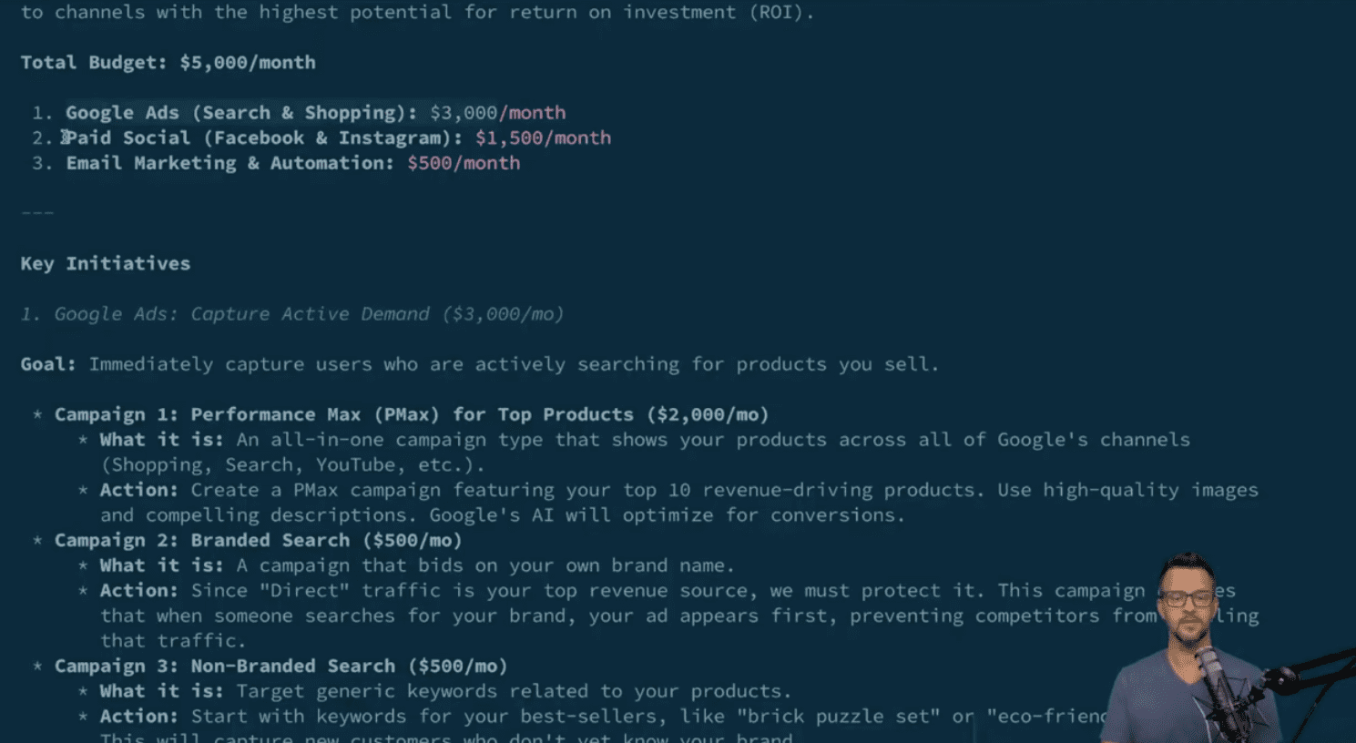
Later, he entered a hypothetical scenario: a $5,000 monthly marketing budget and a goal to increase revenue.
The system generated multiple reports, which revealed that direct and organic search had driven over $419,000 in revenue. It then suggested a plan with specific budget allocations across Google Ads, paid social, and email marketing, each backed by performance data.
Screenshot from: YouTube.com/GoogleAnalytics, July 2025.
How To Set It Up
You can install the server from GitHub using a tool called pipx, which lets you run Python-based applications in isolated environments. Once installed, you’ll connect it to Gemini CLI by adding the server to your Gemini settings file.
Setup steps include:
Enabling the necessary Google APIs in your Cloud project
Configuring Application Default Credentials with read-only access to your Google Analytics account
(Optional) Setting environment variables to manage credentials more consistently across different environments
The server works with any MCP-compatible client, but Google highlights full support for Gemini CLI.
To help you get started, the documentation includes sample prompts for tasks like checking property stats, exploring user behavior, or analyzing performance trends.
Looking Ahead
Google says it’s continuing to develop the project and is encouraging feedback through GitHub and Discord.
While it’s still experimental, the MCP server gives you a hands-on way to explore what natural language analytics might look like in the future.
If you’re on a marketing team, this could help you get answers faster, without requiring dashboards or custom reports. And if you’re a developer, you might find ways to build tools that automate parts of your workflow or make analytics more accessible to others.
The full setup guide, source code, and updates are available on the Google Analytics MCP GitHub repository.
I’ve spent years working with Google’s SEO tools, and while there are countless paid options out there, Google’s free toolkit remains the foundation of my optimization workflow.
These tools show you exactly what Google considers important, and that offers invaluable insights you can’t get anywhere else.
Let me walk you through the five Google tools I use daily and why they’ve become indispensable for serious SEO work.
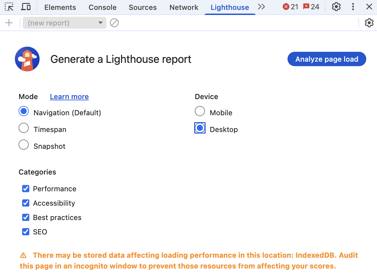
1. Lighthouse
Screenshot from Chrome DevTool, July 2025
When I first discovered Lighthouse tucked away in Chrome’s developer tools, it felt like finding a secret playbook from Google.
This tool has become my go-to for quick site audits, especially when clients come to me wondering why their perfectly designed website isn’t ranking.
Getting Started With Lighthouse
Accessing Lighthouse is surprisingly simple.
On any webpage, press F12 (Windows) or Command+Option+C (Mac) to open developer tools. You’ll find Lighthouse as one of the tabs. Alternatively, right-click any page, select “Inspect,” and navigate to the Lighthouse tab.
What makes Lighthouse special is its comprehensive approach. It evaluates five key areas: performance, progressive web app standards, best practices, accessibility, and SEO.
While accessibility might not seem directly SEO-related, I’ve learned that Google increasingly values sites that work well for all users.
Real-World Insights From The Community
The developer community has mixed feelings about Lighthouse, and I understand why.
As _listless noted, “Lighthouse is great because it helps you identify easy wins for performance and accessibility.”
However, CreativeTechGuyGames warned about the trap of chasing perfect scores: “There’s an important trade-off between performance and perceived performance.”
I’ve experienced this firsthand. One client insisted on achieving a perfect 100 score across all categories.
We spent weeks optimizing, only to find that some changes actually hurt user experience. The lesson? Use Lighthouse as a guide, not gospel.
Why Lighthouse Matters For SEO
The SEO section might seem basic as it checks things like meta tags, mobile usability, and crawling issues, but these fundamentals matter.
I’ve seen sites jump in rankings just by fixing the simple issues Lighthouse identifies. It validates crucial elements like:
Proper viewport configuration for mobile devices.
Title and meta description presence.
HTTP status codes.
Descriptive anchor text.
Hreflang implementation.
Canonical tags.
Mobile tap target sizing.
One frustrating aspect many developers mention is score inconsistency.
As one Redditor shared, “I ended up just re-running the analytics WITHOUT changing a thing and I got a performance score ranging from 33% to 90%.”
I’ve seen this too, which is why I always run multiple tests and focus on trends rather than individual scores.
Making The Most Of Lighthouse
My best advice? Use the “Opportunities” section for quick wins. Export your results as JSON to track improvements over time.
And remember what one developer wisely stated: “You can score 100 on accessibility and still ship an unusable [website].” The scores are indicators, not guarantees of quality.
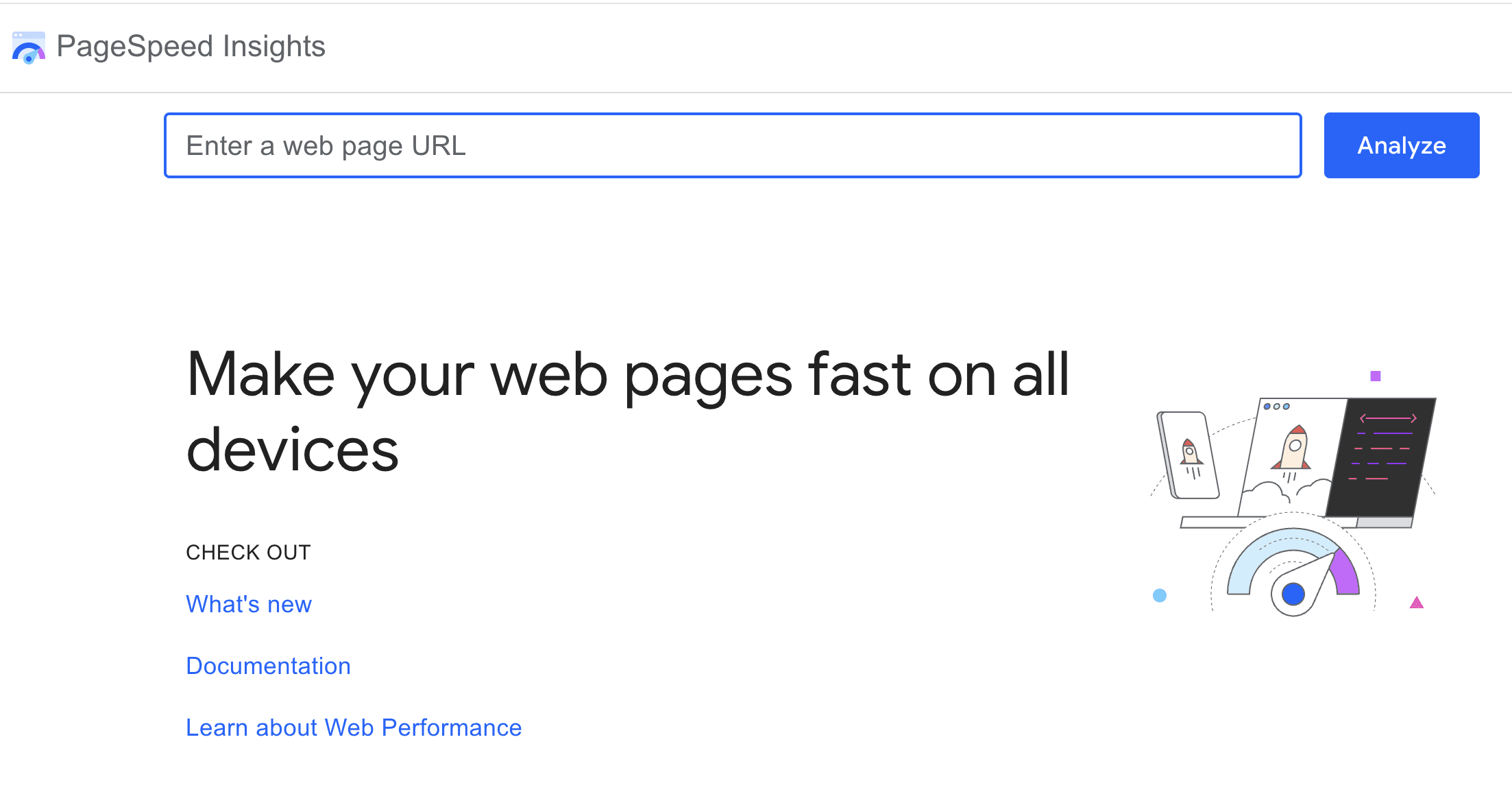
2. PageSpeed Insights
Screenshot from pagespeed.web.dev, July 2025
PageSpeed Insights transformed from a nice-to-have tool to an essential one when Core Web Vitals became ranking considerations.
What sets PageSpeed Insights apart is its combination of lab data (controlled test results) and field data (real user experiences from the Chrome User Experience Report).
This dual approach has saved me from optimization rabbit holes more times than I can count.
The field data is gold as it shows how real users experience your site over the past 28 days. I’ve had situations where lab scores looked terrible, but field data showed users were having a great experience.
This usually means the lab test conditions don’t match your actual user base.
Community Perspectives On PSI
The Reddit community has strong opinions about PageSpeed Insights.
NHRADeuce perfectly captured a common frustration: “The score you get from PageSpeed Insights has nothing to do with how fast your site loads.”
While it might sound harsh, there’s truth to it since the score is a simplified representation of complex metrics.
Practical Optimization Strategies
Through trial and error, I’ve developed a systematic approach to PSI optimization.
Arzishere’s strategy mirrors mine: “Added a caching plugin along with minifying HTML, CSS & JS (WP Rocket).” These foundational improvements often yield the biggest gains.
DOM size is another critical factor. As Fildernoot discovered, “I added some code that increased the DOM size by about 2000 elements and PageSpeed Insights wasn’t happy about that.” I now audit DOM complexity as part of my standard process.
Mobile optimization deserves special attention. A Redditor asked the right question: “How is your mobile score? Desktop is pretty easy with a decent theme and Litespeed hosting and LScaching plugin.”
In my experience, mobile scores are typically 20-30 points lower than desktop, and that’s where most of your users are.
The Diminishing Returns Reality
Here’s the hard truth about chasing perfect PSI scores: “You’re going to see diminishing returns as you invest more and more resources into this,” as E0nblue noted.
I tell clients to aim for “good” Core Web Vitals status rather than perfect scores. The jump from 50 to 80 is much easier and more impactful than 90 to 100.
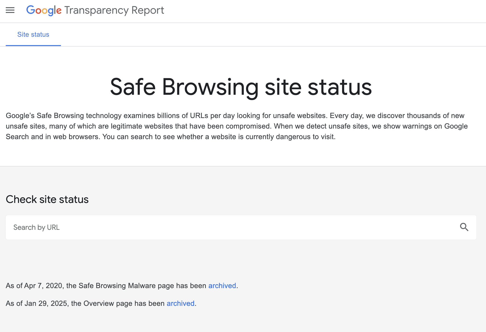
3. Safe Browsing Test
Screenshot from transparencyreport.google.com/safe-browsing/search, July 2025
The Safe Browsing Test might seem like an odd inclusion in an SEO toolkit, but I learned its importance the hard way.
A client’s site got hacked, flagged by Safe Browsing, and disappeared from search results overnight. Their organic traffic dropped to zero in hours.
Understanding Safe Browsing’s Role
Google’s Safe Browsing protects users from dangerous websites by checking for malware, phishing attempts, and deceptive content.
As Lollygaggindovakiin explained, “It automatically scans files using both signatures of diverse types and uses machine learning.”
The tool lives in Google’s Transparency Report, and I check it monthly for all client sites. It shows when Google last scanned your site and any current security issues.
The integration with Search Console means you’ll get alerts if problems arise, but I prefer being proactive.
Community Concerns And Experiences
The Reddit community has highlighted some important considerations.
One concerning trend expressed by Nextdns is false positives: “Google is falsely flagging apple.com.akadns.net as malicious.” While rare, false flags can happen, which is why regular monitoring matters.
Privacy-conscious users raise valid concerns about data collection.
As Mera-beta noted, “Enhanced Safe Browsing will send content of pages directly to Google.” For SEO purposes, standard Safe Browsing protection is sufficient.
Why SEO Pros Should Care
When Safe Browsing flags your site, Google may:
Remove your pages from search results.
Display warning messages to users trying to visit.
Drastically reduce your click-through rates.
Impact your site’s trust signals.
I’ve helped several sites recover from security flags. The process typically takes one to two weeks after cleaning the infection and requesting a review.
That’s potentially two weeks of lost traffic and revenue, so prevention is infinitely better than cure.
Best Practices For Safe Browsing
My security checklist includes:
Weekly automated scans using the Safe Browsing API for multiple sites.
Immediate investigation of any Search Console security warnings.
Regular audits of third-party scripts and widgets.
Monitoring of user-generated content areas.
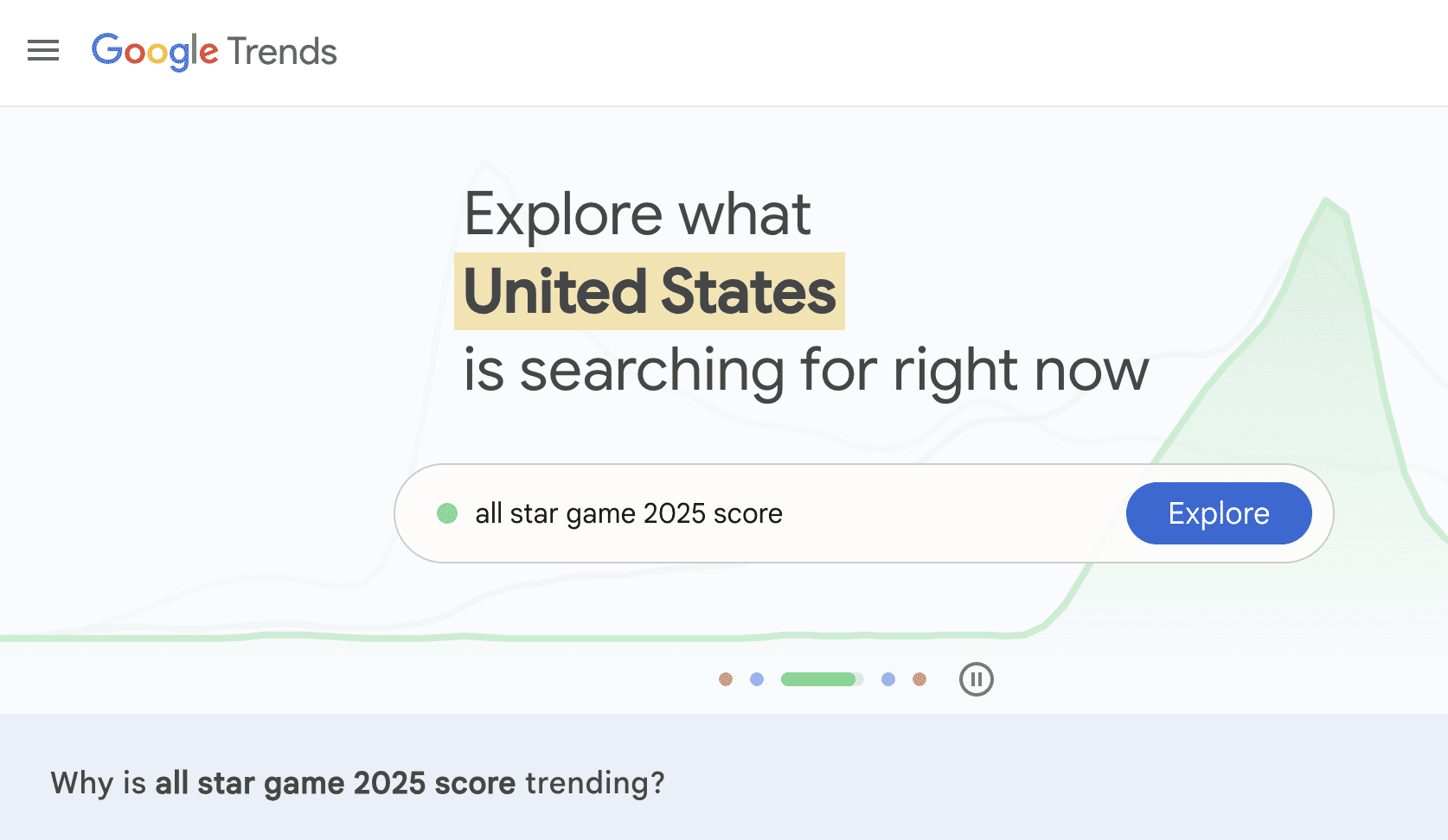
4. Google Trends
Screenshot from Google Trends, July 2025
Google Trends has evolved from a curiosity tool to a strategic weapon in my SEO arsenal.
With updates now happening every 10 minutes and AI-powered trend detection, it’s become indispensable for content strategy.
Beyond Basic Trend Watching
What many SEO pros miss is that Trends isn’t just about seeing what’s popular. I use it to:
Validate content ideas before investing resources.
The Reddit community offers balanced perspectives on Google Trends.
Maltelandwehr highlighted its unique value: “Some of the data in Google Trends is really unique. Even SEOs with monthly 7-figure budgets will use Google Trends for certain questions.”
However, limitations exist. As Dangerroo_2 clarified, “Trends does not track popularity, but search demand.”
This distinction matters since a declining trend doesn’t always mean fewer total searches, just decreasing relative interest.
For niche topics, frustrations mount. iBullyDummies complained, “Google has absolutely ruined Google Trends and no longer evaluates niche topics.” I’ve found this particularly true for B2B or technical terms with lower search volumes.
Advanced Trends Strategies
My favorite Trends hacks include:
The Comparison Method: I always compare terms against each other rather than viewing them in isolation. This reveals relative opportunity better than absolute numbers.
Category Filtering: This prevents confusion between similar terms. The classic example is “jaguar” where without filtering, you’re mixing car searches with animal searches.
Rising Trends Mining: The “Rising” section often reveals opportunities before they become competitive. I’ve launched successful content campaigns by spotting trends here early.
Geographic Arbitrage: Finding topics trending in one region before they spread helps you prepare content in advance.
Addressing The Accuracy Debate
Some prefer paid tools, as Contentwritenow stated: “I prefer using a paid tool like BuzzSumo or Semrush for trends and content ideas simply because I don’t trust Google Trends.”
While I use these tools too, they pull from different data sources. Google Trends shows actual Google search behavior, which is invaluable for SEO.
“A line trending downward means that a search term’s relative popularity is decreasing. But that doesn’t necessarily mean the total number of searches for that term is decreasing.”
I always combine Trends data with absolute volume estimates from other tools.
No list of Google SEO tools would be complete without Search Console.
If the other tools are your scouts, Search Console is your command center, showing exactly how Google sees and ranks your site.
Why Search Console Is Irreplaceable
Search Console provides data you literally cannot get anywhere else. As Peepeepoopoobutler emphasized, “GSC is the accurate real thing. But it doesn’t really give suggestions like ads does.”
That’s exactly right. While it won’t hold your hand with optimization suggestions, the raw data it provides is gold.
The tool offers:
Actual search queries driving traffic (not just keywords you think matter).
True click-through rates by position.
Index coverage issues before they tank your traffic.
Core Web Vitals data for all pages.
Manual actions and security issues that could devastate rankings.
I check Search Console daily, and I’m not alone.
Successful site owner ImportantDoubt6434 shared, “Yes monitoring GSC is part of how I got my website to the front page.”
The Performance report alone has helped me identify countless optimization opportunities.
Setting Up For Success
Getting started with Search Console is refreshingly straightforward.
As Anotherbozo noted, “You don’t need to verify each individual page but maintain the original verification method.”
I recommend domain-level verification for comprehensive access since you can “verify ownership by site or by domain (second level domain),” but domain gives you data across all subdomains and protocols.
The verification process takes minutes, but the insights last forever. I’ve seen clients discover they were ranking for valuable keywords they never knew about, simply because they finally looked at their Search Console data.
Hidden Powers Of Search Console
What many SEO pros miss are the advanced capabilities lurking in Search Console.
Seosavvy revealed a powerful strategy: “Google search console for keyword research is super powerful.” I couldn’t agree more.
By filtering for queries with high impressions but low click-through rates, you can find content gaps and optimization opportunities your competitors miss.
The structured data reports have saved me countless hours. CasperWink mentioned working with schemas, “I have already created the schema with a review and aggregateRating along with confirming in Google’s Rich Results Test.”
Search Console will tell you if Google can actually read and understand your structured data in the wild, something testing tools can’t guarantee.
Sitemap management is another underutilized feature. Yetisteve correctly stated, “Sitemaps are essential, they are used to give Google good signals about the structure of the site.”
I’ve diagnosed indexing issues just by comparing submitted versus indexed pages in the sitemap report.
The Reality Check: Limitations To Understand
Here’s where the community feedback gets really valuable.
An experienced SimonaRed warned, “GSC only shows around 50% of the reality.” This is crucial to understand since Google samples and anonymizes data for privacy. You’re seeing a representative sample, not every single query.
Some find the interface challenging. As UncleFeather6000 admitted, “I feel like I don’t really understand how to use Google’s Search Console.”
I get it because the tool has evolved significantly, and the learning curve can be steep. My advice? Start with the Performance report and gradually explore other sections.
Recent changes have frustrated users, too. “Google has officially removed Google Analytics data from the Search Console Insights tool,” Shakti-basan noted.
This integration loss means more manual work correlating data between tools, but the core Search Console data remains invaluable.
Making Search Console Work Harder
Through years of daily use, I’ve developed strategies to maximize Search Console’s value:
The Position 11-20 Gold Mine: Filter for keywords ranking on page two. These are your easiest wins since Google already thinks you’re relevant. You just need a push to page one.
Click-Through Rate Optimization: Sort by impressions, then look for low CTR. These queries show demand but suggest your titles and descriptions need work.
Query Matching: Compare what you think you rank for versus what Search Console shows. The gaps often reveal content opportunities or user intent mismatches.
Page-Level Analysis: Don’t just look at site-wide metrics. Individual page performance often reveals technical issues or content problems.
Integrating Search Console With Other Tools
The magic happens when you combine Search Console data with the other tools:
Use Trends to validate whether declining traffic is due to ranking drops or decreased search interest.
Cross-reference PageSpeed Insights recommendations with pages showing Core Web Vitals issues in Search Console.
Verify Lighthouse mobile-friendliness findings against Mobile Usability reports.
Monitor Safe Browsing status directly in the Security Issues section.
Mr_boogieman asked rhetorically, “How are you tracking results without looking at GSC?” It’s a fair question.
Without Search Console, you’re flying blind, relying on third-party estimations instead of data straight from Google.
Bringing It All Together
These five tools form the foundation of effective SEO work. They’re free, they’re official, and they show you exactly what Google values.
While specialized SEO platforms offer additional features, mastering these Google tools ensures your optimization efforts align with what actually matters for rankings.
My workflow typically starts with Search Console to identify opportunities, using Trends to validate content ideas, employing Lighthouse and PageSpeed Insights to optimize technical performance, and includes Safe Browsing checks to protect hard-won rankings.
Remember, these tools reflect Google’s current priorities. As search algorithms evolve, so do these tools. Staying current with their features and understanding their insights keeps your SEO strategy aligned with Google’s direction.
The key is using them together, understanding their limitations, and remembering that tools are only as good as the strategist wielding them. Start with these five, master their insights, and you’ll have a solid foundation for SEO success.
Google has rolled out a new comparison feature in Search Console, letting you analyze hourly performance data against two baselines: the previous 24 hours and the same day one week earlier.
The feature expands on Search Console’s 24-hour performance view, which launched in December. With this new capability, you can compare short-term trends more easily within Search Console’s performance reports.
Building On Near Real-Time Data
The original 24-hour view introduced hourly granularity and reduced the lag in data availability.
Now, the comparison feature adds context to that data. Instead of viewing isolated metrics, you can measure shifts in clicks, impressions, average CTR, and position over time.
The feature appears across Search Console’s performance reports for Search, Discover, and Google News.
How It Works
The comparison mode lives within the same interface as the 24-hour view and operates based on your local timezone.
You can toggle between viewing data for the last 24 hours, the previous 24 hours, and the same day from the week before. Visual indicators show how each metric has changed hour by hour.
Why This Matters
Before this update, the 24-hour view was a valuable but somewhat isolated tool. While it gave fast access to recent performance, there was no way to tell whether a spike or dip was meaningful without exporting the data for external comparison.
Now, you can assess whether fluctuations are part of a broader trend or a one-off anomaly.
For marketers and SEOs, this could help:
Validate the impact of content updates or site changes sooner.
Spot issues or opportunities that occur at specific times of day.
Establish baseline expectations for hourly performance.
News publishers and ecommerce sites with time-sensitive strategies may find this especially useful when timing is critical to outcomes.
Looking Ahead
Over the past year, Search Console has evolved from multi-day delays to near real-time feedback paired with reporting options.
As always, the rollout is gradual, so not all properties may see the new feature immediately. But once live, it fits directly into existing workflows, requiring no additional setup.
Google has added a new metadata field to the Search Analytics API, making it easier for developers and SEO professionals to identify when they’re working with incomplete or still-processing data.
The update introduces new transparency into the freshness of query results, an improvement for marketers who rely on up-to-date metrics to inform real-time decisions.
What’s New In The API
The metadata field appears when requests include the dataState parameter set to all or hourly_all, enabling access to data that may still be in the process of being collected.
Two metadata values are now available:
first_incomplete_date: Indicates the earliest date for which data is still incomplete. Only appears when data is grouped by date.
first_incomplete_hour: Indicates the first hour where data remains incomplete. Only appears when data is grouped by hour.
Both values help clarify whether recent metrics can be considered stable or if they may still change as Google finalizes its processing.
Why It Matters For SEO Reporting
This enhancement allows you to better distinguish between legitimate changes in search performance and temporary gaps caused by incomplete data.
To help reduce the risk of misinterpreting short-term fluctuations, Google’s documentation states:
“All values after the first_incomplete_date may still change noticeably.”
For those running automated reports, the new metadata enables smarter logic, such as flagging or excluding fresh but incomplete data to avoid misleading stakeholders.
Time Zone Consistency
All timestamps provided in the metadata field use the America/Los_Angeles time zone, regardless of the request origin or property location. Developers may need to account for this when integrating the data into local systems.
Backward-Compatible Implementation
The new metadata is returned as an optional object and doesn’t alter existing API responses unless requested. This means no breaking changes for current implementations, and developers can begin using the feature as needed.
Best Practices For Implementation
To take full advantage of this update:
Include logic to check for the metadata object when requesting recent data.
Consider displaying warnings or footnotes in reports when metadata indicates incomplete periods.
Schedule data refreshes after the incomplete window has passed to ensure accuracy.
Google also reminds users that the Search Analytics API continues to return only top rows, not a complete dataset, due to system limitations.
Looking Ahead
This small but meaningful addition gives SEO teams more clarity around data freshness, a frequent pain point when working with hourly or near-real-time performance metrics.
It’s a welcome improvement for anyone building tools or dashboards on top of the Search Console API.
The metadata field is available now through standard API requests. Full implementation details are available in the Search Analytics API documentation.
Google Search Console now includes a dedicated search appearance filter for discussion forum content, giving publishers new visibility into how user-generated discussions perform in search.
The update applies to pages that use either the DiscussionForumPosting or SocialMediaPostingstructured data types.
“Starting today, Search Console will show Discussion Forum rich results as a search appearance in the Performance reports.”
Until now, this type of content was lumped into broader appearance categories like “Rich results” or “Web,” making it difficult to isolate the impact of forum-style markup.
The new filter allows you to track impressions, clicks, and search position metrics specifically tied to discussion content.
This update isn’t about new search capabilities, it’s about measurement. Structured data for forums has been supported for some time, but publishers now have a way to monitor how well that content performs.
Structured Data Types That Qualify
The eligible schema types, DiscussionForumPosting and SocialMediaPosting, are designed for pages where people share perspectives, typically in the form of original posts and replies.
Google considers these formats appropriate for traditional forums and community platforms where conversations evolve over time. Pages built around user-generated content with visible discussion threads are the intended use case.
Both schema types share the same structured data requirements, including:
Author name
Date published (in ISO 8601 format)
At least one content element (text, image, or video)
Additional details such as like counts, view stats, or reply structures can also be included. For forums with threaded replies, Google recommends nesting comments under the original post to preserve conversational context.
Implementation & Eligibility Requirements
To qualify for the new search appearance, forum content must follow Google’s structured data guidelines closely.
Google explicitly warns against using this markup for content written by the site owner or their agents. That includes blog posts, product reviews, and Q&A-style content.
If the site’s structure is centered around questions and answers, publishers are expected to use the QAPage schema instead.
Another nuance in the documentation is the recommendation to use Microdata or RDFa rather than JSON-LD. While JSON-LD is still supported, Microdata formats help reduce duplication when large blocks of text are involved.
Why This Matters
This update provides a clearer understanding of how forums contribute to search visibility. With the new search appearance filter in place, it’s now possible to:
Measure the performance of user discussions independently from other content types
Identify which categories or threads attract search traffic
Optimize forum structure based on real user engagement data
Looking Ahead
Google’s decision to break out discussion forum results in Search Console highlights the growing role of user conversations in search. It’s a signal that this type of content deserves focused attention and ongoing optimization.
For publishers running forums or discussion platforms, now’s the time to ensure structured data is implemented correctly and monitor how your community content performs.
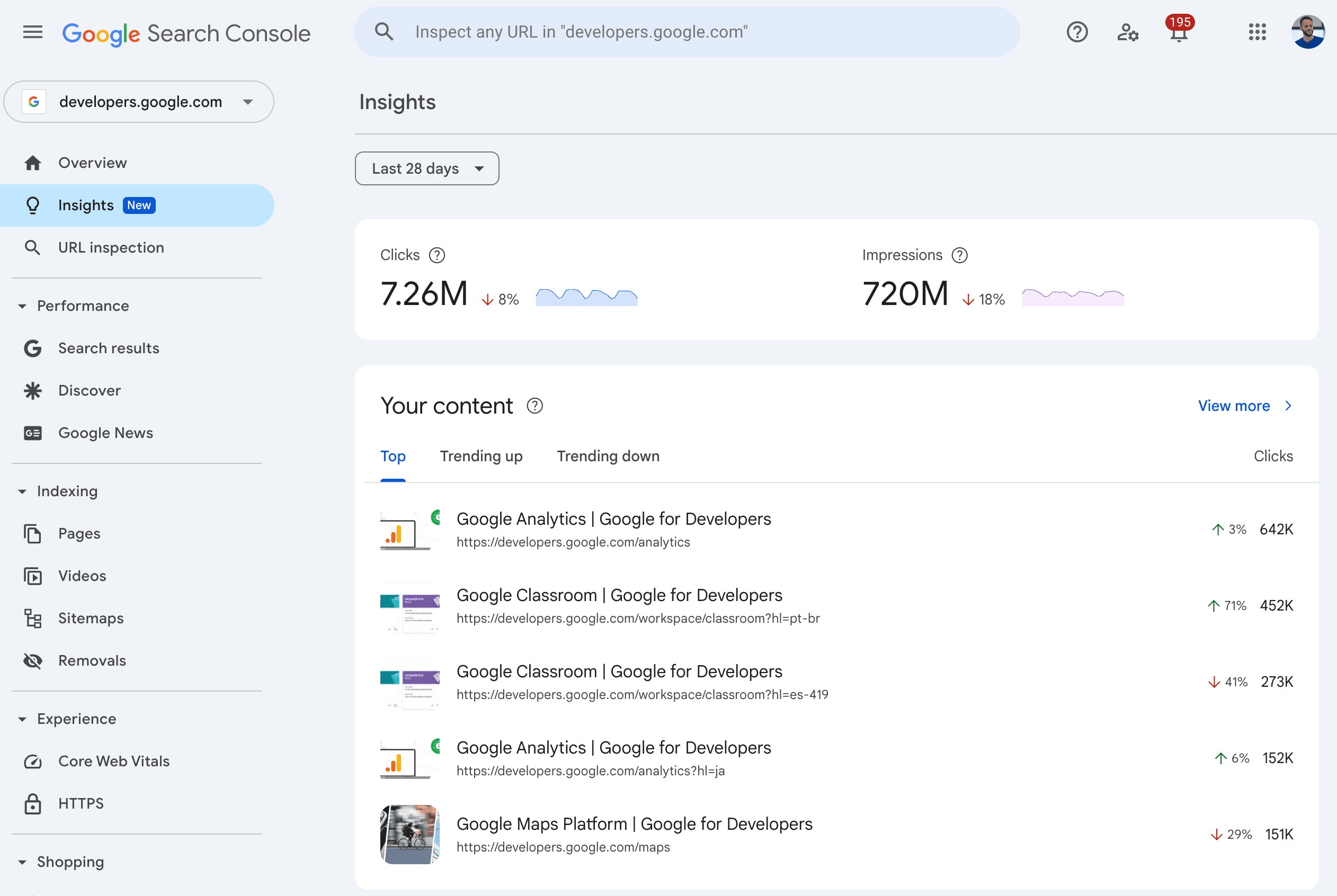
Google has rolled out a new version of Search Console Insights, now integrated directly into the main Search Console interface. This update ends the standalone beta experience.
The new report aims to make it easier to understand your site’s search performance without requiring advanced analytics skills.
What’s New?
Previously accessible through a separate interface, Search Console Insights now lives within the primary Search Console dashboard.
Google describes this as a more “cohesive experience,” bringing insights closer to the tools you already rely on.
The update is designed with non-technical users in mind, including bloggers, small business owners, and content creators seeking to understand how their content performs on Google Search.
Here’s an example of what the integrated experience looks like:
Screenshot from: developers.google.com/search/blog/2025/06/search-console-insights, June 2025.
Highlights From the Updated Report
1. Performance Overview
You can view total clicks and impressions from Google Search, along with comparisons to previous periods.
2. Page Performance
The report identifies which pages are getting the most clicks, along with “trending up” and “trending down” pages, offering insight into what’s working and what may need updating.
3. Achievements Feature Retained
Google is continuing the “Achievements” feature, which celebrates milestones like reaching new click thresholds.
While you can still access past achievements via email links, Google says direct sidebar access will be available in the next few weeks.
4. Search Query Trends
You can see top-performing queries and spot rising trends, which Google suggests can serve as inspiration for new content. Queries with declining performance are also highlighted.
Here’s an example of what this report looks like:
Screenshot from: developers.google.com/search/blog/2025/06/search-console-insights, June 2025.
Gradual Rollout In Progress
The new Insights experience is being rolled out gradually. If you don’t see it immediately, it will likely appear over the coming weeks.
This phased approach allows Google to monitor system performance and incorporate early feedback before releasing the feature to everyone.
How This Helps
By integrating simplified reporting into the main dashboard, Google is bridging the gap between entry-level insights and more advanced analytics.
If you found the existing Performance report overwhelming, this update could offer a more approachable alternative.
For agencies and consultants, the simplified view may also serve as a communication tool for clients less familiar with technical metrics.
The feature breaks questions into smaller topics and searches for each one at the same time. This “query fan out” technique, as Google calls it, lets people explore topics more deeply.
The key change in Google’s documents is that AI Mode data counts toward the totals in Search Console.
“Data from AI Mode is now counting towards the totals in the Search Console Performance report.”
How AI Mode Metrics Work
The documentation explains how AI Mode measures different actions:
Click: When someone clicks a link to an external page in AI Mode, it counts as a click in Search Console.
Impression: Standard impression rules apply. This means users must see or potentially see a link to your site.
Position: Position calculations in AI Mode work the same way as regular Google Search results pages. Carousel and image blocks within AI Mode use standard position rules for those elements.
When users ask follow-up questions within AI Mode, they start new queries. The documentation notes:
“All impression, position, and click data in the new response are counted as coming from this new user query.”
“The best practices for SEO remain relevant for AI features in Google Search.”
There are no extra technical requirements beyond standard Google Search rules.
Google’s documentation clarifies:
“You don’t need to create new machine-readable files, AI text files, or markup to appear in these features. There’s also no special schema.org structured data that you need to add.”
Website owners can control the appearance of their content’s AI features using existing tools, such as nosnippet, data-nosnippet, max-snippet, or noindex controls.
Looking Ahead
With AI Mode data now included in Search Console reports, you may notice changes in traffic patterns and metrics. The data appears within the “Web” search type in the Performance report, mixed with other search traffic.
The documentation notes that clicks from search results pages with AI features tend to be “higher quality.” Users are “more likely to spend more time on the site.”
However, without dedicated tabs for traffic from Google’s AI features, it’s impossible to verify those claims.