8 Blogs That Will Kick-Start Your Creativity as a Product Designer

blogs for designers

Finding the voices that personally resonate with you can be a crucial component when looking to improve your hard and soft skills. From boot camp graduates to industry veterans, a well-written or provocative article can help unlock new ideas, processes, or opinions. This is why embracing new perspectives is so important. 

Having said that, we now have an endless amount of options to choose from when it comes to finding new sources of inspiration. It can be easy to find yourself quickly lost in the algorithm or feeling out of the loop in an ever-evolving and crowded digital space.

We have compiled a shortlist of 8 blogs that will serve as a baseline to help kick-start your creativity as a product designer in 2024.

Top Blogs for Product Designers

  1. DESK
  2. Spotify Design
  3. UX Collective
  4. Webflow
  5. Codrops
  6. DesignerUp
  7. The UX Design Institute
  8. UX studio

1. DESK

DESK website

Founded in 2016, DESK covers topics across design, psychology, and productivity. In their own words, they aim “to create a resource for designers and makers to motivate, inspire, and just have fun.”

DESK is part of House of Van Schneider. A corner of the internet belonging to art director, thinker, and product designer Tobias Van Schneider. Tobias has developed products and services for clients such as Red Bull, Google, NASA, and Sony.

Why Desk?

Simply put, it’s a blog for designers, by designers. They write about a broad scope of topics that challenge you to perceive the world of design today in different ways. Why do you like what you like? What is good design? Should we be challenging the status quo? With contributions from a global team, DESK provides valuable insights from multiple perspectives. If you appreciate storytelling and the psychological aspects of design, this blog is for you. 

Highlight:

Breaking the algorithm is a thought piece that serves as a reminder for us to stay curious. It offers to be proactive rather than reactive to the world around us and the content we consume.

2. Spotify Design

Spotify website

Spotify Design is a community that directly shares its processes with its audience. It offers a peek under the hood of a product used by millions, designed for multiple platforms, contexts, and countries.

Why Spotify Design?

With stories and curated playlists directly from the team, you get a glimpse of what it takes to make Spotify successful. There are regular spotlight segments from team members, workshop guides, how-to segments on navigating your career, and much more. You can find takeaways here, no matter where your interests or strengths lie. With content broadly surrounding people and best practices, Spotify Design can give you a glimpse of what it’s like to work there. Any music-loving designer will surely appreciate their insights and focus on culture.

Highlight: 

One of the best examples is a recent post detailing the collaborative processes between design and engineering. It explains to the reader what to avoid and what to strive for.

3. UX Collective

UX Collective website

UX Collective is the largest independent design publication on the design landscape, hosted on Medium. Curated with content that aims to provoke change, it is a nucleus for critical thinking and shared experiences.

UX collective believes that knowledge sharing is the key to making the design community grow stronger in the future.

Why UX Collective?

As mentioned, UX Collective hosts stories, case studies, and curated essays to ensure quality. The beauty of the platform is that it gives anyone a voice to highlight their interests and passions. Not only that, but you can engage with and contribute to conversations that senior designers, major tech companies, and product makers start globally. It’s up to the reader to find what resonates with them here. If you want to open your mind to new ideas and join a more extensive conversation within the design community, look through UX Collective.

Highlight:

In line with the focus of this article, here is an exciting piece that highlights a few essential lessons in creativity that you can take from the film Everything, Everywhere, All at Once.

4. Webflow

Webflow website

Webflow offers anyone the ability to build a website without code. It’s a powerful tool that goes way beyond standardized templates. Thousands of leading organizations trust it globally to deliver stunning and immersive experiences.

Why Webflow?

As a result of this, Webflow’s blog offers fantastic insights on different topics. Ranging from web typography to the best responsive web design guidelines, you can find various topics there.

The blog also covers emerging design trends and featured articles that discuss design processes, resources, and other forms of inspiration – not to mention their e-books on the no-code revolution, as well as direct links to their free Webflow University courses. This blog is beneficial, especially for people passionate about digital design. I recommend it for those who want to level up their technical abilities, touching on new trends, best practices, and the complexities of the web.

Highlight:

This article demonstrates how creative you can get with menus and navigation styles. It also explains how you can add aesthetic flair while solidifying a memorable experience for the user.

5. Codrops

Codrops website

Codrops is a platform created to elevate and inspire the knowledge growth of contemporary designers, developers, and web professionals. By exploring the latest trends, issues, and topics in the digital field – they make it easy to stay up-to-date with everything. 

The platform has been consistent with its output since 2009. It’s offering freebies, articles, tutorials, and sketches, too. So, it’s clear that Codrops remains dedicated to delivering high-quality, innovative content. Their articles aim to spark the imagination of their readers.

Why Codrops?

There is a vibrant community full of resources to explore here. There are weekly round-ups with posts detailing how to rewrite the source code of PlayStation classics, what Slack would look like, redesigned from the ground up, and portfolios portraying exceptional animation, composition, and style.

The playground section offers an array of “web experiments, concepts, and layouts that push the boundaries of traditional design and showcase the latest in animation techniques.” It’s a great source of creative fuel for anyone looking to challenge the status quo and try new techniques.

Highlight:

Here is an excellent look into unique on-scroll column and row animations.

6. DesignerUp

DesignerUp website

DesignerUp is a platform that shares access to high-quality resources for designers to enhance their skill sets. They host free video tutorials, templates, podcasts, and articles. DesignerUp has adopted a philosophy highlighting how design is an extension of ourselves. They hope to provide a means of allowing us to express that notion.

You will notice that each post is presented and formatted with attention to detail and clarity that allows the process of finding inspiration to feel effortless. With the content offering alone, it feels like a resource that could answer any question you might have, whether it’s about removing the background from an image quickly or if you want to know what the best show on Netflix is about tech start-ups. 

Why DesignerUp?

DesignerUp will be particularly helpful if you are at the start of your design journey. Everything that you need to begin learning is there: courses, templates, freebies, but most importantly, knowledge. It’s trusted and used by industry leaders from Google and Asana to Figma.

Highlight:

Many things can easily fracture our focus and concentration in multiple directions. This affects our productivity, resulting in stress, and ultimately stifles creativity. DesignerUp outlines 10 effective strategies to enhance your workflow and manage your priorities better.

7. The UX Design Institute

The UX Design Institute website

With an offering of various university credit-rated courses, The UX Design Institute is globally recognized. It aims to reset the standard when it comes to UX education. 

They offer a free introductory course on UX and consistently host renowned guest speakers in webinars. Most recently, they have had a conversation with Don Norman on designing for a better world.

Why UX Design Institute?

The blog itself can be handy if you are seeking career tips or advice. In particular, their Expert Interviews segment focuses on people. They give you an insight into the day-to-day processes and workflows of designers operating in various fields. 

Highlight:

Here is an excellent example of incorporating effective and consistent branding within content design. As the article says, “Consistent branding is a crucial pillar of good content design—and, therefore, good UX.”

8. UX Studio

UX studio website

At UX studio, we closely keep our ears to the ground regarding new trends, methods of working, and the different perspectives of designers and researchers alike. On our blog, you will find plenty of resources to guide you on your journey – whether you’re looking for some of the best design agencies to work with around the globe or are on the hunt for tips to improve your Figma workflow. 

Why UX Studio?

At UX studio, we are on a mission to create impactful solutions, make people’s lives easier, and help businesses surpass themselves. This is clear in everything we communicate through our blog. With the input of different voices around the studio, we are sure you’ll have a few takeaways to boost your creativity.

Highlight:

In one of our previous articles, we gathered some great tools to make your life easier as a designer.

Summary

Staying engaged with current trends can be intimidating in the design world when everything seems to move so fast. Each of the resources mentioned above offers its own unique insights. They can serve as a baseline to ensure you maintain your creative energy and output.

Want to learn more?

If you want to learn more about UX design and our experiences working on projects, make sure you check out our UX design blog. We share valuable insights, tips, and best practices to help you grow your skills and knowledge on the topic.

5 Ways Design Will Make Your Product Strategy Great

A stylized, flat illustration of a light bulb with hand-drawn shapes in the background.

First, I wanted to introduce myself a bit. I’m Sándor, a product lead and former product designer with 5 years under my belt. I started my career with UX agency work at UX studio. My first few projects included webshop and mobile app designs for clients like Google. I also worked on a research-only localization project for Netflix.

In 2020 I joined our CEO to launch a new website builder for writers. We sailed from initial discovery to self-sustainability. That’s when I switched to a management role overseeing three smaller product teams, each around 4-6 people.

In short, the perk of having smaller product teams is that processes are not complicated. You can improve them through observations. But, the challenge is that roles are often diluted, and responsibilities are intertwined.

Even if you have strategy frameworks set up, problems in the design and research processes can misguide your strategy. In this article, I’ll bring personal examples to illustrate these problems and recommend solutions to them.

I hope these might help you out to improve your workflow as a designer or optimize your team’s processes as a manager.

How designers work in our product teams

To provide some context, here’s how our product teams work. A product designer starts everything by collecting insights. This can happen through interviews, tests, support emails and so on. Then we pick tickets that contribute to our quarterly objective the most. The designer turns the ideas into sketches, prototypes and finally, usability tests. After iteration rounds features are handed over to developers. We release, then our marketer lets our users and target audience know through various channels.

As you can see at first glance, there’s so much depending on our product designers. They are researchers and analysts as well. This slows down design by quite a margin — but it’s also valuable since one person is at the center of all this knowledge. Thanks to this, I find myself ideating on long-term plans with our designers. They have clear ideas of the future, opportunities and dangers, debts lying ahead.

An image illustrating how the designer role (symbolized by a circle) in our teams is exposed to a lot of information (symbolized by random shapes).
Our designers are exposed to a lot of unfiltered information.

Why strategy is embedded into product design

Good insights are the roots of a good strategy.

And the field of product design is full of great possibilities to collect insights. For example, usability tests and user interviews provide ample opportunity to receive input from users. During these sessions, you can see how your product is helping people.

In this setup I described above, designers and researchers are the first to know about feature requests or user struggles. They’re also the first to know about emerging trends that might affect your strategy in the long run.

How can strategy get derailed in the design process?

Even though all this above might sound natural, the process can get derailed. This heavily depends on the team setup, culture, or collaboration process.

For example, our team does not have dedicated researchers. Because of this, our designers work with a lot of unfiltered information. This calls for designers to be as objective as possible. Any small bias can lead to distorted insights, which means we built our strategy on the wrong assumptions.

But it’s not only about how you process insights. It’s about delivery, too. If all the insights are right, but the solutions are not good enough, the result is the same. You’re not shipping the features that’ll make a difference or contribute to your goals.

Below, I’ll detail these problems a bit more and also introduce new ones. I’ve paired them with tips on how to solve them.

How to optimize product design for strategy?

1. Collect the right insights

During my years working in the field of UX, I found this to be one of the most important principles for strategy. You have to make sure you’re collecting the right insights. Otherwise, you’ll end up like me a few years ago, making the biggest mistake of my career to this day.

Copyfolio, our freshly launched website builder, was just starting out. Our paying user base was growing but only barely. We desperately needed the input to decide what to add to our small editor.

So, from day one, we had a floating action button within the editor. It opened a small window where people could get in touch with us. Found a bug? Needed help? Wanted to recommend changes or share a feature idea? As a user, you could report it all — and sure enough, we started receiving user input. A ton. I remember thinking the more people gave us feedback, the easier it was going to be to make a decision on what to do next.

An image showing a lot of random shapes. Four shapes are circled in the middle, symbolizing the important insight.
Collecting the right information means finding the insights that matter

There were pretty good insights: they needed more customization, new sections, domain connection, and so on. We started implementing all these, but the growth rate did not change a tiny bit. We didn’t understand why.

Looking back from a few years, I still feel dumb for not checking who was giving insight to us. I started asking more questions about our subjects’ background. It turned out that mostly paying users sent requests that we implemented. Users who sign up to a free product and don’t find what they need, just leave. It’s that simple. Most of them won’t bother opening a popup and detailing their needs in multiple lines so they can pay.

Sure, I was collecting insights — just not the right insights. I’ve gathered a few tips on how to avoid falling into the same trap:

  • Always do detailed background exploration on interviews, in surveys, etc. It can reveal unexpected factors.
  • Align your research method with your goal. Define if you need quantitative or qualitative data and find the best way to collect it.
  • Keep challenging the quality of the input you’re getting. Try altering factors to see if you get the same results.

2. Be objective and ready to change your mind

Ensuring the objectivity of your strategy is harder than it looks. It requires a change of mindset: you have to look at things without preconceptions.

During my years in the agency work, an amazing researcher teammate of mine found something interesting. We were working on a smaller module of an app. Users mentioned on the tests that they didn’t know what the app should be used for. Upon a bit of digging, we figured out that the app had so many smaller features and modules that users weren’t sure what the app was for. To put it simply, the app had too many features.

We knew it wasn’t the original scope, but yet, it was a crucial finding, so we wanted to share it with the stakeholders. We prepared a presentation and talked about how we could bring up the topic in the best possible way.

The discussion was pretty unremarkable. We were presenting, they were listening, and a few heads were nodding. At the end, we realized they were not open to this feedback. They couldn’t get their head around the fact that there’s something like “too many features”. Their strategy was the direct opposite: add as many features as possible.

They ended up losing around 35% of their user base in 2 years.

An image with a lightbulb on the left, symbolizing an idea. Three key questions on the right. These are the questions mentioned in the article a paragraph below.
3 simple questions are enough to challenge your perspective

It’s not enough to collect the right insights — you have to be able to stay objective and open enough to change your mind. Here are a few questions that we should have asked the stakeholders:

  • What is the worst scenario if we go with this idea?
  • What is the worst scenario if we ditch this idea?
  • What if your most trusted friend or colleague said this? How would your reaction change then?

There are great frameworks to build confidence in your strategy. The key is to constantly challenge it and be ready to adjust your course. This way, you can ensure that you’re not sticking to an outdated idea.

3. Timeframes help with prioritizing

Let’s move on to the next step. The insights you’re building on are solid, and you’re ready to change your mind about strategy. There’s a high chance you’ll be overwhelmed with ideas and tickets to pick from. So, how do you decide what to work on?

I found that a clear timeframe is key in this case. For example, our team has mutually defined quarterly objectives. We track our progress with key results and decide on our success at the end of the quarter. This makes it easier to prioritize things because:

  • we can see how long a ticket would take,
  • what its payoff could be,
  • and how close it gets us to our desired results.
A full pie chart with pie slices symbolizing feature tickets on the left. On the right, large pie chart slices that didn't fit into the chart, symbolizing tickets that were not good fits for the team's limited time.
Prioritization is how you translate your strategy into practice

To mention a recent example, one of our product teams wanted to improve the traffic on our domain. At first, it sounded like a marketing goal. As we started discussing it, we realized there’s so much the whole team could contribute, so we went for it. At the end of the quarter, we increased traffic by 40%.

The quarterly deadline was pressuring, sure — but it also helped us to prioritize things that directly contributed to the goal. Our designer prioritized tickets that were heavily supporting marketing on purpose. Among other things, he created social media post templates for our marketer.

To this day, I’m sure we couldn’t have achieved this without a clear deadline ahead. Thanks to that, we saw the tickets differently. Vanity ideas got sorted out and tasks got done in an efficient way. For instance, the social media post templates were so easy to use that our marketer learned to use them alone, without the help of the designer.

In short, a clear timeframe helps you implement your strategy with peak efficiency.

4. Ship the best solution

Moving up one step on the ladder. Once you have your tickets sorted, there are still a few ways optimizing design for strategy can help you.

We were listening to the hundredth user telling us to integrate Google Analytics. We finally gave in and added the integration to the roadmap. One thing, however, got stuck in our heads: why is Google Analytics so important for them?

Upon further research, we figured out that most of our users did not know any alternatives for Google Analytics. It was the only free platform that provided the metrics they were interested in, but, at the same time, they hated it. It was hard to use and too complicated to find the things they were looking for.

Three rectangles placed in one another. The outer one reads
Don’t be afraid to go a layer deeper

We decided to go down the harder route: we built a custom analytics tool within our product. Our designer made sure it was simple and easy-to-understand. Metrics were accessible to everyone, not just tech-savvy users. Our test subjects loved it.

So, how can you ensure that you’re shipping the best solution then? You need to map the user’s needs carefully. A lot of “why” questions during research sessions help to dig deep into the actual pain. Don’t be afraid to go another level deeper, there’s no such thing as “too careful” when it comes to research.

5. Always look back and evaluate

And then, there’s a fifth and equally important rule that ties everything together.

I noticed the smaller a team is, the more it’s prone to jump to the next task ahead. This phenomenon came up throughout many client projects I worked on. I also recognized it in our small product teams. Expectations get exponentially higher the smaller a team is. It’s natural in these setups that everyone is burning on high flames to achieve the desired results.

This is not only dangerous because people can burn out but also because it’s detrimental to product strategy. Shipping features frequently can lead to skipping the retrospective evaluation process. But it’s an easy way to keep your strategy fluid.

A stylized Swiss army knife with multiple blades. The title says
Retro talks are the Swiss knives of product strategy

We shipped a dedicated blogging feature on Copyfolio. We agreed to keep it simple at first to see if there’s any interest from the users’ side — but usage numbers stayed low. Thanks to a retro session we looked back and decided to do some further research. Turns out, our users felt like the feature was so simple that it wasn’t even worth trying.

This insight would have never surfaced without a good retro session. And later it affected our whole product strategy. We realized a well-developed blogging feature set could not only help our current users. It could also increase our reach across the market and bring in users who would blog elsewhere.

Retrospective evaluation is key not only to track your progress but to keep your strategy dynamic. It also has a unique relationship with all the other tips I mentioned above:

  1. Doing retros ensures that you collect the right insight. If something isn’t right, you can go back and make sure you’re listening to the feedback you need to listen to.
  2. If you’re open to changing your approach, retrospective talks provide the earliest opportunity to do so.
  3. With strict deadlines comes the urge to skip retros and use the time for something else. Stick to your boots and allocate time for retros.
  4. Retros also help your team ship the best solution possible with iterative releases. Release something, see how it performs, discuss it and improve the feature until it’s the best possible version.

Summary and final thoughts on integration

This is just the tip of the iceberg. I’m sure there are many other ways to ensure your design & research processes in small teams are optimized for strategy. Nonetheless, the most important takeaways are now on your belt:

  1. Collect the right insights by aligning your research methodology with your goals.
  2. Be objective and ready to change your mind.
  3. Set up timeframes and deadlines to prioritize for maximum impact.
  4. Ship the best solution by always going a layer deeper into the users’ problem.
  5. Always look back and evaluate.
5 stylized, flat circles symbolizing planets. The title says
5 ways how good design processes make your strategy great

If you think you learned something useful today, I’m glad I could help with this article. But don’t forget that changing habits and processes is a delicate task. If you want to integrate some of these tips into your personal workflow, be persistent: habit stacking can be a great tool, for example. If you would like to update your team’s processes, on the other hand, the most important thing is to initiate discussion with team members to find the optimal solution for everyone.

Want to learn more?

If you want to learn more about building a successful brand strategy make sure you check out our article on Defining Brand Strategy and How to Develop One. We share valuable insights, tips, and best practices to help you grow your skills and knowledge on the topic.

Special thanks to my team mates for their contributions to this article: Laura Sima, Katica Babarczi, Dávid Pásztor & Barbara Bicskei.

target.com 2007
Ecommerce Is Going Back In Time & Here’s Why

Ecommerce is always changing but here is one big reason I see as to why.

How can you win in an extremely crowded space like LA traffic at 5 p.m. On a weekday. 


internet is like la traffic

I started building my first website using HTML in the late 90s. but let’s be honest no one wants to hear about me and building some websites. But the reason I brought it up is things were much simpler. We didn’t have the ability to create a lot of functions or fancy movement on websites back then. 

You might ask what this has to do with digital commerce today, well I can tell you. Back then we had one thing and that was extremely slow internet. So, to get a web page to load sometimes felt like ages. Large images were not an option complex design was also not an option. 

Now this affects the user experience dramatically. Our goal back then from the .com boom on was to make sites simple and could load quickly with a slow internet connection DSL.  

Now as Internet speeds increased our desire for cooler looking websites that had cooler functions or in our minds seems cooler took over. I mean there was some wild stuff that was happening in the mid-2000s.

One thing was for certain we still had a slow internet connection compared to nowadays. So the goal back then in e-commerce was to make sure your website loaded quickly and the only way to do that was to make sure that it didn’t have too much complexity. 

Back then we were fighting a slow internet connection or slow server speeds.

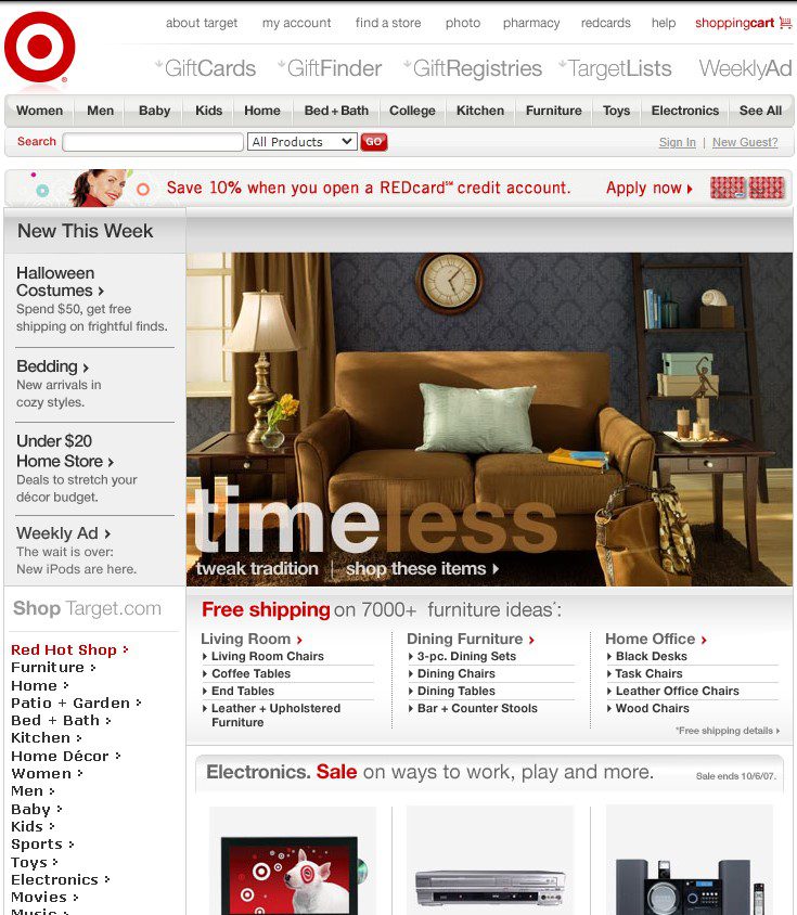
In 2007, the U.S. download speed average was 3.5 mbps

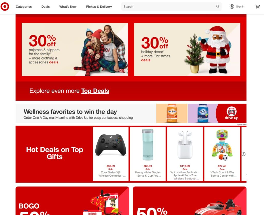
In 2022 U.S. internet download speed averages is 109 Mbps

Back then we were fighting a slow internet connection or slow server speeds. Today we are fighting a fast internet connection with extremely fast server speeds, but we are battling extremely short users’ attention spans.

BUT ITS REALLY THE SAME FIGHT!

So, in order to capture users’ imagination, we have to do it within a matter of seconds. So keep these facts in mind when you’re building your website today or you’re looking to optimize your performance today.

THE BIG TAKE AWAY IS LESS IS MORE!

JUST LOOK AT TARGET.COM HOME PAGE IN 2007 COMPARED TO TODAY. THE BIG CHANGE I SEE IS A WHOLE LOT LESS OF EVERYTHING! 

BACK IN 2007

target.com 2007

TODAY

By Jeffry Graham