Is your page not attracting the number of people you thought it would? Or are you wondering what you can improve to get your page higher up in the search results? And to get people to stay on (and come back to) your site? There are a few things you can do to give your page a better chance at performing well. In this blog post, we’ll discuss how you can determine which pages could use some extra love and what you can do to turn them into high-quality pages!
It is important to realize that content quality can have a big impact on your business and online findability. Especially since Google announced its helpful content update, your rankings might suffer if you have too much low-quality content. It’s not just about using the right keyword; search engines nowadays look at the whole picture. So it’s important to identify those low-quality pages and work your magic.
How to determine page quality
It’s important to determine which pages need improving and in what order. It can be tempting to just get started with the first page that comes to mind, but take some time to work out how your pages perform. This helps you prioritize and decide on what page needs your attention first.
Have a look at the metrics
You probably know your audience to some degree, but it’s unlikely that you know exactly what they want. Or how they search online and navigate through your site. Even if you have a hunch or hear from them regularly, make sure to look at the data to validate what people do on your site and where you can improve. A great tool to do this is Google Analytics. It can tell you how many people visit your site and where they’re coming from. Additionally, which pages are being visited the most, and how long people tend to stay on each page. All of this helps you determine the quality of your individual pages. So it’s well worth the effort to start learning about Google Analytics.
Use the Yoast SEO content analysis
Yoast SEO cleverly analyses your content to help you identify problems. Your content might have readability issues, making it hard for users to understand what you’re saying. Or you might have overused your keywords, making your text seem unnatural and spammy. Using Yoast SEO, you can easily see which pages and posts need improvement by looking at the traffic lights in the overview.
Yoast SEO shows red and orange traffic lights in the overview to highlight content issues
Identify low-quality pages with Screaming Frog
A tool you can use to easily identify low-quality content is Screaming Frog SEO Spider. When you run a query for your website in the SEO spider, you will get a list of all the URLs on your site. Now scroll through that list and visit every URL that makes no sense to you. The fact is, low-quality pages often occur in groups, rather than as a single page.
Think along the lines of old .html pages, where you end your URLs with a trailing slash now. Think about your attachment pages or anything with too many numbers in it. These should all make you feel suspicious. Visit the page and see if it displays low-quality content that shouldn’t be on Google. Test if these pages are indexed and check if there are more pages like them. Take a critical look at the pages you’ve found.
10 tips to directly improve page quality
Once you’ve assessed the quality of your individual pages, it’s a good idea to create a list prioritizing the pages you want to work on first. After that, the real fun begins. Let’s take a look at the first 10 tips to improve your page quality.
1. Decide on what you want to do with the page
First things first, figure out what you want to do with your page. For pages that are no longer up to date, ask yourself the following question: Can you update the page by making changes to it? Great, then you can go to the second tip on this list. But for pages that no longer have any business being on your site anymore, it might be best to remove them. Decide whether you want to update or delete the page.
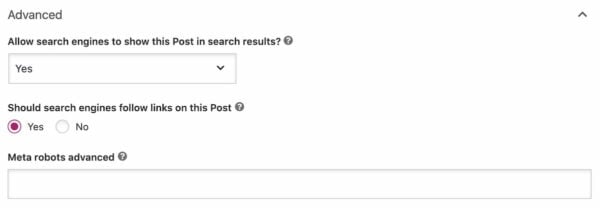
Chances are that you’ll also resurface a few outdated pages that don’t need to be shown in Google, even if you want to keep them on your site. On these pages you can use the noindex tag. If a low-quality page still holds relevant links to other parts of your website and has some traffic due to, for instance, links from other websites, you can use noindex, follow in your robots meta tag. This way, Google can find the page, follow the relevant links, but it will keep the page itself out of the search results.
You can find these indexing options in the Advanced tab in the Yoast SEO meta box
2. Think about search intent
When you want to improve the quality of a page, it’s good practice to take search intent into consideration. Search intent (or user intent) is the term used to describe the purpose of an online search. To be more exact, it’s the reason why someone conducts a specific search. Over the years, Google has worked hard to improve its algorithm to be able to determine people’s search intent. That’s why you need to think about matching your content to someone’s search intent when they land on your page.
The reason we’re discussing this here is that you want to make sure your pages show up for the right search intent. When someone is looking for information, you don’t want to send them to your product page right away. They’re probably not ready for that yet. And when someone does have a transactional intent, you don’t want them to land on one of your blog posts discussing the latest news. In that case, you want to ensure they go to the right product (or category) page right away.
An important factor that determines the quality of your page is content. There are a few basics that you need to tackle right away. For one, always base your content on the right keyphrases by conducting keyword research. Also, if your low-quality page doesn’t have a lot of text and doesn’t hold a lot of information, this could be considered thin content. Your users and search engines aren’t fans of this type of content, as it has little or no value to them. So make sure to write extensively on the topic you want to be found on.
Try to be critical of your writing and become the source for people instead of copying another source. Although it’s always good to keep an eye on your competition and the content they’re producing, make sure to have your own voice. If you write unique, insightful, useful content, people will be much more inclined to actually read it or link to it. Google will see that content as an addition to its index.
4. Show E-E-A-T
Everyone can own a website nowadays. Which is great, as this opens up the web for everyone. But this online growth has also resulted in trust issues when it comes to sites you’re not familiar with yet. That’s why it’s crucial to show readers, and search engines, that you can be trusted and that you’re an authority in your field. This doesn’t just help your pages show up in the search results; it also helps users reach the level of trust they need to do business with you online.
Google is working hard to recognize and reward high-quality content, and this is where E-E-A-T also comes into play. This acronym stands for Experience, Expertise, Authoritativeness, and Trustworthiness. This core concept is outlined in their Search Quality Raters guidelines and is used to evaluate online content. Meaning that your content will be judged as higher quality if you show experience, expertise, authoritativeness and trustworthiness. All of these will enhance the quality of your pages while helping you build a strong brand online.
5. Work on your site reputation
Another factor that is closely related to trustworthiness is the reputation of your website. This is something search engines also take into account when determining the quality of the pages on your site. But how do they determine your reputation? By analyzing what others are saying about you online. For example, user ratings about your site and how positive these are. But also other experts or established sites mentioning your business on their site. Or any other information about your business or authors mentioned on other sites.
6. Link to and from your page
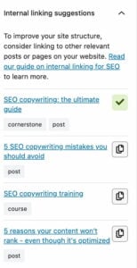
For people and search engines to be able to find your page, you need to ensure that you link to it. From other pages on your website that are related to the one you’re currently working on. So make sure to work on your internal linking and connect the content on your website to each other.
That being said, it’s important not to overdo it and link to every page you own in one post. Always keep the user in mind. So make sure to link to pages or posts that are actually relevant and that you can link to naturally. Our plugin has a great internal linking tool that suggests related content for every post or page.
Tips to improve site performance
We still have 4 tips to go, and they’re all related to the performance of your site. Some of them may take some more time, but these aspects are essential if you want to improve the quality of your pages. Not just for the search engines, but especially for your users.
7. Improve your site’s speed
The speed of your website determines whether you get a good ranking in Google, and its importance keeps growing. Why? Because faster sites are easier for search engines to process. And because search engines know that users don’t like slow websites. Users tend to buy less from slower sites and don’t read and engage as much as they would on a site with great site speed. So work on improving your site speed, you’ll be thankful for it later. Google also made page experience a ranking factor, making speed and user experience on your site even more important.
8. Consider user experience
User experience, also called UX, is all about how users experience a site or product. Search engines want to provide their users with the best results for their search queries. The best result doesn’t only mean the best answer, but also the best experience. So even if you’ve written an excellent answer in a post, but your site is slow or a mess, Google won’t consider your post the best answer.
Consider the goal of your site and its specific pages. What do you want visitors to do on your page? Buy stuff? Read your articles? Your design and content should support this goal. Having a clear goal in mind will also help you prioritize the improvements for your site. This ties in with the search intent of a certain page, but you should also consider whether the design and structure of your pages support the goal of your site. And how does your site work on mobile devices?
9. Don’t forget about accessibility
The last question mentions your mobile site, and with good reason. Mobile is such a big part of most people’s lives nowadays that you don’t have the luxury of not having a well-performing mobile site. Make sure your site works on different devices and in different browsers to cater to every one of your site visitors. We have an ultimate guide on Mobile SEO that helps you determine the state of your mobile website and what you can still improve on.
10. Keep your site healthy and safe
The safety and health of your site is important for the visibility of your site, but it’s also important for you and your business. So make sure to check how safe your site is right now and make the necessary improvements to keep your site happy and healthy. If you’re using WordPress, we have blog posts that help you with your site’s health and your security in a few easy steps.
Time to improve that page quality!
All of these tips will help you improve the quality of your pages. And give Google a website that truly helps their visitors, and in the end, simply answers their question. As soon as you have cleaned up all that low-quality content and all high-quality pages surface in Google, you know you’ve made yet another sustainable step towards better rankings. Have fun!
Thinking about building a website? Whether you are a small business owner, a freelancer, or launching a side project, one of the first questions you will want answered is: how much does it cost to build a website? This is not just about curiosity, understanding your website costs early on can help you budget effectively and avoid any unpleasant surprises.
The truth is that the answer is rarely simple. Ask ten business owners about their website building costs and you will probably get ten completely different answers. That is because website costs can range from almost nothing to tens of thousands of euros. The variation comes down to what you need your website to do. A small brochure site with a few pages can be built on a modest budget, whereas an ecommerce store with thousands of products and secure payment facilities will always cost more. The good news is that once you understand where the costs lie, you can make better decisions. And while Yoast SEO will not directly reduce your build costs, it will help you avoid expensive SEO mistakes, improve site performance, and keep your long-term marketing budget under control.
What are you actually paying for when building a website?
Design and user experience: This sets the tone for how visitors feel about your site. Good design is more than colors and fonts, it is about navigation, site structure, and encouraging visitors to stay and explore. Read more about user experience.
Development: Turns your designs into a working website. A simple build will cost less, but advanced features or integrations push the price up.
Domain and hosting: These two are essential and unavoidable. Your domain name generally costs between €10 and €50 per year and hosting keeps your site live. Shared hosting is cheapest, but dedicated hosting provides better performance and enhanced security. As a recommendation, Bluehost is a great choice for both domain registration and hosting. On top of that, it also works extremely well with WordPress.
Content: A blank page isn’t going to keep visitors on your site for very long, so you’re going to need to have something to show them. You can of course do your own content, but professional content creators can be useful in getting more conversions.
SEO: This ensures your site gets found. You can do it yourself, but Yoast SEO helps simplify the process and can reduce costs by guiding you on how to optimize pages as you write.
Here’s a chart to explain the above in a quick-check guide:
Area
Description
Design
Custom visuals, layout, user interface (UI), mobile responsiveness
User experience (UX)
Navigation logic, site structure, call-to-action placement
Development
Code, content management system (CMS), plug-ins or features
Domain and hosting
Your website’s address and where it lives online
Content and SEO
Written pages, blog posts, metadata, and optimizations
Ongoing maintenance
Plugin updates, security, backups, fixes
Upfront costs:
Of course, none of this comes for free, unless there are some things you can do yourself like copywriting or photography. This will still cost you in terms of time though, so it may be worth considering hiring a professional if there are other areas of your business that you would rather focus on. With that in mind, let’s take a quick look at some upfront costs that you will only have to pay for once at the very start.
Obviously, once your website is up and running, that’s not the end of the story. You are presumably here for the long-term and that means there are going to be recurring costs. These cover things like hosting, so your site can stay live, maintenance, to keep everything secure and updated, and you’ll need to continually post new content to engage with your site’s visitors.
Most people spend their time focusing on the look and feel of their site and while that is important, it’s not the only thing to consider. It’s understandable that things like legal technicalities and CDNs are not front-of-mind when you’re excited about growing your business but it is necessary. That means you’ll need to complete these, often overlooked, tasks to make sure that you remain on track for growth and stay compliant.
Type of cost
Low estimate
High estimate
Marketing & ads
€100/month
€10,000+/month
Accessibility & legal compliance
€200
€5,000+
Scaling & performance upgrades (plugins, CDN, extra development work)
€100
€10,000+
Website building options
There are three main ways to build a site, and your choice here will have an impact on the final cost.
1. DIY builders (like Wix or Squarespace)
These platforms, as well as some others, will let you build a site from scratch without the need for any technical skills. They’re affordable, quick to set up and ideal for portfolio sites, hobby sites, or small businesses. If you are using these site builders for business, you might find them limiting when you need to scale or want more advanced SEO.
2. WordPress + Yoast
For most successful small and medium sized businesses, WordPress is an excellent solution as it’s flexible, scalable, and widely supported. What’s more, when you pair it with Yoast SEO for WooCommerce you can start publishing optimized content from day one, making your online store more visible instantly. This makes it more affordable in the long run as there’s no need for an agency, and you can add features as you grow rather than having to rebuild every time.
3. Custom-built website via an agency
For complex businesses like advanced ecommerce or security services, a custom-built site is their best option. It’s the most expensive option but gives you complete control, giving you everything you want without having to compromise on anything. However, you may find that tailored code and features will cost a lot more.
Watch out for these hidden costs
One common misconception is that the costs end when your site goes live. That’s just not true, in fact, some of the most expensive problems show up after launch. These can include:
Non-converting content: You can have the most beautiful website in the world but if it’s not pulling in paying customers, there’s a problem. Try investing in professional copywriting and SEO-friendly content that will ensure visitors take action.
Dropped traffic: Starting off with bad SEO can really hamper your traffic. Without help, it’s easy to make errors that could take months to fix. This is very much a case of prevention is better than cure.
Technical debt: Sites built on outdated technology or poorly coded templates may work at first but become costly to maintain or upgrade after a while.
Accessibility cost: It’s important that you make sure your site caters to all, especially those who may have visual or audio impairments.
Legal costs: There are certain legal requirements to take care of. These aren’t just there to protect the customer; they protect you too. So, don’t forget that you’ll need things like a cookie consent tool and a term of service policy.
How Yoast saves you money (over time)
Yoast isn’t about saving you money on upfront costs; what it does is prevent expensive mistakes. It will save you money over time though as you’ll benefit from reduced costs of ongoing SEO and content marketing.
To get more specific though, Yoast’s real-time SEO guidance helps you write better, optimized content without needing to hire a writer. In addition, the Readability analysis and Internal linking suggestions are two features that help to reduce bounce rates by making your content perform better, which literally translates into more conversions. On top of this, adding structured data manually is time consuming and costly. Yoast automates much of this, giving you rich search results without developer costs. And if that’s not enough to whet your appetite, there are free and premium options.
Feature
How it saves you money
Real-time SEO guidance
Write better content, faster, without hiring an SEO expert
Readability analysis
Engaged readers means more conversions
Schema & structured data
Get results without coding knowledge
Internal linking suggestions
Boost traffic to key pages without external help
Budgeting tips for small business owners
By spending smart, you can get big results for less. Here are a few things to keep in mind:
Start with clarity, not complexity: Fancy animations might look nice, but if they confuse your visitors, they’re not worth the price.
Spend more on content than code: Great content = better SEO = better ROI.
Invest in tools that scale with you: WordPress and Yoast both grow with your business.
Plan for the long game: Don’t treat launch as the finish line. Content updates and SEO tweaks are ongoing.
Ecommerce vs. general website: does it change the cost?
Yes, dramatically. Ecommerce sites need:
Payment gateways.
Product listings.
Inventory management.
Legal disclaimers.
Stronger performance and security.
Expect to pay more, sometimes a lotmore, for development, plugins, and maintenance. But again, tools like Yoast SEO help make your product pages more visible and your content more persuasive.
Platforms like WooCommerce give you a practical and flexible way to run your online store without having to reinvent the wheel. But the real key to success is visibility, after all, if people can’t find you, they can’t buy from you. And this is what Yoast SEO for WooCommerce does best.
Ultimately, what matters about your site most is what it does for your business. With WordPress and Yoast, you can create a professional site that looks great, enhances your online visibility, and grows with your business, without breaking the bank. One of the best things you can do to really set the wheels in motion now though is to go to this guide WordPress for beginners training course and learn how to put yourself and your company first.
Good SEO isn’t a luxury; it’s a smart investment, so start today. Good luck!
Brendan Reid
Brendan is a seasoned writer with a particular interest in SMEs. What he really enjoys is being able to provide real, actionable steps that can be taken today to start making business better for everyone.
Today we’ve launched a redesigned onboarding experience for Yoast SEO for Shopify, built to guide, support, and empower every user from the moment they install. Customer-centric marketers and designers know, first impressions matter, and thoughtful onboarding is the first step to long-term success.
A new onboarding, designed with care
We’ve simplified the setup process, removed unnecessary steps, and introduced a guided, narrative-style welcome experience that makes it easier to get started and harder to get stuck.
Whether you’re new to SEO or scaling a large store, our goal is the same: help you feel confident from the first click.
“We wanted users to land in the onboarding flow and immediately understand two things: how the app can help them improve their Shopify store’s SEO, and what steps to take first to see results.” Tom Ottjes, UX Designer at Yoast
Behind the scenes: Service design in action
This onboarding redesign isn’t just a UI refresh, it’s the result of a service design approach that included:
Journey mapping based on real user behavior
Cross-functional collaboration across UX, development, support and marketing using service blueprints
Strategic improvements to both front-end and back-end processes
Want to learn how a single blueprint helped align our teams and reshape the onboarding experience?
We’re already working on the next phase of improvements designed to improve our customers’ experience, including smarter in-app guidance and contextual feature onboarding.
Thanks to everyone who shared feedback along the way. Keep it coming, we’re listening, learning, and building better together.
Beth is Product Marketing Manager at Yoast. Before joining the company, she honed her digital marketing and project management skills in various in-house and agency environments.
First impressions stick, especially in UX. When we saw that new users of our Yoast SEO for Shopify app were skipping key steps or dropping off early, we knew our onboarding wasn’t working. Using journey mapping and service blueprints, we redesigned the experience to be faster, clearer, and more supportive from the start. Here’s how small, well-timed changes made a big difference.
Table of contents
Launching an improved onboarding experience
We recently launched a redesigned onboarding experience to help Shopify merchants set up for success. Behind that update is a bigger story: how thoughtful UX decisions, team-wide alignment, and service design methods reshaped the user experience. And we mean that in the broadest sense, from discovery to giving users the feeling that the app is working for them and helping them succeed.
In this interview, we spoke with our UX designer, Tom Ottjes, who led the project to unpack that process. His answers will offer a closer look at the problems we needed to solve, the tools he used to communicate across teams, and the omnichannel changes that made the biggest difference.
Before you start reading, here’s a quick animation showing the various parts of the service blueprint we worked on. Of course, there’s much more, but we cannot show you everything.
From patterns to priorities
Before redesigning a single screen, the team needed a way to understand and communicate what wasn’t working. They needed to uncover what had to change to fix the experience for people in a way that also helped us achieve our company goals. That’s where service design tools, particularly customer journey maps and service blueprints, came in.
Customer journey mapping helped visualize what users were experiencing from discovery through installation and first use. It highlights not only the steps customers take but also where they become confused, hesitant, or drop off. Based on support conversations, surveys, and analytics, the journey map revealed several issues. One of those issues was a lack of early guidance, which led to missed configuration steps, among other things.
Before we moved on to action, we wanted to define success by determining KPIs. This is an essential step. It will help shape the direction of the service and experience you will be designing. Instead of viewing onboarding as just a UI problem, the service blueprint mapped every user action alongside the systems, processes, and people behind them. This included content, customer support, notifications, and working within Shopify’s own platform constraints.
Because it connects what’s visible to the user with what happens behind the scenes, a service blueprint became central to the project. It gave every team, from UX to development, support, and marketing, a shared reference point. By mapping each phase as its own blueprint, the team could prioritize quick wins while keeping an eye on a longer-term onboarding vision.
It turned a complex, cross-functional issue into something everyone could contribute to. The blueprint helped make improvements easier to design, build, and test in smaller, clearer parts.
A real example: Turning uncertainty into reassurance for larger stores
One of the more surprising and important insights from our service blueprinting process was about scale. We discovered that while the app felt fast and responsive for smaller Shopify stores, larger ones had a very different experience. For shops with tens of thousands of products and pages, the initial processing and indexing step could take anywhere from several minutes to a few hours.
The problem? We weren’t telling users that. Small stores would see their data reflected almost instantly. Large stores would land on a blank dashboard, with no indication that the system was still working in the background. From the user’s perspective, it looked like nothing was happening.
We addressed this with a series of small but intentional changes. First, we introduced a proper loading state with messaging acknowledging what was happening. Then, we added an email field to that screen, giving users the option to be notified when setup was complete. When they enter their email, they receive a confirmation message once everything is ready.
It’s a small detail, but one that shifts how the experience feels. Instead of confusion or doubt, users now get feedback, a sense of transparency, and a way to re-engage later. And for us, it’s a concrete example of why aligning the front-end and back-end through service design actually matters.
Meet the designer
Meet the UX designer: Tom Ottjes
This interview is with Tom Ottjes, one of Yoast’s UX designers. He led the onboarding redesign for our Shopify app and was co-responsible for designing the Yoast AI features. With several years of experience working across product and marketing, his approach centers on translating user behavior into actionable design. Much of his work focuses on simplifying complex flows, improving user guidance, and helping teams understand the customer journey.
Tom, what problem were you seeing that made this project a priority?
With our Yoast SEO for Shopify app, we strive to deliver real, tangible value to our users. That starts with understanding their experience from the moment they install the app. Through a combination of user surveys, interviews, support request analysis, and product analytics, we began to see clear patterns emerge.
There were three main friction points we kept hearing and seeing:
A lack of guidance: Many users simply didn’t know how to use the app effectively. They installed it but weren’t sure what to do next to optimize their store.
Unclear value delivery: We noticed that crucial steps, like completing the ‘Site representation’ settings, which unlock immediate SEO benefits, were often skipped. That told us users weren’t seeing the connection between setup actions and real results.
Hesitation to engage with the free trial: Users were wary of testing the app, unsure of what the trial included or whether it was truly risk-free.
All of these insights pointed to one thing: the onboarding experience wasn’t doing its job. It wasn’t guiding, reassuring, or demonstrating value early enough. We visualized all these issues in a detailed customer journey map, helping us to zoom out and see broader patterns. We found different user types, where they dropped off, and what confused them. That map became a key alignment tool and helped us frame the onboarding redesign as a top-priority project.
What would success look like for you from the user’s perspective?
From the user’s point of view, success meant feeling confident and supported from the very first interaction with our app. We wanted users to land in the onboarding flow and immediately understand two things: how the app can help them improve their Shopify store’s SEO, and what steps to take first to see results.
That meant offering a smoother, more intuitive experience. An experience that clearly communicated value upfront, provided improved guidance around initial setup steps, and highlighted key features. It should also assure users that trying the app was safe and worthwhile.
First, we wanted to help users quickly understand the full value of the app. In addition, we wanted users to complete key onboarding actions such as filling out their ‘Site representation’ settings and exploring core features relevant to their store. Emotionally, we aimed for a sense of clarity, trust, and motivation to continue.
Ultimately, if a user could say, ‘I know exactly what this app does, what I need to do, and I can already see it working for me,’ then we knew we were on the right track.
The new onboarding helps introduce the app and guides the user through the set up
Can you explain your service design process and how it helped the teams?
After mapping the current onboarding journey and identifying the key pain points, we knew we didn’t just need a better UI. We needed a more holistic service experience. That’s where service blueprinting came in.
We started by defining clear KPIs to measure the impact of our changes, such as completion rates for critical onboarding steps, time to value, and feature discovery. These metrics gave us a shared definition of success and helped shape the direction of the user experience.
Then we used the service blueprinting method to reimagine onboarding as a complete service. A service blueprint maps the relationships between people, processes, and touchpoints tied to a customer journey. It helped us visualize both what the user sees and everything happening behind the scenes to support that experience, from content strategy to customer support workflows to engineering requirements.
This systems-level view was essential in aligning multiple teams, like UX, development, marketing, and support. Everyone could see how their work connected to the user’s experience and where coordination was needed. It also helped us identify internal gaps, inefficiencies, or dependencies early, so we could design around them.
To move quickly and deliver value incrementally, we broke the optimized onboarding journey into phases, prioritizing what would have the most immediate impact for users. That approach lets us ship improvements faster while staying grounded in a long-term vision for the onboarding experience.
We approached the whole effort using a service design mindset. We zoomed out to understand the system users interact with, not just the screens they see. Service blueprinting helped us take what users were experiencing (empathy and insight), identify internal blockers, and structure releases around clear hypotheses. It wasn’t just about delivering onboarding, but about improving the service behind it.
How are you tracking whether it’s helping users get started faster?
From the start, we knew that redesigning onboarding wasn’t just about launching something new. We wanted to prove it made a difference. So, we defined clear KPIs to measure the impact of our changes. To make this measurable, we built the tracking infrastructure needed to monitor user behavior at each step.
But we didn’t stop at numbers. We also incorporated qualitative customer listening tools, things like in-app feedback, support conversations, and interviews. As we wanted to understand how users feel as they move through onboarding.
Are there still improvements to make?
Absolutely, because onboarding is never truly ‘finished.’ It’s an evolving experience, and we see it as a continuous opportunity to better support our users.
The next phase of our optimized onboarding journey will focus on deepening the guidance we provide, helping users go beyond setup and start making more meaningful improvements to their store. We’re looking at how we can better surface insights, suggest next steps based on context, and empower users to unlock even more value with confidence.
While I can’t share all the details just yet, I can say this: we’re not stopping at getting users through the door. We’re focused on helping them thrive once they’re inside.
Good things are coming. As always, we’re listening closely to our users to make sure what we build truly meets their needs.
Pro tips for getting started with service blueprinting
Thinking of using service blueprinting in your own work? Here are a few things that helped us:
Start with a real journey: Mapping is most useful when it’s grounded in actual user behavior. Use support data, interviews, and analytics to anchor the blueprint in real problems.
Define what “success” means upfront: Before mapping, align your team on what outcomes you’re working toward (e.g., faster time to value, fewer drop-offs).
Map front-end + back-end: Don’t just track what users see. Include internal systems, support workflows, engineering dependencies, and anything that influences the experience.
Keep roles visible: Show which team is responsible for which process. It keeps conversations focused and collaboration smoother.
Don’t overcomplicate: A blueprint doesn’t need to be a polished artifact. Start simple. The value is in getting teams aligned, not in how it looks.
Blueprinting doesn’t replace good UX research or design, but it’s a powerful way to connect them to the broader experience. If you’re working on anything cross-functional, it’s absolutely worth trying.
A shared understanding drives real change
This project wasn’t just about shipping a new flow. We wanted to design with a clear, shared understanding of our users and the processes that support them.
Our service blueprint turned out to be a great tool to align teams around a single goal: helping users quickly see the value of the Yoast SEO for Shopify app. Along the way, we uncovered friction, mapped dependencies, and built toward something more consistent, supportive, and effective.
Thoughtful onboarding is the start of everything that follows. By making those early minutes feel clear, calm, and grounded in real outcomes, we’ve not only improved setup times and reached our KPIs but also changed how we work, design, and listen together.
The work continues, focusing on feature onboarding, improved guidance, and even future WordPress experiences. Together, we’ll apply these lessons from now on. We’ll design by putting users first, build teamwork on transparency, and create experiences that guide, not just onboard.
Edwin is an experienced strategic content specialist. Before joining Yoast, he worked for a top-tier web design magazine, where he developed a keen understanding of how to create great content.
An SEO audit is a health checkup of your site. It allows you to know what works and what does not, and it allows you to make improvements based on what you find. This can lead to improved performance — both on the search results pages and how visitors engage with your website.
Table of contents
What is an SEO audit?
An SEO audit looks at how well a website performs in search results to find areas that need work. It helps find technical SEO problems, analyze on-page elements, evaluate Core Web Vitals and site speed, and analyze user experience and content quality. An SEO audit also looks at outside variables like backlinks and rival tactics to identify areas for improvement. Making sure your website is optimized for users and search engines can help it rank better and attract more organic traffic.
A helpful guide
An SEO audit checklist
Read on below for the step-by-step process, but here is an SEO audit checklist that will help you get started quickly.
⬜️ Crawl your website using Screaming Frog (or similar tools)
⬜️ Analyze your site with an SEO tool (e.g., Semrush or Ahrefs)
⬜️ Pull reports from Google Analytics and Search Console
⬜️ Create a centralized spreadsheet for findings
⬜️ Check the user experience (check CTAs, menus, etc)
⬜️ Audit website content (duplicate and thin content)
⬜️ Optimize internal linking
⬜️ Optimize page titles and meta descriptions
⬜️ Improve content with proper headings (H1 to H6)
⬜️ Ensure the correct use of canonical tags
⬜️ Add and validate Schema markup
⬜️ Monitor and improve Core Web Vitals
⬜️ Improve general site performance
⬜️ Improve mobile responsiveness
⬜️ Boost user engagement
⬜️ Track metrics regularly
⬜️ Check Search Console reports
⬜️ Schedule regular check-ins
Step 1: Preparing an SEO audit
To make your site audit a success, you must prepare well. You need to collect the right information about your website using SEO tools, understand how to diagnose issues and prioritize fixes.
Crawl your website with Screaming Frog (or something similar)
The first step is crawling your website with crawler software. This helps find technical SEO issues that otherwise wouldn’t be so visible. Screaming Frog is one of the most trusted names in this, but Sitebulb is another highly recommended one. The free version of Screaming Frog crawls 500 URLs, but you can upgrade if needed.
Crawling your site is easy; simply download and install Screaming Frog. Open the tool and enter your site’s homepage URL. Then, hit Start, and the crawl will run. Once the scan is complete, export the data into a CSV file for further sorting and prioritization.
Screaming Frog gives you a ton of data that you can export to sheets quickly
What to look for?
Screaming Frog generates a ton of data, so it’s good to prioritize the outcome. Scan for missing, duplicate, or overly long titles and descriptions. Each page should have unique, targeted metadata. Find pages or links that return (404) errors as broken links frustrate users and hurt SEO. Then, identify oversized assets that slow your page load time, such as images, JavaScript, and CSS files. Last but not least, make sure that canonical URLs are properly implemented to avoid duplicate content issues.
Use an all-in-one SEO tool (Semrush or Ahrefs)
In addition to a technical crawl, you can use tools like Semrush or Ahrefs to conduct a detailed SEO audit. These tools provide many insights, including keyword rankings, backlink health, and competitor performance.
These tools also let you run a site audit, which gives you a technical health score. You’ll find many improvements to make, like pages blocked by robots.txt or issues with internal linking. The tools also review the quality and relevance of your backlinks and give you ideas on how to get high-quality new links. You’ll also get keyword rankings to track how individual pages perform for target keywords. Identify opportunities to refine content or target new search terms.
Download the most important reports and cross-reference them with your Screaming Frog export.
Pull data from Google Analytics and Search Console
Combining all these insights with your site’s user behavior and engagement data will make your SEO audit come alive. It helps you understand how people use your site and how they experience it to pinpoint pages to improve. Export your findings from Google Analytics and Search Console to include in your audit comparisons.
Check the top-performing landing pages in Google Analytics and their engagement rates. Pages with low engagement rates may have poor content or a disconnect between user expectations and page design. Also, look at session duration and exit rates to find pages where people quickly leave your site.
Use the Performance Report in Search Console to see which pages and queries drive the most clicks and impressions. This will also highlight low CTR pages — ranking well but failing to attract searchers. Then, check the Page Indexing Report for crawl errors, warnings, or blocked pages and review the Core Web Vitals Report to find pages failing on speed or usability metrics.
Google Search Console is an essential tool for SEO audits
Create a centralized spreadsheet
Once you have all the data, please combine everything in a big spreadsheet. How you set this up is up to you, as everyone uses something different. But you could use something like this:
This spreadsheet will guide your fixes throughout the audit process.
Minimal SEO audit (optional)
Not every audit needs to be a deep dive into your site. Sometimes, you don’t have the time but still feel the need to work on your site. In this case, you could do a simpler, quicker health check and evaluate specific regions of your site to see if these perform well. Such a minimal SEO audit is a streamlined version of a full audit to find and fix critical performance issues.
Here’s a basic framework for a quick audit:
Check that your site is indexed by searching site:yourdomain.com in Google.
Run a Google PageSpeed Insights test for slow-loading pages.
Examine the titles and meta descriptions of your most important pages (e.g., homepage, service pages, and key sales pages).
Fix broken links using Screaming Frog or a quick manual check in your navigation.
This lightweight SEO audit still finds high-priority issues without the time commitment of a full review.
Step 2: User experience & content SEO
The next step is to see how people perceive and interact with your site. Look at the user experience and see if you can find things to improve. You can get people to your site by using high-quality content aimed at the right search intent and audience. Not only that, because you want to have them returning.
Improving the user experience
Do you know if your users can find what they need quickly? If not, they might leave your site quickly. Giving them a good experience will do wonders in the long run. In your SEO audit, start by diagnosing these common UX factors:
Make sure the colors match your branding and are easy to read. Look at contrast, as this is especially important for buttons and links. Make CTAs (like “Buy now” or “Learn more”) stand out visually.
Check if the most important design elements are above the fold. Key messages and CTAs should be visible without scrolling. Think of this as the headline act—it must grab attention immediately. Add customer testimonials, third-party endorsements, and security badges (e.g., SSL or payment protection signs) to build credibility.
Give special attention to your menus. Test menus, drop-downs, and search functions. Breadcrumbs also help users see where they are within the site hierarchy.
Audit website content
SEO is largely about content, so review its quality and improve where necessary. The Semrush/Ahrefs site audit should have given you many pointers. With this list, start working on the following.
Check the keyword targeting of your content. Make sure that each page represents a primary keyword. Ahrefs and Semrush show which keywords your pages rank for and identify gaps.
Check for duplicate or thin content. Avoid weak, duplicate, or low-value content. Where necessary, merge similar pages into one in-depth article. Provide actionable, valuable content.
Remember Google’s Helpful Content standards. Create content that delivers real value and focuses on user intent. Your content should answer questions with actionable, audience-focused solutions. Last, you demonstrate Experience, Expertise, Authoritativeness, and Trustworthiness (E-E-A-T): Add author bios, cite reliable sources, and link references where necessary to develop expertise and trustworthiness.
Internal linking and related content
SEO is not just about getting users and search engines to your site —it’s also about keeping and showing them around. One of the most powerful ways to do this is through internal linking, so be sure to include this in your SEO audit.
Check how you link your most important pages, like cornerstone articles or product categories. Your content should have a couple of links based on relevance and importance, but not too many. In addition, you should include a related content section on your pages to encourage further reading.
Anchor text should include relevant keywords or describe the linked page and try to avoid generic phrases like “click here”.
An internal search feature is another important aspect of showing people around your site. Make sure that your search bar provides relevant results, especially on large websites. Monitor what people search for to inform your content strategy.
Step 3: General on-page SEO
On-page SEO concerns the technical and content improvements you make on specific pages. This helps search engines understand your pages. It also helps your readers to find what they want.
Optimize page titles and meta descriptions
Page titles and meta descriptions are the first things a visitor sees in search results. While search engines like to generate these based on relevance, you can still influence how you’d like these to appear for maximum CTR.
For your page titles, make sure that every page on your site has a unique title. Duplicate titles confuse search engines, which is something you don’t want. And while there’s no limit to how long titles can be in the SERPs, they get cut off visually after a set number of characters. Try to find the sweet spot.
Incorporate your primary keyword close to the beginning of the title, but avoid keyword stuffing. For example, instead of “SEO tips SEO tips SEO tips,” use “10 SEO tips for beginners – Step-by-step guide.” Don’t forget to add your brand name at the end of the title, e.g., “How to do an SEO audit – Your Brand”
For your meta descriptions, make sure that they concisely explain what the page is about. You should also include the primary keyword while making sure the text flows naturally. Don’t forget to encourage action. Incorporate a call-to-action (CTA), such as “Learn more,” “Discover how,” or “Start now.”
Optimize heading structures (H1 to H6)
Headings are excellent tools for structuring and making your content easier to read. They also assist search engines with recognizing how important the information is on each page.
Start with one H1: The H1 is the main heading for the webpage, and it should contain your targeted keyword. Each page should have a single H1 tag.
Use H2s for major sections: Use H2 tags to break up content into logical sections. Consider these the main subheadings of your article.
Add H3s or H4s for subsections: You can have more subsections under H2s if you want to break it down further using H3 or H4 for better structuring.
Keep it logical: Don’t skip heading levels (e.g., jumping from H1 to H4) or use headings only for styling.
Be descriptive: Write headings describing the section’s content. For example, instead of “Step 1,” use “Step 1: Analyze your traffic metrics.”
WordPress has a handy feature to check the heading structure of your articles
Ensure proper use of canonical tags
Canonical tags show a search engine which version of a page to prioritize when duplicates or near-duplicates of the same page are available on your site. This is especially important for online stores, as these have many variations of the same products due to filtering or session-based URLs.
You should always choose one canonical version for a page. For example, if both https://example.com and https://www.example.com exist, set one canonical URL to prevent duplicate content issues. Don’t forget to add the canonical tag in each page’s HTML section and be consistent in your internal linking. For instance, always link to one version of the URL rather than switching between http and https.
Regularly check for issues using Screaming Frog or Semrush to find pages missing canonical tags or ones with conflicting canonicals.
Add and test schema markup
Structured data in the form of Schema markup helps make your site more understandable for search engines. The code you add to your site helps structure and identify your content in a way that search engines can easily consume. In some cases, this can even lead to highlighted search results, for instance, for products or ratings and reviews.
Yoast SEO drastically simplifies adding schema for WordPress, WooCommerce and Shopify users. The SEO plugin outputs JSON-LD (the format preferred by Google) to add schema markup directly to your page’s HTML.
There are many options for adding Schema, but you should start with the basics and things relevant to your site. For instance, you should use the Article schema for articles and blog posts and highlight publication dates, images, authors, and headlines.
Ecommerce businesses should use Product structured data. This data should highlight pricing, stock availability, ratings, and reviews. If it makes sense, you can also markup your FAQ pages, which will no longer be highlighted in Google’s SERPs.
There are many other options, so you must check what makes sense for your situation. For instance, if you run a recipe site, you can add Recipe structured data, or if you publish events on your site, use Events.
Don’t forget to test your structured data. Use Google’s Rich Results Test Tool to check if your structured data is correct and valid. Also, check Search Console for errors under the “Enhancements” tab.
Yoast SEO makes it easy to add essential structured data
Audit and improve your backlinks
Backlinks are as important as ever. Every link from a relevant, high-quality source counts towards your authority. These links prove to search engines that your content is valuable and meaningful. Of course, there’s a ton of spamming happening with links.
You can use tools like Moz, Ahrefs, or Semrush to audit your backlink profile. The results show a list of spammy backlinks and links from irrelevant websites with low authority. If spammy websites link to you, there’s an option in Google Search Console to disavow these links. This is only needed in very rare cases, though. Only disavow links you’re sure are harmful — this is a last resort for low-quality links you cannot get removed manually.
It’s more important to focus on earning high-quality backlinks. Create shareable, high-value content like guides, research, or infographics while building relationships with related websites, bloggers, or journalists for natural backlink opportunities.
Step 4: Site speed and engagement
Check your site performance, as site speed and user engagement greatly impact success. Pages that load slowly are annoying for users and can give you a poor score in the eyes of search engines. Low engagement rates can hurt your results, as users might stop visiting your site.
Understanding and improving Core Web Vitals
To underscore the importance of performance, Google launched the Core Web Vitals. These metrics help site owners gain insights into how their sites perform in real life and get tips on improving those scores. The metrics focus on loading times, interactivity and stability. Together, these determine how enjoyable users find your site.
LCP measures how long your largest asset loads
The Largest Contentful Paint (LCP) measures how long it takes for the largest visible element on the screen (usually an image, video, or headline) to render fully. If performance is bad, you can improve this by optimizing images by compressing them without sacrificing quality. You can use modern file formats like WebP for faster performance and minimize render-blocking resources like heavy CSS or JavaScript files. Defer unnecessary scripts and prioritize above-the-fold content.
INP measures interactivity
Interaction to Next Paint (INP): INP is the new Core Web Vitals metric from Google that tracks how quickly your site responds to user input clicks, taps, and keystrokes. While FID only reported on the delay for the first interaction, INP evaluates all interactivity events for the session. This ensures a fuller score.
You can improve your performance by minimizing JavaScript execution. Use Screaming Frog or PageSpeed Insights to flag heavy scripts and defer or remove non-critical JavaScript. Use browser caching to cache JavaScript and other assets so they don’t reload unnecessarily and reduce reliance on third-party scripts. You can offload heavy tasks to web workers to free up the main thread and process user interactions faster.
CLS measures stability
Cumulative Layout Shift (CLS) measures the stability of a webpage’s visual layout. It checks if the content moves unexpectedly as the page loads (e.g. when an image loads late and pushes buttons elsewhere on the screen).
You can improve this by specifying dimensions (width and height) for all images and videos in your HTML/CSS. This prevents the browser from guessing dimensions and rearranging content. Avoid inserting ads, banners, or other dynamic elements above the fold after loading content. Please preload important assets like fonts or images to ensure they appear quickly and predictably.
Site speed optimization beyond Core Web Vitals
Core Web Vitals should be a main focus, but there are other strategies to implement to improve site speed and page experience. Faster websites equal user satisfaction, reduce bounce rates and make your audience more likely to stick around in the future.
Start reducing the number of HTTP requests for a faster site. Combine CSS and JavaScript files where practical, or use modern HTTP/3 protocols, allowing browsers to send out multiple requests simultaneously. Also, unused CSS and JavaScript should be eliminated to reduce file sizes and speed up load times. File compression can be used via Gzip or Brotli to compress the assets before serving them to the user. Compressed files load faster without losing quality; most hosting providers or web servers can help you set this up. Tools like Google Lighthouse can also alert you if compression is missing.
Implement lazy loading for images and videos so that only visible content loads immediately while other assets load as needed. WordPress users can easily use plugins like Smush or Lazy Load by WP Rocket to achieve this, or custom JavaScript libraries like lazysizes work on other platforms. Distribute your site’s static assets with a Content Delivery Network (CDN), which delivers files from servers closest to users, improving global load speeds. Popular CDN providers include Cloudflare, Akamai, and Amazon CloudFront. Finally, performance analysis tools such as Google Lighthouse, GTmetrix, or Pingdom analyze bottlenecks, track progress, and ensure your efforts work.
Google’s PageSpeed Insights is one of the best tools to understand your site’s real-life performance
Improving mobile performance and responsiveness
Mobile is everything these days. For most websites, this means that most of the traffic will be coming from mobile devices. Search engines like Google consider the quality of your mobile site when ranking your content, so being mobile-friendly should always be on the tip of your tongue.
Run various mobile tests to see how your site performs on phones and tablets. Look for layout issues, problems with interactive elements, or slow-loading pages or assets. Check if your responsive web design works properly so your site dynamically adapts to all device sizes. Also, ensure your CTAs are mobile-friendly, and your forms are accessible from mobile devices.
Increasing user engagement on your site
Faster pages keep users on your website, but engagement ensures they take meaningful actions. Thanks to better site performance, you’ll get higher engagement rates, which results in better conversions, newsletter signups, product purchases, and more.
Simplify your site’s navigation to make it easy for users to find what they need. Use clear menus with logical structures, such as categories and subcategories, and add breadcrumbs to show users where they are within the site. Dropdown menus should be intuitive, and internal search bars must return accurate, relevant results quickly. Additionally, ensure key Call-to-Actions (CTAs), like “Sign Up” or “Request a Quote,” are prominently placed above the fold or immediately following key content sections. Use descriptive, action-oriented language in your CTAs to make them more compelling and clickable.
Encourage users to explore your site more with internal links and related content suggestions. Add social sharing buttons to blog posts, infographics, or product pages to make it easy for users to share content on platforms like Facebook, LinkedIn, or X. If using popups or exit-intent offers (e.g., subscription prompts or discounts), ensure they are thoughtfully designed and minimally intrusive. Poorly timed or aggressive popups risk driving users away, so aim to balance engagement with user experience.
Tools for site speed and engagement improvements
To help optimize, you can utilize Google Lighthouse, which will show you how your Core Web Vitals performs overall, and GTmetrix, which goes in-depth and gives actionable recommendations on improving page speed results.
Hotjar offers insights into where users click, how they scroll, and how they behave overall. WP Rocket is for WordPress users looking to automate technical processes such as caching, lazy loading, and database optimization. Various WordPress plugins add customizable social share buttons to enhance content sharing, making it easier for visitors to share your posts on their favorite platforms.
Step 5: Monitoring and tracking results
SEO is a colossal effort; the process does not end there once that initial effort is made. You must monitor your actions to determine whether those changes work as intended. Regular monitoring is also a great opportunity to find improvements and better calibrate your SEO strategy. Regular monitoring helps you improve your site, adjust to the latest algorithm updates, and retain the course.
Why monitor results?
By tracking results, you can measure the impact of your audit (e.g., increased rankings, traffic, and engagement). It’ll also help spot new issues like broken links, slow pages, or dropped rankings. This will ultimately help you improve your strategy by identifying what’s driving results and where to focus next.
SEO is not something you do in a month or so. It takes time, and you might see the results in many months. Consistently track and analyze.
Metrics to track
Start by looking at traffic metrics. Organic traffic shows how many users find your site through search engines, which you can monitor in Google Analytics under Acquisition > Organic Search. Check referral traffic to see if other backlinks are sending visitors to your site. This data shows how effective your SEO and link-building work is.
Next, evaluate engagement and search performance. Metrics like engagement rates and time on page help you understand how users interact with your content. On the search side, track keyword rankings with tools like Wincher, Ahrefs, or Semrush to see how well your pages are doing in the SERPs.
Use Google Search Console to monitor your CTR and check for indexing issues in the Coverage Report. Make sure that your most important pages are indexed. Monitor loading speed, interactivity, and layout stability in tools like PageSpeed Insights.
Schedule regular check-ins
You need to make monitoring results a regular thing. Review rankings, CTR, and new crawl errors weekly. Each month, check traffic trends, user behavior, and fixes made during the audit. Every quarter, you should run a fresh crawl with Screaming Frog, check competitor performance, and update old pages based on new opportunities.
Conclusion on doing SEO audits
Following these steps will help perform an SEO audit, from preparing your data to addressing user experience and technical SEO improvements. Make sure each fix you aim to do aligns with your goals and strategy. Auditing regularly keeps your site running at its best and ready to rank in search results.
Edwin is an experienced strategic content specialist. Before joining Yoast, he worked for a top-tier web design magazine, where he developed a keen understanding of how to create great content.
Favicons are those little icons you see in your browser tabs. When you have many open tabs in your browser, they help you recognize and find the page you were looking for. They are important for your branding because Google shows them in the mobile and desktop search results. So, let’s take a closer look at those little icons and your branding here!
What is a favicon?
A favicon is a tiny, square image that represents a website. You see it in your browser’s address bar, open tabs, and bookmarks. Its main job is to help users quickly identify and find a site among many open tabs or results. Often, these match a website’s logo or theme, making it instantly recognizable. For consistency, favicons follow certain size and format rules to look good on different devices and platforms.
Favicon in your browser bar
The above example is in a browser bar, but we also see these in the search results. For some time, Google has shown them in its search results.
The Yoast logo is an example of a favicon in Google search
If your favicon represents a trustworthy brand, it can help people recognize your brand through this little icon, boosting your site’s click-through rate. After all, a picture says more than a thousand words!
Make your favicon stand out
You should make sure your favicon stands out, whether from that long list of tabs or the search results. Check if it matches your logo and website well. Especially when you are not one of the big brands and want people to recognize this little icon. Some tips directly related to that are:
Avoid too many details in your icon;
Please use the right colors so the favicon doesn’t blend in with the gray of your browser tab;
Test it at various sizes to ensure it remains clear and recognizable.
Everything is about branding. Your brand should be recognizable. Proper branding ensures that people will immediately relate your favicon to your website.
Follow Google’s guidelines regarding which format and size to use for your favicon. Google’s latest guidelines require favicons to maintain a 1:1 aspect ratio and a minimum size of 8×8 pixels. While the minimum size offers a baseline, Google strongly recommends using a resolution of at least 48×48 pixels to ensure clarity and visual appeal across various devices.
You should review and adjust your favicons to align with these guidelines. Make sure that your brand remains effectively represented in search results.
Yoast SEO shows your favicon in the Search Appearance section
Do these have SEO benefits?
Are there real SEO benefits? The importance of these icons certainly increased since they are present in the search results. While adding a favicon won’t directly make your page rank higher, it might increase the click-through rate to your page when it is shown next to your URL in the search results. It adds professionalism to your site, enhancing user perception and trust. This might indirectly contribute to better engagement metrics.
Of course, this only works if people feel positively about your brand or website. In practice, you should invest time in holistic SEO: making your website (and product/service) awesome in every way!
Favicons in WordPress
If you use WordPress, you might know that there’s a favicon functionality in WordPress. You can use this default functionality without hassle. It’s located in the General Settings and is called Site Icon. Here, you can read step-by-step instructions on how to change your site’s favicon in WordPress.
Set your favicon in the WordPress General Settings
These icons are small powerhouses
Favicons might be small, but they impact how people see your website. Your favicon can represent your brand by keeping your design simple and following the latest guidelines. It helps attract attention and makes your site look more professional. While they don’t directly boost search rankings, they can lead to higher click-through rates and better brand recognition. These benefits can support your overall SEO strategy. Spending a little time on a great icon can strengthen your connection with visitors.
Edwin is an experienced strategic content specialist. Before joining Yoast, he worked for a top-tier web design magazine, where he developed a keen understanding of how to create great content.
As webshop owners, we continuously refine our checkout process by monitoring shopping cart abandonment and running A/B tests. Why do some users fail to make purchases even after adding products to their carts? This article explores that question while considering diverse perspectives about abandoned shopping carts.
Table of contents
Shopping cart abandonment occurs when online shoppers add items to their virtual cart but leave the site without completing the purchase. This often results from unexpected costs, complex checkout processes, or limited payment options. Addressing these issues is vital for ecommerce businesses to boost sales and improve customer satisfaction. Optimizing this is a huge part of ecommerce SEO and Shopify SEO.
Shopping cart abandonment continues to challenge ecommerce businesses, with statistics showing that nearly 70% of potential purchases are left incomplete. This is a huge annual loss. While this represents a significant economic issue, exploring it unveils a complex mix of cultural, technological, and behavioral factors.
Economic and behavioral insights
The many abandoned shopping carts may reflect broader consumer behavior trends, especially in a cautious post-pandemic environment. Consumers are increasingly deliberate about spending, influenced by economic factors like inflation and financial uncertainty. This trend aligns with the behavioral economic principle of loss aversion, where the fear of making a poor purchase decision outweighs the potential benefits.
Cultural variations in shopping behavior
Cultural influences profoundly affect shopping behaviors, with some cultures prioritizing the experience over the transaction. In regions where shopping is viewed as a social activity, higher abandoned shopping cart rates might occur as consumers enjoy browsing without the intent to purchase immediately. This cultural perspective invites businesses to consider localized strategies that respect and leverage these social shopping practices.
For some, shopping isn’t just a functional task; it’s an enjoyable activity akin to window shopping. These users may add items to carts for fun rather than purchase. Online window shopping could explain some cart abandonment, as users may use carts as temporary wish lists, planning to revisit them later.
Technological and psychological dimensions
Technological advancements, such as predictive AI, offer promising solutions to reduce abandoned shopping carts by addressing consumer hesitations. However, this raises privacy concerns, prompting the need for transparent data practices. Psychologically, shoppers may experience decision fatigue or become overwhelmed by choice, leading to abandonment. Simplifying choices and providing clear, concise information can alleviate these issues.
Ethical and environmental considerations
The rise of sustainability and ethical consumption reshapes consumer expectations. As environmental concerns become more prominent, consumers demand transparency and ethical practices from retailers. Businesses that fail to meet these expectations risk losing customers who prioritize these values, highlighting the need for authentic corporate responsibility.
Alternative shopping models
Community-based buying and cooperatives represent alternative shopping models emphasizing collective purchasing power and shared values. These models can reduce abandonment by fostering community and commitment among consumers. Additionally, they challenge traditional capitalist paradigms, offering a collaborative approach to consumption.
Nike has a nice and clean shopping cart with options to save favorite items quickly
Causes of cart abandonment
The reasons for cart abandonment can be surprisingly straightforward, often overlooked during checkout optimization. While many focus on preventing abandonment, it’s crucial to understand why users utilize shopping carts initially. As we discussed, could cultural practices or economic conditions influence shopping behavior, leading to varying patterns of cart usage across different regions?
Research by Close and Kukar-Kinney (2010) highlights that the primary focus shouldn’t solely be on abandonment but also the initial use of shopping carts. Many assume users add products to carts to buy them, but this isn’t always true. A significant portion of users treat shopping carts as wish lists or use them to calculate total costs, including potential hidden fees.
This raises the question: How do digital shopping habits compare to traditional in-store shopping, and what lessons can be drawn from other industries, such as hospitality or travel, where reservations and bookings often follow similar patterns?
Kaufman-Scarborough and Lindquist (2002) also note that shopping carts serve purposes beyond immediate purchases. This implies that “abandonment” might be an oversimplification. Some users explore and tally future purchases without intending to buy immediately.
Session time-out concerns
Session time-out refers to the automatic expiration of a user’s shopping session on an ecommerce website after a period of inactivity. When a session times out, the items in the user’s shopping cart may be lost or require re-addition, leading to frustration and potential abandonment. This technical limitation can significantly impact the shopping experience, particularly for users who take longer to make purchase decisions or are interrupted during the process.
To mitigate abandonment caused by session timeouts, you can extend session durations. You can also implement persistent shopping carts or reminders to encourage users to complete their purchases before the session expires.
Challenges in understanding cart usage
Determining why users abandon carts and how they use them is challenging but possible. Studies and enhanced ecommerce analytics in tools like Google Analytics can provide insights. Exit intent surveys, which appear when users attempt to leave, can offer valuable feedback on abandonment reasons.
The famous Baymard Institute statistics show an average cart abandonment rate of 70.19% (as of September 2024), highlighting the need for comprehensive analysis. Comparative studies across different retail sectors or geographic markets reveal unique patterns or universal truths about consumer behavior.
The Baymard Institute identified several causes of cart abandonment. Here are the main ones:
48% Extra costs too high (shipping, tax, fees)
26% The site wanted me to create an account
25% I didn’t trust the site with my credit card information
23% Delivery was too slow
22% Too long/complicated checkout process
21% I couldn’t see/calculate the total order cost up-front
18% Returns policy wasn’t satisfactory
17% Website had errors/crashed
13% There weren’t enough payment methods
9% The credit card was declined
There are many opportunities to apply insights from mobile app user experience research to improve mobile shopping cart processes. Technological advancements, such as AI and machine learning, can also personalize and streamline the shopping experience on mobile devices.
Suggestions for improvement
To effectively address cart abandonment and its alternative uses, we must consider a range of strategies that incorporate diverse perspectives and innovative thinking. Here are some suggestions that help improve the shopping cart experience.
1. Transparent pricing and costs
While clearly displaying prices and additional costs like shipping is fundamental, consider how cultural perceptions of pricing transparency might vary. In some regions, consumers expect negotiation, while others value fixed, upfront pricing. Brands can experiment with dynamic pricing models or offer region-specific promotions to align with local expectations.
2. Diverse and flexible payment options
Beyond merely outlining payment methods, consider integrating payment innovations such as digital wallets or microfinancing options. These can cater to tech-savvy consumers and those with limited access to traditional banking. Offering payment flexibility reduces barriers and aligns with the growing trend toward financial inclusivity.
3. Streamlined checkout process
Defining checkout steps is crucial, but personalizing the process is equally important. Use data analytics to tailor the checkout experience based on user behavior, such as pre-filling information for returning customers or offering fast-track options for those in a hurry. To minimize friction, consider implementing one-click checkouts, similar to Amazon’s model.
4. Wish lists and alternative engagements
Implementing wish lists is a practical way to differentiate between genuine abandonments and alternative cart uses. However, expanding beyond traditional wish lists to include social commerce features — like sharing wish lists with friends or integrating with social media platforms — can enhance the shopping experience. This builds community and taps into the influence of peer recommendations. Retargeting and cart recovery email campaigns are also valid options.
5. Social commerce and community-driven experiences
Social commerce and community-driven shopping are reshaping how consumers interact with brands. By creating platforms where users can collaborate, share reviews, or engage in group buying, businesses can foster a sense of community that reduces shopping cart abandonment. These experiences transform shopping from a solitary activity to a shared journey, increasing consumer commitment.
6. Ethical and sustainable practices
Aligning with consumer values on sustainability and ethics can mitigate cart abandonment. Clearly communicate how products meet ethical standards, whether through sustainable sourcing or fair trade certification. Transparency can reassure consumers and reduce shopping cart abandonment driven by ethical concerns.
7. Technological integration and innovation
Explore technologies like augmented reality to offer virtual try-ons or 3D product visualizations. These innovations can reduce uncertainty and enhance consumer confidence, particularly in fashion and home furnishings, where physical interaction with products is traditionally valued.
8. Feedback and iterative improvement
Encourage consumer feedback at various shopping journeys to identify pain points leading to abandonment. Based on this feedback, implement iterative improvements, ensuring the shopping experience evolves in line with consumer expectations and technological advancements.
These strategies give businesses insight into the issues and solutions that reduce shopping cart abandonment rates. As a business owner, you want to improve the overall shopping experience for your customers. This comprehensive approach addresses practical and emotional aspects of consumer behaviors. The goal should be to foster loyalty and encourage conversion in a difficult ecommerce environment.
Stumptown Coffee Roasters offers different ways to shop, including a subscription and an option to donate part of the purchase
How do you handle shopping cart abandonment on your site? Do you provide wish lists? Consider these insights to optimize your website’s shopping experience. Maybe you borrowed other innovative strategies from other industries or cultures for your approach to reducing cart abandonment? If not, take a look around and get inspired!
Edwin is an experienced strategic content specialist. Before joining Yoast, he worked for a top-tier web design magazine, where he developed a keen understanding of how to create great content.
Online retailers work hard to make their stores stand out from the competition. One of the main points they should focus on is offering the best user experience. Combined with a proper SEO strategy, this can lead to great results. Search engines like Google prioritize user satisfaction, so integrating UX and ecommerce SEO helps improve search rankings and build a long-term relationship with your customers.
UX is the underrated SEO powerhouse
Traditionally, SEO focused on keywords, backlinks, and technical factors. However, Google’s algorithms also focus on user engagement and satisfaction. A great UX is not simply an add-on but the foundation of your SEO efforts.
As Steve Jobs famously said, “Design isn’t just what it looks like and feels like — design is how it works.” High-quality UX/UI design can increase visitors’ time on a website and lead to better conversion rates. Such metrics indicate to search engines that the site effectively addresses user needs, which could warrant higher rankings.
Customers seek a seamless experience when buying something. A great UX can influence those purchasing decisions and set your brand apart from competitors in a market with similar products and services.
As another business leader, Dr. Ralf Speth, ex-CEO of Jaguar Land Rover, famously said: “If you think good design is expensive, you should look at the cost of bad design.”
Improving conversion rates through UX
A website’s design, performance, and functionality directly impact its conversion rates. A well-executed user interface can boost conversions. Such enhancements attract more visitors and convert them into loyal customers. There are many sections on your online store that could benefit from UX improvements.
For example, abandonment of shopping carts is a big issue in ecommerce. There are many reasons why users leave their carts without buying. Most of these are tied to the buyer journey, but many customers also leave their carts due to issues with the store or the buying process UX. In numbers: the Baymard Institute found “that 22% of US online shoppers have abandoned an order in the past quarter solely due to a “too long/complicated checkout process,” while 17% left because of technical issues on the site.”
Improving page speed is also one of the pillars of UX. Portent found “that the difference in ecommerce conversion rate between blazing-fast and modestly quick sites is sizable. A site that loads in 1 second has an ecommerce conversion rate 2.5x higher than a site that loads in 5 seconds.”
These are all things you can fix in your UX strategy. In a well-known study, Forester Research showed that businesses can expect up to $100 in return for every dollar spent on UX. For many retailers, investing in UX and ecommerce SEO can drive business growth.
The importance of mobile optimization
Since mobile has far eclipsed desktop traffic in market share, optimizing for mobile is more important than ever. At the start of 2024, Statista calculated that smartphones were responsible for 77 percent of retail site traffic globally and for generating two-thirds of online shopping orders.
First impressions matter
Creating a positive first impression is critical for ecommerce businesses. Research suggests that users form an opinion about a website in just 50 milliseconds. Key factors influencing these lightning-fast judgments include visual complexity, prototypicality, and exposure time. Prototypicality refers to how closely a website aligns with users’ expectations based on familiar design patterns. Exposure time is the brief period visitors initially see and evaluate a site.
Websites that are visually simple yet stick to common conventions are perceived as more appealing, even within this short exposure time. As visitors spend more time on a site, the familiar structure becomes as influential as its simplicity. Focus on these design elements to make visitors happy and improve engagement.
Google NavBoost and user trust
Recent insights into Google’s NavBoost highlight the role of user behavior in search rankings. NavBoost analyzes user interactions, particularly click patterns, to refine search results based on user satisfaction. Metrics such as “good clicks” (indicating user satisfaction) and “last longest click” (where users spend the most time) directly correlate with UX.
A positive user experience leads to higher rates of good clicks and lower bounce rates. This shows that UX is important in establishing trust and credibility through Google’s E-E-A-T framework (Expertise, Experience, Authoritativeness, Trustworthiness).
The symbiosis of UX and SEO
UX and SEO are one. You might even call it SXO: Search Experience Optimization. Search engines prioritize websites that offer good user experiences. That makes sense because it aligns with their goal of delivering valuable content to users. A focus on UX boosts user satisfaction and could enhance search engine rankings. Those rankings could help drive traffic and improve conversions.
Strategic initiatives for UX and SEO
There are many things to do if you want to enhance both UX and ecommerce SEO, here are just a couple of them:
Responsive design: Make your website mobile-friendly, as mobile devices account for over half of global web traffic. Responsive design improves user satisfaction by providing a seamless experience across devices. As a result, it might positively influence search engine rankings. For example, eCommerce giants like Amazon excel in responsive design. These stores make sure that users have a consistent and user-friendly experience whether they are browsing on a desktop, tablet, or smartphone. This adaptability helps capture and retain mobile users.
Clear navigation and structure: Develop intuitive site architecture that facilitates easy navigation. This not only enhances the user experience but also aids search engines in understanding and indexing content effectively. A well-designed navigation system with a robust site search option can improve user satisfaction. For instance, ASOS, a popular online fashion retailer, offers a well-organized navigation menu with clear categories, making it easy for users to quickly find what they’re looking for.
Improve performance:Optimize page speed to reduce bounce rates and improve user engagement. Google’s Core Web Vitals highlight the importance of fast, stable, and interactive pages. Practical steps include compressing images, leveraging browser caching, and using content delivery networks (CDNs). Research shows that a site that loads in one second can have a conversion rate 2.5 times higher than one that takes five seconds.
Engaging content: Create informative, relevant, and engaging content. High-quality content draws users in and sends positive signals to search engines. For example, incorporating detailed product descriptions, customer reviews, and engaging blog posts can enrich the user experience and encourage visitors to spend more time on your site.
Accessibility: Incorporate accessibility features to accommodate all users, including those with disabilities. This aligns with UX best practices and ecommerce SEO requirements. Following the Web Content Accessibility Guidelines (WCAG) ensures your site is usable for a diverse audience, enhancing user satisfaction and search visibility.
A/B testing: Implement A/B testing to refine your UX and conversion strategies. This involves comparing two versions of a webpage to see which performs better. For example, testing different CTAs, headlines, or images can provide insights into what resonates most with your audience. Businesses can continuously optimize their site for better engagement and conversion rates by iterating based on real user feedback.
A strategy for success with UX and SEO
Today, it would be foolish not to integrate UX into your SEO strategy. Focus on user experience design and combine it with proven SEO strategies. This helps ecommerce businesses improve search visibility, engage users, and support long-term growth. This approach helps customers find and appreciate online stores, which leads to loyal customers and increased revenue.
Edwin is an experienced strategic content specialist. Before joining Yoast, he worked for a top-tier web design magazine, where he developed a keen understanding of how to create great content.
Ecommerce is always changing but here is one big reason I see as to why.
How can you win in an extremely crowded space like LA traffic at 5 p.m. On a weekday.
I started building my first website using HTML in the late 90s. but let’s be honest no one wants to hear about me and building some websites. But the reason I brought it up is things were much simpler. We didn’t have the ability to create a lot of functions or fancy movement on websites back then.
You might ask what this has to do with digital commerce today, well I can tell you. Back then we had one thing and that was extremely slow internet. So, to get a web page to load sometimes felt like ages. Large images were not an option complex design was also not an option.
Now this affects the user experience dramatically. Our goal back then from the .com boom on was to make sites simple and could load quickly with a slow internet connection DSL.
Now as Internet speeds increased our desire for cooler looking websites that had cooler functions or in our minds seems cooler took over. I mean there was some wild stuff that was happening in the mid-2000s.
One thing was for certain we still had a slow internet connection compared to nowadays. So the goal back then in e-commerce was to make sure your website loaded quickly and the only way to do that was to make sure that it didn’t have too much complexity.
Back then we were fighting a slow internet connection or slow server speeds.
In 2007, the U.S. download speed average was 3.5 mbps
In 2022 U.S. internet download speed averages is 109 Mbps
Back then we were fighting a slow internet connection or slow server speeds. Today we are fighting a fast internet connection with extremely fast server speeds, but we are battling extremely short users’ attention spans.
BUT ITS REALLY THE SAME FIGHT!
So, in order to capture users’ imagination, we have to do it within a matter of seconds. So keep these facts in mind when you’re building your website today or you’re looking to optimize your performance today.
THE BIG TAKE AWAY IS LESS IS MORE!
JUST LOOK AT TARGET.COM HOME PAGE IN 2007 COMPARED TO TODAY. THE BIG CHANGE I SEE IS A WHOLE LOT LESS OF EVERYTHING!