Google has rolled out Search Live in English in the United States, bringing real-time, camera-aware conversations to the Google app on Android and iOS.
You can tap the new Live icon under the search bar, or open Google Lens and choose Live to start an interactive voice conversation that can also see what your camera sees.
Rajan Patel, VP of Engineering for Search at Google, highlights the launch in a post on X:
Having a Live conversation with Search is officially a thing for everyone in the US! 💬 Now, all English users in the US will see the “Live” button in the Google App or Lens to ask questions, get real-time help, and even point your camera to show what you’re seeing and ask…
Search Live has two entry points. In the Google app, you can start a voice conversation and optionally enable video input.
Look for the icon shown below:
Image Credit: Google
In Lens, camera sharing is on by default so you can immediately ask questions about what is in front of you and get follow-ups with links to dig deeper on the web.
Google highlights practical scenarios such as hands-free trip planning, quick how-to guidance for hobbies, step-by-step troubleshooting for electronics without typing model numbers, support for school projects, and picking a board game by scanning several boxes at once.
See it in action in this launch video:
Why This Matters
Search Live moves queries from typed text to camera and voice, with answers arriving while people are actively engaged in tasks.
You can capture these searchers by prioritizing content that answers specific, in-the-moment questions. Ensure that your visual information is accurate and easily recognizable.
Local businesses should consider keeping storefront photos, product imagery, and key details current since people can now point, ask, and get links in real time.
Looking Ahead
Search Live is only launching in English in the U.S. for now, but Google says more languages and regions are coming.
This launch continues Google’s push to move everyday search beyond the keyboard. Businesses that prepare their content and visuals for that shift will be better positioned when the rollout expands
Google is updating Discover with two changes that could change how your content finds readers.
You can now follow publishers directly in Discover, and Google will start showing social posts from platforms like X, Instagram, and YouTube Shorts in the feed.
Rollout begins today, with social integrations coming in the weeks ahead.
Layla Amjadi, Senior Director of Product Management for Search, wrote:
“We’re updating Discover to make it even easier to find, follow and engage with the content and creators you care about most. From creators to news publishers, Discover will be a more helpful and personalized jumping-off point for exploring the web.
What’s New Today
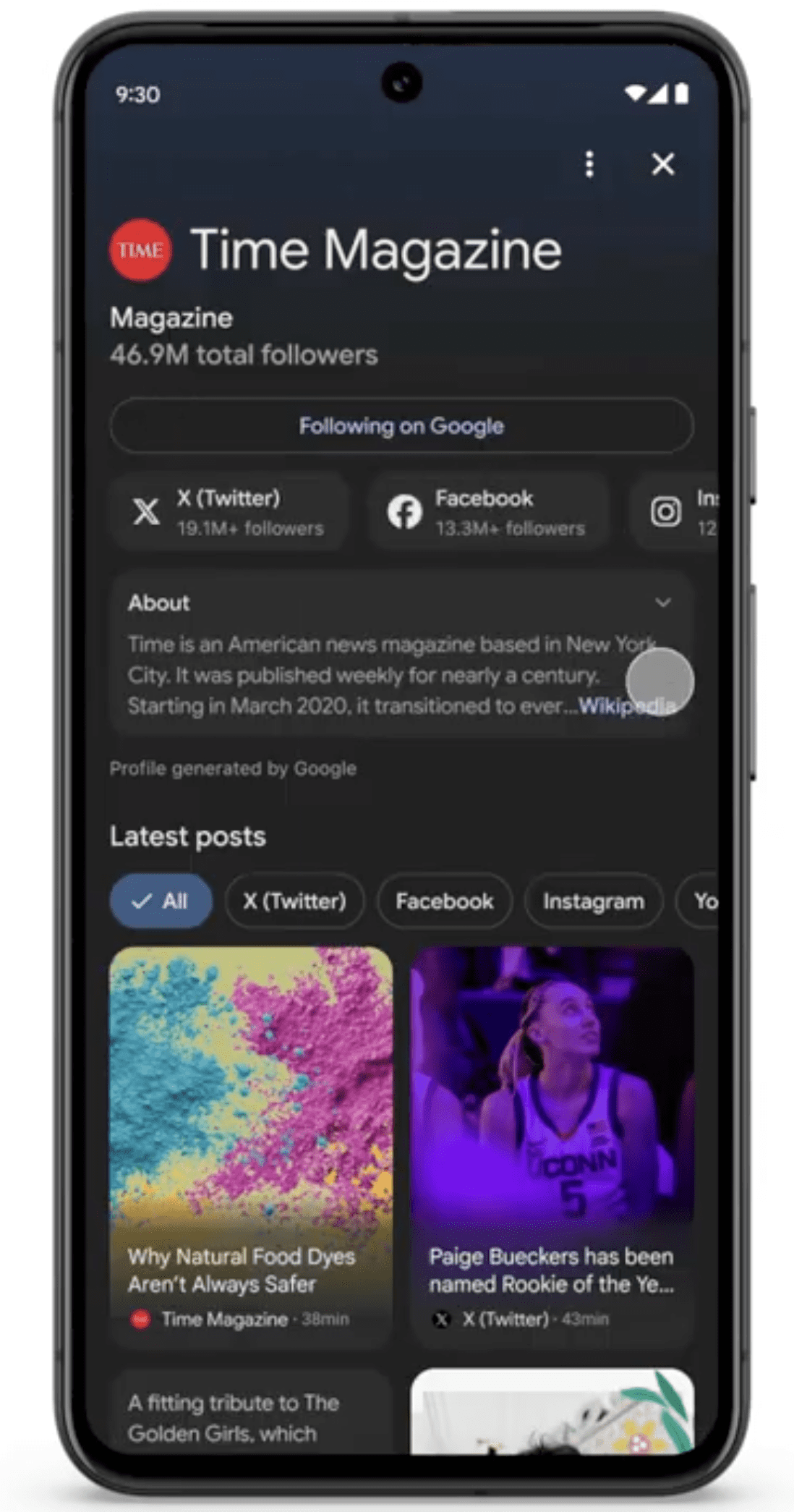
Signed-in users can follow publishers and creators right inside Discover.
When someone taps a name in Discover, they’ll see a dedicated space with that source’s content across formats. If they like what they see, they can follow to get more from that source over time.
Here’s an example of a dedicated publisher space in Google Discover:
Screenshot from: : blog.google/products/search/discover-updates-september-2025, September 2025.
Google’s announcement reads:
“Now, you can “follow” publishers or creators right on Discover to see more of their content. You can preview a publisher or creator’s content — including articles, YouTube videos and posts from social channels — before you follow. Just tap their name to find a new, dedicated space for their content.”
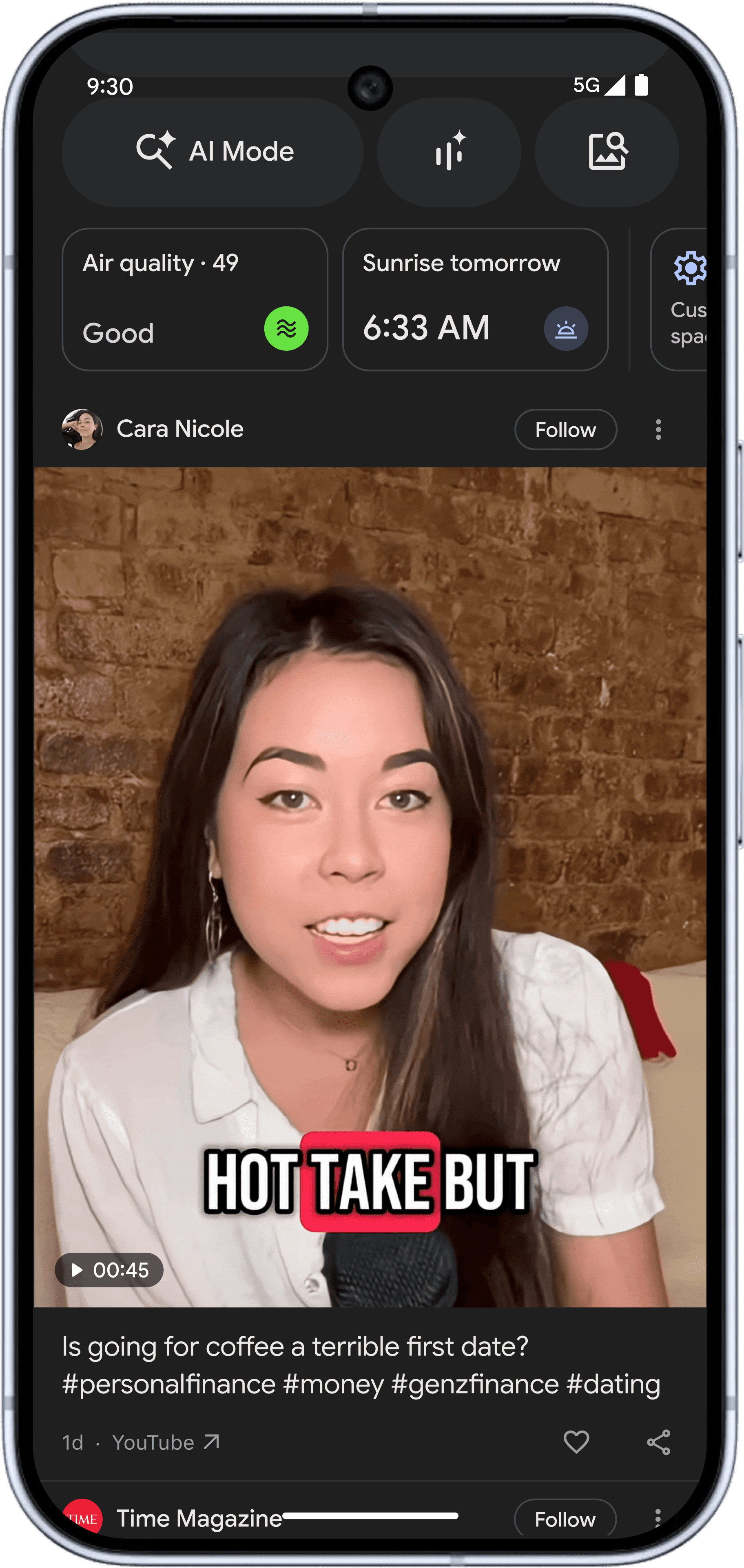
Social Posts In Discover
Google Discover will soon begin showing posts from X and Instagram, along with YouTube Shorts, with more platforms planned.
Google’s announcement reads:
“In the coming weeks, you’ll start to see more types of content in Discover from publishers and creators across the web, such as posts from X and Instagram and YouTube Shorts, with more platforms to come. In our research, people told us they enjoyed seeing a mix of content in Discover, including videos and social posts, in addition to articles.”
Here’s an example of an in-feed social media post in Google Discover:
Screenshot from: : blog.google/products/search/discover-updates-september-2025, September 2025.
Why This Matters
If you publish across web + social, your posts could reach Discover audiences without an extra tap into each platform.
The Follow button gives you a direct, opt-in signal that may help stabilize Discover traffic over time.
This follows Google’s preferred sources feature in Top Stories, which lets people pick news outlets they want to see more often for timely queries.
Looking Ahead
The follow button is available starting today for signed-in users. Social posts will appear in the coming weeks as the integration rolls out.
Together, these updates point to more user-directed personalization across Search surfaces.
The AI search revolution has arrived with fanfare, transforming how users discover information across platforms like ChatGPT, Perplexity, and Google’s AI Overviews.
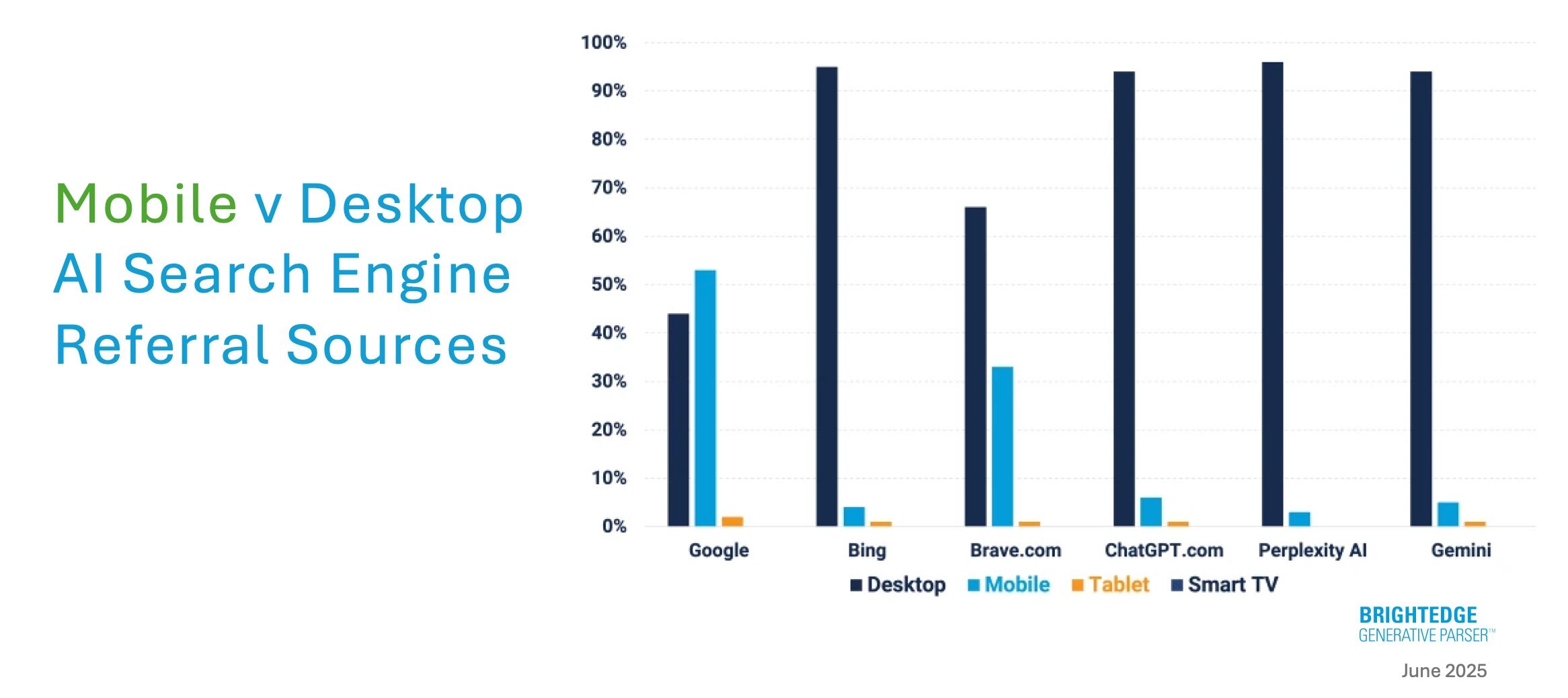
Yet, beneath the headlines lies a counterintuitive reality that’s reshaping how we approach the age-old debate and strategies on desktop vs. mobile: Over 90% of AI-powered search referrals originate from desktop devices.
While mobile accounts for more than half of global web traffic, AI search engines are making their biggest impact on desktop – a complete reversal of typical user behavior patterns that creates both challenges and more mobile opportunities for marketers.
Currently, some of the findings I share below contradict conventional wisdom.
Recent analysis of referral traffic across leading AI search platforms in the U.S. and Europe shows a striking disconnect between where users consume content and where AI engines drive meaningful traffic.
This gap represents one of the most significant untapped opportunities in the current search landscape.
AI Desktop Vs. Mobile Referral Numbers Tell A Surprising Story
The data from BrightEdge Generative Parser (my employer for disclosure) paints a clear picture of desktop dominance across virtually every AI-powered search platform.
ChatGPT leads the desktop concentration, with 94% of referral traffic coming from desktop devices, leaving just 6% for mobile users. This massive skew occurs despite ChatGPT’s widespread mobile app adoption.
Perplexity pushes desktop dominance even further, with 96.5% of referrals originating from desktop and mobile barely registering at 3.4%. For a platform positioning itself as a research-focused AI engine, this pattern suggests that users prefer desktop environments for gathering in-depth information.
Microsoft’s Bing maintains similar patterns, with 95% of desktop referrals vs. 4% mobile, despite integration across Microsoft’s ecosystem and the introduction of Copilot features.
Google Gemini follows suit, with 91% of traffic coming from desktop and 5% from mobile, indicating that even Google’s AI offerings struggle to capture mobile referral momentum.
The lone exception? Google Search itself maintains the mobile majority at 53% mobile vs. 44% desktop, but this reflects its entrenched position as the default search engine across mobile browsers, particularly Safari on iPhones.
Source: BrightEdge The Open Frontier of Mobile AI Search, June 2025
Why Mobile AI Search Isn’t Converting To Referrals
The disparity isn’t about user engagement; AI search activity on mobile is likely booming.
Instead, it’s about architectural design choices that fundamentally alter user flows and referral patterns.
The In-App Preview Problem
Mobile AI platforms often intercept the first click on citations, showing content previews within their own interfaces.
This creates a multi-step process where users must click again to reach external websites, significantly reducing referral traffic compared to desktop experiences, where first clicks typically lead directly to source sites.
ChatGPT exemplifies this pattern. On desktop, citation clicks immediately redirect users to source websites. On mobile, the app frequently displays in-app content previews, requiring users to take additional action to generate actual referrals.
The Discovery Vs. Research Divide
Desktop and mobile AI searches serve fundamentally different user intents.
Mobile users often engage in discovery-oriented searches, seeking quick answers, product comparisons, and immediate problem-solving.
Desktop users tend to gravitate toward comprehensive research, detailed analysis, and tasks that require sustained attention.
This behavioral split suggests AI platforms are evolving into distinct experiences rather than responsive versions of the same product.
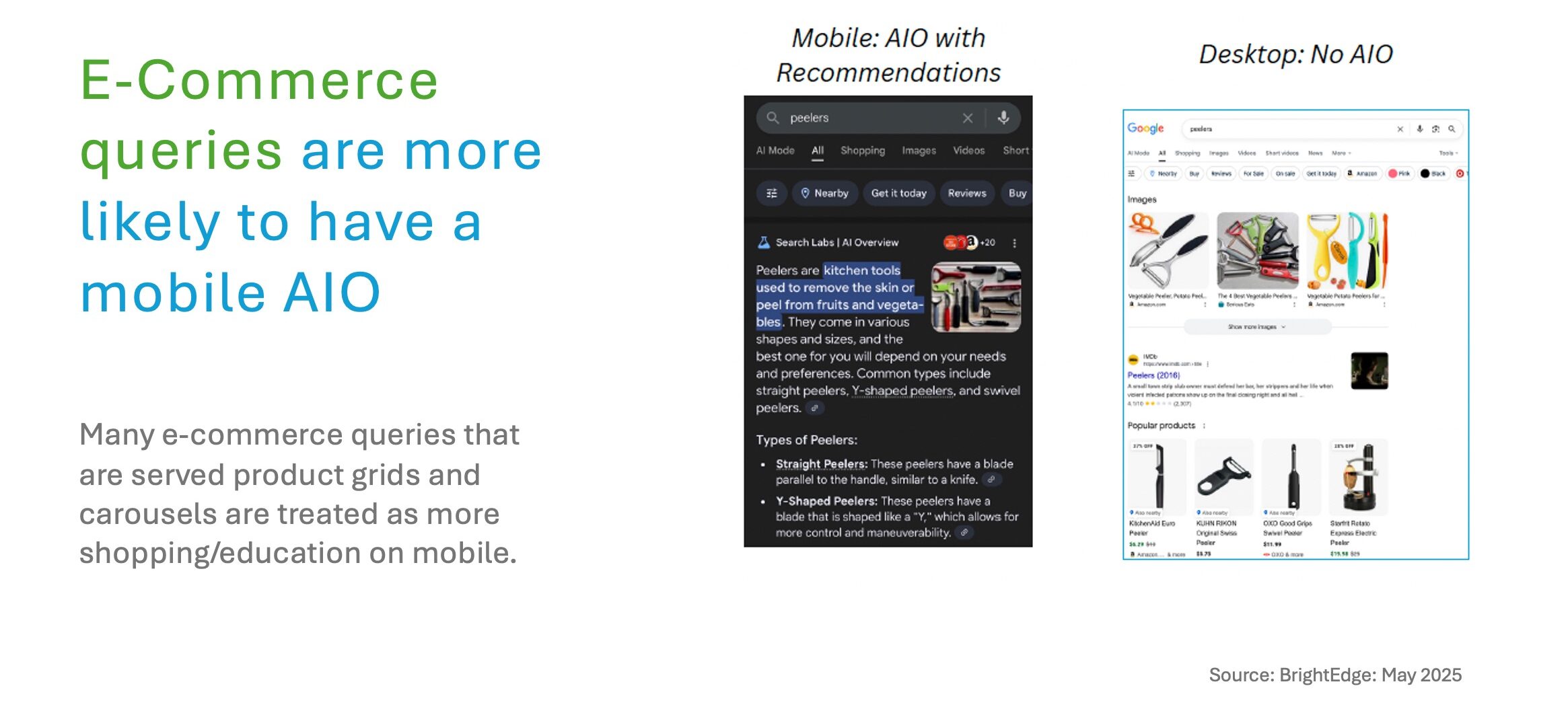
Google’s AI Overviews demonstrate this evolution clearly: Ecommerce queries are three times more likely to trigger mobile AI Overviews (13.5% vs. 4.5% on desktop), treating shopping searches as educational discovery rather than direct product promotion.
Meanwhile, desktop AI Overviews command 80% more screen real estate (1110 px vs. 617 px) and appear for 39% more keywords than mobile devices, but show more consistent day-to-day patterns.
This suggests Google is actively experimenting with mobile AI formats while maintaining predictable desktop experiences.
The Apple Factor: Mobile’s Hidden Gatekeeper
Apple’s role as mobile web gatekeeper cannot be understated.
With Safari as the default browser on nearly a billion devices, Apple controls mobile search behavior in ways that could reshape the entire landscape overnight.
Current data shows that 58% of Google’s mobile search traffic to brand websites originates from iPhones, making Apple’s browser defaults critically important for AI search adoption.
Unlike Google, which has integrated AI features across its mobile search experience, Apple has not yet embedded AI-powered search into its mobile web stack.
This creates a massive structural opportunity. A single change in Safari’s default search provider or the introduction of native AI search features could trigger a significant redistribution of AI-powered traffic across the mobile ecosystem.
As mobile AI platforms mature and address current referral limitations, early movers will capture significant advantages.
Build Mobile AI Foundations Today
Responsive design excellence becomes critical when AI engines start citing mobile content more frequently.
Ensure your site adapts seamlessly across various screen sizes, orientations, and device modes to maximize citation potential regardless of how AI platforms display your content.
Optimize for speed and accessibility with fast page load times and mobile-friendly content that includes appropriately sized text, images, and interactive elements.
We are seeing AI engines increasingly factor user experience signals into their citation decisions. Schema markup is recommended so AI engines can interpret the structured data on your mobile pages and present users with content that they need and want.
Improve Core Web Vitals as these metrics become crucial for mobile AI performance. Core Web Vitals measure webpage quality beyond loading speed, correlating directly with user experience.
For mobile AI optimization, every millisecond matters – small improvements can have a significant impact on citation likelihood.
Track Desktop Vs. Mobile AI Performance
Monitor AI Overview differences using keyword reporting tools that switch between desktop and mobile AI Overviews.
This enables you to observe performance gaps and identify platform-specific opportunities.
The data reveals striking differences:
Desktop AI Overviews claim 80% more screen real estate (1110 px vs. 617 px), allowing for more detailed explanations and citation opportunities.
Desktop shows 39% more keyword coverage than mobile devices, but this gap represents a future mobile opportunity.
Ecommerce queries are three times more likely to trigger mobile AI Overviews, as platforms treat shopping searches as educational discovery on mobile.
Source: BrightEdge, May 2025
Have Different Content Strategies For Both Desktop And Mobile
Create mobile-first educational content and product guides rather than traditional product pages.
Mobile AI engines favor discovery-oriented content that helps users understand products and make informed decisions.
Ensure dual-platform accessibility by configuring your site’s crawling capabilities for both mobile and desktop views. Your content must be prepared for AI citation regardless of screen size or platform interface.
Watch Apple and Google industry moves: With Apple’s potential entry into AI search, content strategies should account for possible Safari integration changes that could dramatically shift mobile search behavior overnight.
3. Leveraging The Current Desktop Opportunity
While mobile AI search matures, desktop presents immediate opportunities for brands ready to optimize for AI-powered referrals.
Desktop AI citation optimization: Focus on creating quotable, authoritative content that AI engines can easily cite and reference. This includes structured data markup, clear section headers, and direct answers to common questions.
Comprehensive content development: Desktop AI users engage with longer-form, detailed content. Invest in comprehensive guides, thorough analysis, and expert commentary that support extended research sessions.
Multi-modal content integration: Desktop environments support richer media experiences. Combine text, video, infographics, and interactive elements to increase citation potential across different AI platforms.
More Mobile AI Disruption Is Coming
The current 90% desktop dominance in AI referrals represents a temporary market imbalance rather than a permanent shift away from mobile. Several factors suggest significant mobile AI search growth ahead.
Platform incentives align toward mobile expansion. AI search companies understand that capturing mobile market share is essential for long-term growth, and current referral limitations likely drive the active development of mobile-optimized solutions.
User behavior patterns favor mobile AI adoption. Once technical barriers to mobile AI referrals are addressed, user preferences for mobile-first interactions should drive rapid adoption.
Apple’s AI integration timeline creates a sense of urgency. With Apple controlling mobile browser defaults and reportedly developing AI search capabilities, the mobile AI landscape could transform rapidly.
Key Takeaways
The AI search revolution is creating two distinct experiences: desktop-focused referral traffic and mobile-focused engagement that don’t yet translate to website visits. This divide presents both immediate opportunities and strategic imperatives for marketers:
Immediate opportunities exist in desktop AI optimization. With 90% of AI referrals coming from desktops, brands can capture significant traffic by optimizing for desktop AI search patterns and citation preferences.
Mobile AI strategy requires different thinking. Mobile AI optimization isn’t about responsive design. It’s about understanding discovery-focused user intent and preparing for different referral mechanisms as more AI search engines hit the market.
Apple remains the wild card. Any changes to Safari’s default search behavior or introduction of native AI features could reshape mobile search overnight, making preparation essential.
The brands that recognize this desktop-mobile divide and develop device-specific AI strategies will gain significant competitive advantages as the AI search ecosystem matures.
The question isn’t whether mobile AI search will grow. It’s whether your plan will be ready when it does.
The future of AI search lies not in choosing between desktop and mobile but in mastering both experiences as distinct opportunities to serve different user needs and capture referral traffic across the entire search journey.
Unless otherwise indicated, any data mentioned above was taken from this BrightEdge study. The data was for May 2025 and is based on thousands of actual website referrals for medium to large brands across the world.
Google has discontinued its Page Annotations feature in the iOS app, which automatically added search links to webpages.
The feature was introduced late last year and converted certain website text into Google Search links without publisher consent.
Recent updates confirm that it’s no longer supported.
Short-Lived & Controversial
The Page Annotations feature was first announced in November and attracted attention for its potential to divert traffic away from websites.
This feature automatically converted on-page text into tappable links that directed visitors to Google Search results.
Unlike similar features in Google’s ecosystem, Page Annotations used an opt-out model, meaning publishers didn’t need to opt in.
If you didn’t want Google to insert links into your content, you had to submit an opt-out form, and the changes would take effect within 30 days.
Silent Removal
Google has removed all mentions of the Page Annotations feature from its official documentation on “Control what you share with Google.”
The updated text outlines various methods for publishers to control their content’s appearance in search results but does not mention the now-discontinued feature.
Additionally, the annoucement thread on Google’s community forums has been removed.
An archived version of the announcement remains available. See it in the screenshot below:
Screenshot from: web.archive.org, March 2025.
Why the Reversal?
While Google hasn’t publicly stated reasons for discontinuing Page Annotations, the feature’s introduction came at a sensitive time for the company, which has been facing increased scrutiny over its search and advertising practices.
The feature raised concerns about Google’s relationship with publishers. By inserting its links into others’ content without explicit permission, Google influenced how people interacted with websites within its app.
Why This Matters
Google’s quick discontinuation of Page Annotations suggests it may be reevaluating its publisher relationships due to ongoing antitrust concerns.
Publishers no longer need to worry about Google adding links to their content in the iOS app.
Google is expanding ‘Circle to Search’ to iPhones, allowing users to search for anything on their screens.
Google isn’t calling it by that name, though, because you can use “whatever gesture comes naturally.”
If you’ve seen how it works on Android, it essentially does the same thing on iPhones.
The big difference is you can only activate it from the Google or Chrome apps, whereas ‘Circle to Search’ on Android is built into the operating system.
Additionally, Google is expanding AI Overviews within Lens search results.
‘Search Screen With Google Lens’ On iOS
Previously exclusive to Android, this ‘Circle to Search‘ alternative expands visual search on iOS.
How It Works
iPhone users can now open the Chrome or Google apps and tap the three-dot menu to initiate a screen-wide Lens search.
Instead of taking a screenshot or navigating to another tab, you can highlight, draw, or tap on the part of the screen you want to identify.
Google will then return information about the object you’ve identified.
Expanding AI Overviews
Circle to Search employs Google Lens, which uses an online image database to help you identify objects.
Google says new AI models allow Lens to recognize more unusual or unfamiliar things.
For those “unusual” searches, Google says an AI Overview will appear with information about what your camera is pointing at.
This overview details what you see and includes links to web resources. You can see an example below:
This is all done without prompts. You won’t need to ask a specific question or add extra keywords to find what you need.
However, you can refine your search with follow-up questions if you choose to.
Availability
These new features are rolling out to iOS users this week and will be available globally for Chrome and Google apps.
For AI Overviews, English-language users in select locations will see them first in the Google app on Android and iOS, followed soon by Chrome on desktop and mobile.
Google is rolling out updates to the “Circle to Search” tool, making it more helpful for marketers, businesses, and Android users.
Circle to Search lets you circle, scribble, or tap on anything visible on your phone screen to instantly search the web without switching apps.
With expanded AI Overviews, the tool is better equipped to deliver useful insights—especially for visual searches.
AI Overviews Now Cover More Visual Searches
The most significant update is the expansion of AI Overviews to handle a broader range of visual search results.
You can circle objects like a trending product, a competitor’s ad, or a storefront logo to get an instant, AI-powered summary.
Screenshot from: blog.google/feed/circle-to-search-new-features/, January 2025..
For example, suppose you spot an interesting product in a social media post. In that case, you can circle it to generate an overview of the brand, pricing, related products, and links to explore further.
This makes it easier to research trends, analyze competitors, and stay on top of what resonates with audiences.
Navigational Searches
Google is improving Circle to Search to make it easier for you to find and use information. You can now quickly visit a URL, send an email, or call a phone number.
Circle to Search will recognize numbers, email addresses, and URLs on your screen so you can act with just one tap.
Why This Matters
Visual search can assist marketers with understanding consumer behavior and identifying opportunities.
Through Circle to Search, you can extract information from social media posts, competitor materials, or real-world items like event signage or product displays.
This access to insights can help with making data-driven decisions faster.
Availability
These new features are rolling out now for Android users.
Google is starting to roll out an AI-based Q&A feature to Google Business Profiles (GBP) on Google Maps for mobile.
This feature will very likely replace Google Q&A, which has silently gone missing on some listings.
The “Ask Maps about this place” AI feature was first announced in late October 2024, along with a number of other Google Maps AI enhancements, but has not been widely available or visible.
At the time, Google also noted that “you’ll also see similar experiences in the coming months on Search – including AI-powered review summaries and the option to ask detailed questions about places.”
Currently, the feature is available on the Google Maps app, buried on the profile in the Overview tab, beneath the basic business NAP details and the review summaries.
How Does It Work?
Ask Maps allows users to input open-ended questions into a query box. While it offers and suggests pre-formed queries tailored to the business, users can also ask specific questions.
Pre-formed queries can differ significantly by business location (for multi-location businesses), with businesses sharing minimal overlap. And sometimes, similarly formulated questions might deliver slightly different answers.
The query field allows for compound questions. Although, the more you ask, the more likely you will be told that there isn’t enough information about this place to answer your question.
Screenshot from Google Search, January 2025
Ask Maps often, but not always, suggests six pre-formed queries – a kind of local version of People Also Ask – to help the searcher more quickly get their potential questions answered.
Some listings have no questions, and a few have two to four of these suggested queries.
These pre-formed queries vary by location, with even locations tied to the same brand sharing minimal overlap.
In looking at four or five different store locations, there were only a few of these questions that were duplicated.
Screenshot from Google Search, January 2025
We were curious about whether the review corpus or previous Q&A answers were used to generate these pre-formed queries.
We downloaded and analyzed reviews and Q&A content using N-grams, word clouds, and ChatGPT. We found virtually no correlation between the existing Google Q&A or review content and the pre-formed queries presented.
Obviously, a searcher can ask any question of the AI.
As mentioned, however, if Google does not have enough data from the listing attributes, reviews, the business website, or trusted third-party sites, the user will be told: “There’s not enough information about this place.”
Not Every Category
Unlike the soon-to-be legacy Q&A feature, Ask Maps excludes some business categories and is only available in U.S.-based locations.
In our review, the feature wasn’t present on profiles for most healthcare providers, counseling, social services, pregnancy care, and drug rehab centers, although we did find it on dentist profiles.
The feature was also not visible on highly distressed and spammy categories like moving companies, locksmiths, and garage door listings. It was available in categories that are less spam-filled, like HVAC, roofers, and electricians.
Profiles of businesses in legally regulated categories like marijuana dispensaries, tobacco, guns, or dating services did have the feature.
The primary category of the listing determines whether the feature appears or not.
YMCA locations in my area each have slightly different categories, and the one with social services as the primary category did not have Ask Maps, while all the others did.
Screenshot from Google Search, January 2025
Where Does The Information Come From?
Google says:
“All of these features are made possible thanks to Gemini’s powerful creation, reasoning and summarization capabilities — grounded in our trusted data about 250 million places around the world and insights from the Maps community.”
In answering Ask Maps questions, Google appears to rely first on content in the business profile, GBP reviews, and the business website before it will access third-party content.
When Google had images from GBP image uploads relevant to the answer, those were included as well.
While the source for these images, in the example we saw, was represented as the business website, the images all came from Google Business Profile.
Screenshot from Google Search, January 2025
Ask Maps will go out to third-party web sources if needed to answer a question, and the site is trusted.
In the following example, we asked about issues that customers had experienced with this dealership, and the response referenced Carfax.com and Facebook.
Oddly, Ask Maps is currently unable to answer product inventory questions even when Google clearly has the inventory uploaded to Merchant Center, and it shows elsewhere on the profile.
Screenshot from Google Search, January 2025
Reviews From The Web
It’s obvious that consumers value reviews, and Ask Maps gives them access to both summary of the worst and best of Google reviews, as well as reviews from around the web.
The query below, asking about Barbara Oliver Jewelry’s “rating around the internet,” surfaced the review summary (using Local schema) directly from her website with additional data from Facebook.
However, despite numerous attempts, it would not surface her Yelp reviews.
Screenshot from Google Search, January 2025
Your Website As Data Source
The following video demonstrates Ask Maps’ ability, in many situations, to answer questions that previously required a visit to a business website.
On the Barbara Oliver jewelry profile, we asked, “What’s involved in custom ring design?” and got back a 118-word answer that referenced multiple sections and pages from the Barbara Oliver website.
Google Q&A Deprecation
Clearly, this feature is a major improvement upon Google Q&A, which rolled out in early 2018. Most Q&A answers are user-generated and often repetitive, contradictory, or inaccurate.
Initially, the feature was highly visible on the Business Profile in search, although it has moved down the page more recently.
A contributor in the Google support forums was recently told that the current Q&A feature is being deprecated.
As communicated in our previous email, the Q&A feature is no longer available to any of our users, regardless of their location. Additionally, there is no support link or method through which you can verify this information independently. Please note that this update aligns with Google’s new guidelines. As per these changes, profiles that are updated in accordance with the latest requirements will not have a Q & A option available.
This has yet to be formally confirmed by Google. But it makes sense given that Ask Maps, once it rolls out more widely and to search, does a significantly better job of answering questions than Q&A could ever hope to. Ask Maps does so by using a limited number of reliable sources.
At the moment, Ask Maps is U.S. only. In its current form, it probably violates EU DMA regulations and highlights the massive self-preferencing occurring with Google Local.
It’s, therefore, unlikely to come to Europe anytime soon. Although, it is likely to show up elsewhere soon.
Local Marketing Strategy Response
Google continues to move down the path of more dynamic AI-generated content on your Google Business Profile.
While this behavior changes dramatically by vertical, there is every reason not just to treat your profile as your new homepage but to up your game in that regard.
In a practical sense, it doesn’t really matter whether your leads come directly from Google or from your website as long as they are coming in. And when you can gain an edge by feeding Google, you should.
Website
As the example above demonstrates, Google answers user questions with substantial and meaningful responses.
My colleague David Mihm has long argued that your website content is perhaps best viewed as a feed for search and now AI engines.
You need to be sure that your site has a properly siloed structure and content.
The content must answer all important customer questions about your business. This includes not just what you do, but how and where and how well you do it.
It should show as well as tell, by providing imagery and video on top of text.
Reviews
Given the ability of tools like Ask Maps to summarize your reviews from both Google and from around the web, it’s more important than ever to both diversify your review content and highlight them on one of Ask Maps’ most trusted sources: your website.
Photographs
We have long championed original, high-quality photography (and video) on both your website and GBP.
It leads to increased engagement (a ranking signal) and increased conversions (the ultimate goal). And your photos need to be regularly updated at both places for maximum benefit.
There is no more economical way to get higher returns than great photographs and video.
Social Profiles
Google first looks at GBP data, then reviews, and then the business website. But if the question cannot be answered there, it will then start pulling in information from your social accounts.
Facebook and LinkedIn were common in our testing, and you should be sure that they are up-to-date and accurately reflect your products, services, and reputation.
Citations
Google has long relied on web references (a.k.a. citations) – non-linked branded mentions – from around the web to understand local entities.
This can be seen very clearly in the screen below, where we asked if the business owner supported local volunteer organizations.
Both a news article and the Facebook page for one of the organizations she works with were referenced.
This type of sourcing is also a great research tool to understand the types and sources of valuable citations for your business.
These types of searches should be done for your direct competitors as well to provide additional ideas on where you might be able to get these references.
Screenshot from Google Search, January 2025
The Future Of Local
The growing “zero-click” behaviors in Google Local inevitably lead to declining traffic for small business websites. These types of changes will continue unless the government steps in to regulate it as a monopoly.
For some sectors, like publishing, which depends on traffic for ad sales, this is a potential death knell – in local. However, traffic losses can often be replaced with more leads from GBP if you play Google’s game.
As frustrating as it is sometimes, we think that the game is still worth playing. The leads generated can be significant. But the types of content and signals Google needs these days to rank you well (branding, reviews, engagement, etc.), you should be doing regardless.
That game is increasingly verticalized on Google – or at least user behaviors are.
We will also highlight critical technical elements and new opportunities in voice features and accessibility.
Whether starting out or looking to improve your strategy, read on for practical tips to succeed in SEO.
1. Master Conversational, Long-Tail Keywords
A key difference between text search and voice search is the use of conversational, long-tail keywords.
For example, someone might type, “best Italian restaurant NYC,” while a voice searcher would ask, “What’s the best Italian restaurant in New York City?”
To improve visibility in voice searches, focus on long-tail keywords that reflect natural speech.
Use question phrases like “what,” “where,” and “how.” Tools like AnswerThePublic and AlsoAsked can help you find common questions in your industry.
Example
For instance, a meal delivery service might encounter questions like, “What’s the healthiest meal delivery option?”
The company can increase its chances of ranking in voice searches by creating content that answers these.
2. Aim For Position Zero
Featured snippets, or “position zero,” are short answer boxes at the top of search results. They’re crucial for voice search, as they provide direct answers for virtual assistants.
To improve your chances of getting a featured snippet, offer clear answers to common questions in your field. Use bullet points, numbered lists, or short paragraphs (40-50 words) for easy reading.
Example
Imagine a skincare brand that creates a series of “How to” blog posts addressing common concerns like “How to get rid of acne scars” or “How to build a basic skincare routine.”
By structuring their content in a voice-friendly way and providing direct, actionable answers, they can improve their odds of earning featured snippets for these queries.
3. Prioritize Local SEO
Many voice searches are local, like “coffee shops near me” or “directions to the nearest gas station.”
To take advantage of this traffic, businesses should focus on local SEO.
Encourage satisfied customers to leave reviews, as these can appear in voice search results.
Also, use local keywords throughout your website and create specific pages or posts with phrases like “best [product/service] in [city].”
Example
Consider a local home services company that wants to improve its visibility for voice searches.
This business could use the ‘LocalBusiness’ schema markup, target “near me” keywords, and create city-specific service pages.
This would help search engines understand where the business operates and improve its visibility in local voice searches.
4. Speed Up Your Website
Voice searchers want quick answers, and slow-loading websites can lose them. Page speed is crucial for ranking in both regular and voice searches.
Use tools like Google’s PageSpeed Insights or GTmetrix to check your load times and find improvements.
You can speed up your site by compressing images, minifying CSS and JavaScript, using browser caching, reducing redirects, and upgrading your hosting.
Example
Imagine an ecommerce website that struggles with slow load times due to large product images and inefficient code.
Implementing a series of speed optimizations could improve page load times, provide a better user experience, and increase the site’s chances of ranking for voice searches.
5. Implement Structured Data
Structured data, or schema markup, is code that helps search engines understand your website better.
This extra information can boost your chances of ranking for voice searches and appearing in special search results.
If you own a local business, focus on specific schema types like LocalBusiness, Restaurant, and Product.
These schemas let you share important details such as your business hours, address, menu items, and customer reviews.
Example
Consider a local restaurant that implements RestaurantSchema markup on its website.
By providing search engines with detailed information about their cuisine type, price range, hours, and location, they can improve their chances of appearing in voice search results for queries like “What’s the best sushi restaurant near me?”
6. Craft Voice-Friendly Content
To optimize your content for voice search, think about both what you say and how you say it. People using voice search want clear, brief, and easy-to-understand information.
Here are some tips for creating voice-friendly content:
Answer common questions directly.
Use simple words and short sentences.
Organize your content with H2 tags, bullet points, and numbered lists.
Keep paragraphs short (1-2 sentences).
Write a clear, conversational title that matches what people might ask in a voice search.
FAQ pages work well for voice search optimization because they naturally answer common questions in a straightforward way.
Users often search for “Near Me” phrases such as “pizza near me,” “gas stations near me,” or “ATM near me.” To improve your visibility for these searches, follow these tips:
Add Google Maps to your website to show where your business is located.
Use local keywords, like neighborhood names and landmarks.
Example
If you run a retail business with several locations, create specific pages for each.
You can help customers find their nearest store more easily by including store details, directions, and maps.
7. Improve Accessibility
Voice search is essential for many users with visual impairments or mobility challenges.
Improving your website’s accessibility can help these users and may also improve your voice search rankings. Here are some key accessibility practices:
Include captions and transcripts for video and audio content.
Use semantic HTML markup.
8. Explore Voice-Specific Features
As voice search technology improves, there are new ways to optimize your content.
Here are some features to consider:
Build Alexa skills or Google Actions to connect with voice assistant users.
Use speakable markup to show which parts of your content work well for audio playback.
Optimize for conversational searches on voice shopping sites like Amazon and Walmart.
Make Your Business Voice-Search Ready
Implementing these eight voice search optimization strategies can ensure your business is well-positioned to capture the growing audience of voice search users.
The key to success is to imagine yourself in your target customer’s shoes and consider how they might phrase their queries when speaking to a voice assistant.
As a final tip, it’s always a good idea to conduct your own voice searches related to your industry or niche. Analyze the top-ranking results and identify commonalities or best practices you can apply to your optimization efforts.
By staying proactive and continually refining your approach, you can remain ahead in the ever-evolving world of voice search SEO.
By removing barriers and ensuring inclusive digital experiences, you can tap into this 1 billion-person market and drive substantial economic growth.
Digital accessibility helps to increase employment opportunities, education options, and simple access to various banking and financial services for everybody.
In fact, they often enhance overall website performance, which leads to:
Better user experience.
Higher rankings.
Increased traffic.
Higher conversion rates.
Ensures Your Websites Are Compliant
Increasing lawsuits against businesses that fail to comply with accessibility regulations have imposed pressure on them to implement accessibility in their digital assets.
Compliance with ADA, WCAG 2.0, 2.1, 2.2, Section 508, Australian DDA, European EAA EN 301 549, UK Equality Act (EA), Indian RPD Act, Israeli Standard 5568, California Unruh, Ontario AODA, Canada ACA, German BITV, Brazilian Inclusion Law (LBI 13.146/2015), Spain UNE 139803:2012, France RGAA standards, JIS X 8341 (Japan), Italian Stanca Act, Switzerland DDA, Austrian Web Accessibility Act (WZG) guidelines aren’t optional. Accessibility solution partnerships ensure to stay ahead of potential lawsuits while fostering goodwill.
6 Steps To Boost Your Growth With Accessibility
To drive growth, your agency should prioritize digital accessibility by following WCAG standards, regularly testing with tools like AXE, WAVE, or Skynet Technologies Website Accessibility Checker, and addressing accessibility gaps. Build accessible design frameworks with high-contrast colors, scalable text, and clear navigation.
Integrate assistive technologies such as keyboard navigation, screen reader compatibility, and video accessibility. Focus on responsive design, accessible forms, and inclusive content strategies like descriptive link text, simplified language, and alternative formats.
Providing accessibility training and creating inclusive marketing materials will further support compliance and growth.
To ensure the website thrives, prioritize mobile-first design for responsiveness across all devices, adhere to WCAG accessibility standards, and incorporate keyboard-friendly navigation and alt text for media.
Optimize page speed and core web vitals while using an intuitive interface with clear navigation and effective call-to-action buttons, and use SEO-friendly content with proper keyword optimization and schema markups to boost visibility.
Ensure security with SSL certificates, clear cookie consent banners, and compliance with privacy regulations like GDPR and CCPA. Finally, implement analytics and conversion tracking tools to gather insights and drive long-term growth.
We know this is a lot.
If this sounds good to you, let us help you get set up.
How Can Digital Accessibility Partnerships Supercharge Your Clients’ SEO?
Partnering for digital accessibility isn’t just about inclusivity — it’s a game-changer for SEO, too!
Accessible websites are built with cleaner code, smarter structures, and user-friendly features like alt text and clear headings that search engines love.
Plus, faster load times, mobile-friendly designs, and seamless navigation keep users engaged, reducing bounce rates and boosting rankings. When you focus on making a site accessible to everyone, you’re not just widening your audience—you’re signaling to search engines that the website is high-quality and relevant. It’s a win-win for accessibility and SEO!
12 Essential Factors To Consider For Successful Accessibility Partnerships
Expertise: Look for a provider with a proven track record in digital accessibility, including knowledge of relevant global website accessibility standards and best practices.
Experience: Consider their experience working with similar industries or organizations.
Tools and technologies: Evaluate their use of automated and manual testing tools to identify and remediate accessibility issues.
Price Flexibility: Explore pricing models that align with both the budget and project requirements. Whether for a single site or multiple sites, the service should be compatible and scalable to meet the needs.
Platform Compatibility: Ensure seamless accessibility integration across various platforms, providing a consistent and accessible experience for all users, regardless of the website environment.
Multi-language support: Enhance user experience with global language support, making websites more inclusive and accessible to a global audience.
Regular check-ins: Schedule regular meetings to discuss project progress, address any issues, and make necessary adjustments.
Clear communication channels: Establish clear communication channels (for example: email, and project management tools) to facilitate efficient collaboration.
Transparent reporting: Request detailed reports on the progress of accessibility testing, remediation efforts, and overall project status.
KPIs to measure success: Review the partner’s historical data, especially those similar projects in terms of scale, complexity, and industry.
Evaluate technical expertise: Assess their proficiency in using various accessibility testing tools and ability to integrate different APIs.
Long-term partnership strategy: Compare previous data with the current one for improvement and optimization process. It is crucial for a long-term partnership that there is a specific interval of review and improvements.
Scaling Accessibility With Smart Partnerships
All in One Accessibility®: Simplicity meets efficiency!
The All in One Accessibility® is an AI-powered accessibility tool that helps organizations to enhance their website accessibility level for ADA, WCAG 2.0, 2.1, 2.2, Section 508, Australian DDA, European EAA EN 301 549, UK Equality Act (EA), Indian RPD Act, Israeli Standard 5568, California Unruh, Ontario AODA, Canada ACA, German BITV, Brazilian Inclusion Law (LBI 13.146/2015), Spain UNE 139803:2012, France RGAA standards, JIS X 8341 (Japan), Italian Stanca Act, Switzerland DDA, Austrian Web Accessibility Act (WZG), and more.
It is available with features like sign language LIBRAS (Brazilian Portuguese Only) integration, 140+ multilingual support, screen reader, voice navigation, smart language auto-detection and voice customization, talk & type, Google and Adobe Analytics tracking, along with premium add-ons including white label and custom branding, VPAT/ACR reports, manual accessibility audit and remediation, PDF remediation, and many more.
Quick Setup: Install the widget to any site with ease—no advanced coding required.
Feature-Rich Design: From text resizing and color contrast adjustments to screen reader support, it’s packed with tools that elevate the user experience.
Revenue Opportunities: Agencies can resell the solution to clients, adding a high-value service to their offerings while earning attractive commissions through the affiliate program.
Reduced development costs: Minimizes the financial impact of accessibility remediation by implementing best practices and quick tools.
Agency Partnership: Scaling accessibility with ease!
Extended Service Offerings: The All in One Accessibility® Agency Partnership allows agencies to offer a powerful accessibility widget – quick accessibility solution into their services, enabling them that are in high demand.
White Label: As an agency partner, you can offer All in One Accessibility® under their own brand name.
Centralized Management: It simplifies oversight by consolidating accessibility data and reporting, allowing enterprises to manage multiple websites seamlessly.
Attractive Revenue Streams: Agencies can resell the widget to clients, earning significant revenue through competitive pricing structures and repeat business opportunities.
Boost Client Retention: By addressing accessibility needs proactively, agencies build stronger relationships with clients, fostering long-term loyalty and recurring contracts.
Increase Market Reach: Partnering with All in One Accessibility® positions agencies as leaders in inclusivity, attracting businesses looking for reliable accessibility solutions.
NO Investment, High Return: With no setup costs, scalable features, and up to 30% commission, the partnership enables agencies to maximize profitability with their clients.
Affiliate Partnership: A revenue opportunity for everyone!
The All in One Accessibility® Affiliate Partnership program is for content creators, marketers, accessibility advocates, web professionals, 501 (c) organizations (non-profit), and law firms.
Revenue Growth through Referrals: The All in One Accessibility® affiliate partnership allows affiliates to earn competitive commissions by promoting a high-demand accessibility solution, turning referrals into consistent revenue.
Expanding Market Reach: Affiliates can tap into a diverse audience of businesses seeking ADA and WCAG compliance, scaling both revenue and the adoption of accessibility solutions.
Fostering Accessibility Awareness: By promoting the All in One Accessibility® widget, affiliates play a pivotal role in driving inclusivity, helping more websites become accessible to users with disabilities.
Leveraging Trusted Branding: Affiliates benefit from partnering with a reliable and recognized quick accessibility improvement tool, boosting their credibility and marketing impact.
Scaling with Zero Investment: With user-friendly promotional resources and a seamless onboarding process, affiliates can maximize returns without any costs.
Use Accessibility As A Growth Engine
Endeavoring for strategic partnerships with accessibility solution providers is a win-win for agencies aiming to meet the diverse needs of their clients. These partnerships not only enhance the accessibility of digital assets but also create opportunities for growth, and loyalty, top search engine rankings, boost revenue, improve compliance with legal standards, and make you to contribute into digital accessibility world.
With Skynet Technologies USA LLC, Transform accessibility from a challenge into a revenue-driving partnership. Let inclusivity power the success.
Ready to get started? Embarking on a digital accessibility journey is simpler than you think! Take the first step by evaluating the website’s current WCAG compliance with a manual accessibility audit.

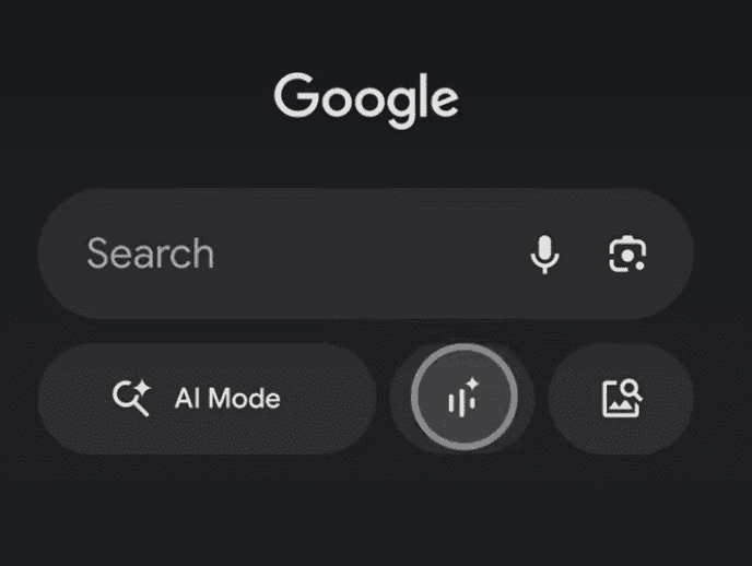 Image Credit: Google