App store optimization: A guide to enhance your app’s visibility
App store optimization (ASO) helps your app stand out in busy marketplaces. It’s about making your app more visible and increasing downloads. This guide will provide strategies for both Google Play and Apple App Store, perfect for those starting or looking to improve.
What is app store optimization?
App store optimization is an important process for app developers and marketers. It is a way to make your app more noticeable in a crowded online environment. The primary aim of ASO is to enhance your app’s visibility so that potential users can find it easily among millions of other apps.
Visibility is the first step to success. When your app ranks higher in search results, more people will see it, which can lead to more downloads. But ASO doesn’t stop there. It’s also about attracting the right users — those likely to engage with your app and find value in it.
ASO involves several strategies to achieve these goals. These include selecting the right keywords, writing engaging descriptions, and making sure your app’s visuals appeal. Each element makes your app appealing to both the app store algorithms and potential users.
In short, ASO is about optimizing all aspects of your app’s listing to improve its chances of being discovered and downloaded. App store optimization can significantly impact your app’s success in the marketplace.
ASO vs. SEO
App store optimization and search engine optimization aim to improve visibility, but they operate in distinct environments. ASO is specific to app stores like Google Play and Apple App Store, while SEO focuses on Google Search and other platforms where users search for information. Understanding the differences and similarities between these two can enhance your app’s strategy.
One key difference is the platform. ASO deals with app-specific factors like app titles, keywords, ratings, and reviews. In contrast, SEO involves optimizing website content, backlinks, site structure, and more.
User intent also varies. App store users typically search for specific functionalities, games, or entertainment, whereas web searchers often seek commercial insights, general information, or answers to specific questions. Of course, there are instances where an online store offers both a good mobile experience and an app in various stores. It all depends on the strategy.
Despite these differences, ASO and SEO share some common ground. Both rely heavily on keywords to improve search rankings. In ASO, keywords help your app rank higher in app store search results, just as they do for web pages in SEO. Quality content is crucial in both areas. For ASO, this means clear app descriptions and engaging visuals, while SEO involves well-written, relevant website content. User engagement plays a vital role, too. High engagement, such as time spent on the app or positive user ratings, can lead to better rankings in app stores and search engines.

What does app store optimization focus on?
Understanding the main components of app store optimization is essential for improving your app’s visibility and attracting more downloads. Each element is important for how the app store’s algorithms work and how potential users perceive your app.
Keyword research
Keywords are at the heart of ASO. Selecting the right keywords can increase the chances of your app being discovered. Start by identifying terms that potential users might use to search for apps like yours. Use tools to analyze keyword popularity and competition. Updating your keyword research regularly is important to adapt to changing trends and user behavior.
App title and subtitle/short description
Your app’s title is one of the first things users see. It should be catchy and include important keywords. The subtitle or short description allows you to highlight key features or benefits. A compelling title and subtitle can make your app more appealing and improve its search ranking.

App description
Your app description needs to be informative and engaging. It should clearly explain what your app does and why it’s valuable to users. Use this space to incorporate keywords naturally, but avoid keyword stuffing. The goal is to provide enough information to convince users to download your app.

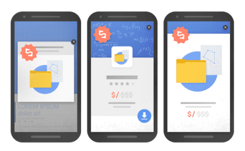
App icon and screenshots
Visuals play a significant role in attracting users. Your app icon should be simple, memorable, and convey the essence of your app. Screenshots offer a glimpse into the app’s features and functionality. They should be high quality and highlight what makes your app unique. These visuals can influence a user’s decision to download your app. If it makes sense, you could also add a short highlight video.
Ratings and reviews
User ratings and reviews impact your app’s reputation and ranking. Encourage satisfied users to leave positive feedback. Responding to positive and negative reviews shows that you value user input and are committed to improving the app. Addressing user concerns can improve ratings and boost user trust.
App updates
Regular updates are crucial for maintaining your app’s relevance and performance. Updates can include new features, bug fixes, or improvements. Communicating these updates clearly to users can enhance their experience and keep them engaged. Consistent updates can also positively affect your app’s ranking in the app store.
Platform-specific ASO strategies
While the core principles of app store optimization apply across platforms, the Google Play and Apple App Stores have unique characteristics that require tailored strategies. Understanding these nuances can enhance your app’s visibility and success on each platform.
Google Play Store
The Google Play Store uses a distinct algorithm for ranking apps. Keyword usage, user engagement, and app performance play significant roles. The Google Play Console offers features that can help you optimize your app’s presence. Include relevant keywords in your app’s title and description, which are crucial for search rankings.
User engagement metrics, such as downloads and active users, also affect your app’s visibility. Encouraging users to interact with your app and leave positive reviews can boost your rankings. Additionally, Google Play allows for A/B testing of your app’s listing, enabling you to experiment with different visuals and descriptions to see what resonates with users.

Apple App Store
The Apple App Store has its own ranking factors and review processes. Unlike Google Play, Apple emphasizes the app’s metadata, such as the title, subtitle, and keyword field. It’s vital to use these fields wisely to ensure your app is discoverable. The App Store Connect platform provides insights into your app’s performance and user engagement.
Regularly updating your app with new features and improvements can enhance its appeal and ranking. Apple’s review process is more stringent, so make sure your app complies with their guidelines to avoid delays. Encouraging users to leave ratings and reviews can significantly impact your app’s reputation and visibility.
Measuring ASO success
Tracking and measuring success is essential to ensuring the effectiveness of your app store optimization efforts. This involves monitoring key performance metrics and using analytics tools to refine your strategies.
Key metrics to track
One of the primary metrics to monitor is the number of app downloads. This indicates how well your app is attracting new users. Look for trends or sudden changes in download numbers, as these can signal the impact of your ASO efforts. Another crucial metric is the conversion rate, which measures how many users download your app after visiting its page. A high conversion rate suggests that your app listing is appealing and effectively communicates the app’s value.
User engagement is another important area to track. Monitoring how often users open your app, how much time they spend on it, and which features they use can provide insights into its effectiveness and user satisfaction. High engagement levels often correlate with better rankings in app stores, as they indicate a valuable app experience. Ratings and reviews also offer valuable feedback. A steady flow of positive reviews can boost your app’s reputation and visibility. Keep an eye on the average rating and the number of reviews to ensure you meet user expectations.
Tools for analyzing and improving ASO strategies
Several tools can help analyze your ASO performance. Platforms like App Radar and Sensor Tower provide detailed analytics on app store performance, including keyword rankings and competitor analysis. These tools can help identify which keywords are driving traffic and where adjustments might be needed. Google Play Console and App Store Connect offer built-in analytics that provide insights into user behavior and app performance.
Use these platforms to track metrics like user retention, download source, and geographic distribution, which can inform your ASO strategies. Regularly reviewing these metrics and using analytical tools will help you understand what’s working and what isn’t.

App store optimization mistakes to avoid
App Store Optimization (ASO) is crucial for boosting your app’s visibility and downloads, but common mistakes can undermine your efforts. Avoiding these pitfalls can significantly enhance your app’s performance.
Neglecting keyword research is a frequent error. Keywords are vital for discoverability. Use research tools to find relevant, high-volume keywords that match your app’s features, and update them regularly to align with market trends.
Another mistake is underestimating the importance of visuals. Your app icon, screenshots, and promotional videos are the first impressions users get. Poor-quality visuals can deter downloads, so invest in professional design to make them attractive and cohesive. Highlight key features and benefits in your screenshots to set clear user expectations.
Ignoring app reviews and ratings can harm your app’s reputation and ranking. Encourage users to leave reviews and respond to feedback promptly. Constructive responses to negative reviews show commitment to user satisfaction and can improve your app’s image.
Not updating your app regularly is also detrimental. Updates keep your app relevant and improve its performance. Include new features, bug fixes, and enhancements, and communicate these updates to keep users engaged.
Finally, avoid keyword stuffing in your app description. While keywords are important, overuse can make descriptions hard to read and lead to penalties from app stores. Focus on clear, engaging, and informative descriptions that naturally incorporate keywords.
Improving in-app purchase
After successfully working on your ASO, you can also improve paid in-app purchases — if you have these — to maximize revenue. Start by analyzing user behavior to identify popular features and potential purchase opportunities, using tools like Google Analytics for insights.
Communicate the value of in-app purchases. Highlight benefits with compelling descriptions and visuals, and ensure pricing reflects the perceived value. Make the purchase process smooth and intuitive to prevent user drop-off. Consider prompts for users who show interest but don’t complete purchases.
Personalize offers to align with user interests, using data to create targeted promotions. Limited-time discounts or bundles can encourage purchases and enhance user satisfaction. Regularly update your app with fresh content to maintain engagement and create new purchase opportunities.
User feedback is invaluable for refining in-app offerings. Address common concerns and implement suggested features to boost satisfaction and purchase rates. Conduct A/B testing on pricing and promotions to find what works best with your audience.
Conclusion
App store optimization is an ongoing process that is vital to your app’s success. Focusing on keyword research, engaging visuals, and user feedback helps to improve your app’s visibility and appeal. Tailoring strategies to specific platforms like Google Play and Apple App Store helps maximize reach.
Consider your monetization strategy as well. Whether through in-app purchases or ads, align these with user experience to boost revenue without disrupting engagement. Personalization and strategic ad placement can improve outcomes.
Integrating ASO with effective monetization and engagement strategies ensures your app attracts and retains users. Adjust to algorithm changes and user preferences to position your app for long-term success. Continuously optimizing your approach will drive downloads and revenue, making ASO an essential tool for success in the app marketplace.
Edwin is an experienced strategic content specialist. Before joining Yoast, he worked for a top-tier web design magazine, where he developed a keen understanding of how to create great content.