Google Rolls Out CrUX Vis Core Web Vitals Tool via @sejournal, @martinibuster

Google rolled out a new Core Web Vitals tool called CrUX Vis that shows you hidden patterns in performance scores and offers guidance on what to improve. The data is sourced from the CrUX dataset which is based on actual user experiences on the URLs and websites that are analyzed and explored in the new tool.

CrUX

The new tool is based on the CrUX dataset which is what the Core Web Vitals scores are based on.

Chrome’s documentation of CrUX explains:

“The Chrome User Experience Report (also known as the Chrome UX Report, or CrUX for short) is a dataset that reflects how real-world Chrome users experience popular destinations on the web.

CrUX is the official dataset of the Web Vitals program. All user-centric Core Web Vitals metrics are represented.

CrUX data is collected from real browsers around the world, based on certain browser options which determine user eligibility. A set of dimensions and metrics are collected which allow site owners to determine how users experience their sites.

The data collected by CrUX is available publicly through a number of Google tools and third-party tools and is used by Google Search to inform the page experience ranking factor.

Not all origins or pages are represented in the dataset. There are separate eligibility criteria for origins and pages, primarily that they must be publicly discoverable and there must be a large enough number of visitors in order to create a statistically significant dataset.”

Debugging Core Web Vitals

Improving website performance scores may not offer the direct ranking benefit that many SEOs and publishers hoped it would but it’s still the same critical factor to get right it’s always been. High performance scores improve earnings, ad clicks, conversions, user experience, website popularity and virtually every goal an SEO and publisher has for a site, including indirect benefits to rankings. A site can still limp along with poor performance scores but it will not be living up to its full earnings potential.

Although tools based on Chrome’s Lighthouse offer performance snapshots and estimated scores those tools were unable to provide a sense of how the site was performing over time or provide a breakout of important performance metrics to gauge whether performance is trending up or down.

CrUX Vis

Chrome’s new tool is called CrUX Vis, a data visualization tool that enables users to visualize the Chrome User Experience data (CrUX). CrUX Vis provides an entirely new way to understand website performance and gain a big picture view of what’s going on at the URL and website level (called origin).

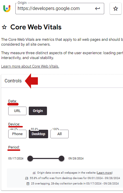
The different variables for what is visualized can be changed in the section at the top of the page called Controls, covering data, device and period.

Screenshot Of CrUX Vis Controls

Segment Data By Multiple Variables

As seen in the screenshot above, the data can be segmented in three ways:

  1. Data
    Performance scores can be viewed by origin (the entire site) or by URL
  2. Device
    Data can be segmented and visualized by mobile, data and a combined view.
  3. Period (Date Range)
    The tool currently allows data visualization by 25 overlapping time periods stretching back about six months. It currently shows performance visualizations from 3/17/2024 through 09/28/2024.

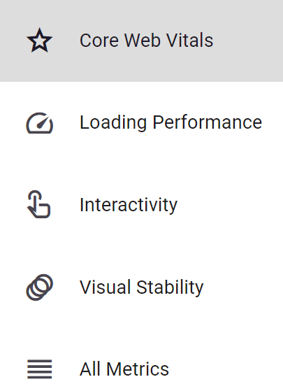
Five Views Of Metrics

There are five ways to analyze the data, covering core web vitals, three categories of metrics and all metrics combined. These variables are accessible on left hand navigation panel on the desktop UI (user interface).

  1. Core Web Vitals
  2. Loading Performance
  3. Interactivity
  4. Visual Stability
  5. All Metrics Combined

Visualizing Data

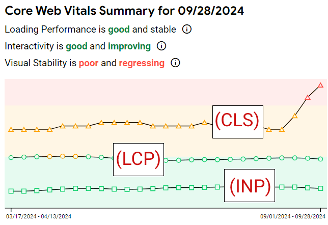
The visualization for Core Web Vitals shows a time-based trend graph that’s colored with green, yellow, and pink. Green is good and pink is not good.

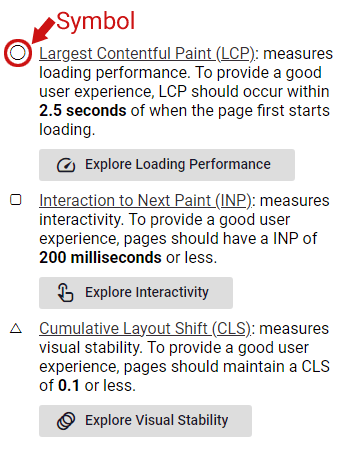
The three core web vitals are represented by a circle, squate and a triangle:

  • Circle = Largest Contentful Paint (LCP):
  • Square = Interaction to Next Paint (INP)
  • Triangle = Cumulative Layout Shift (CLS)

The desktop UI (user interface) shows the trend graph and a summary on the left and a text explanation on the right.

Screenshot Of User Interface

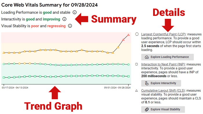
The graph offers a visual snapshot of which direction the core web vitals are moving and an explanation of the kind of trend for each metric.

The three kinds of trends are:

  1. Good And Improving
  2. Good And Stable
  3. Poor And Regressing

Screenshot Showing CWV Performance

A more comprehensive explanation of the data is to the right of the trend graph, with each metric identified by the circle, square, and triangle icons.

Screenshot Of Data Explanation
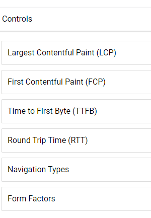
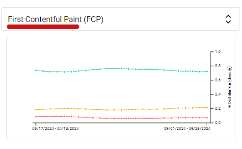
Loading Performance

Using the left hand navigation to get to the Loading Performance screen shows another trend graph that offers additional metrics related to how fast the site or URL loads.

It offers the following six visualizations:

  • Largest Contentful Paint (LCP)
  • First Contentful Paint (FCP)
  • Time to First Byte (TTFB)
  • Round Trip Time (RTT)
  • Navigation Types
  • Form Factors

Screenshot Of Six Visualization Choices

There’s a toggle next to each choice:

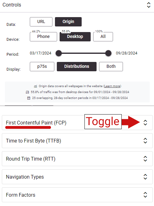
Clicking the toggle shows the trend graph:

The rest of the choices show similar breakdowns of each kind of metric.

The new CrUX Vis tool should be useful to publishers and digital marketers who want to get an accurate measurement of website performance, visualized as a trend. It’s useful for competitior research and for website audits.

Go check it out at:

CrUX Vis

Featured Image by Shutterstock/Krakenimages.com

How To Use The New Google Ads AI Image Editor via @sejournal, @brookeosmundson

In case you missed it, Google just rolled out the AI Image Editor to support additional campaign types.

Originally launched for Performance Max campaigns, it now supports these additional types:

  • Search
  • Display
  • App
  • Demand Gen.

If you’re not familiar with the AI Image Editor tool, have no fear!

This tutorial, originally posted by Google Ads, breaks down how you can start taking advantage of the tool to save you time and money.

What Can the AI Image Editor Do?

With the help of Google AI, the image editor tool can help create new high quality image assets, as well as edit existing assets in your PPC campaigns.

When it comes to editing image assets, there’s a wide variety of features to choose from. These include:

  • Removing image background
  • Replacing image background
  • Add and erase objects and images
  • Extend images outside their existing aspect ratio.

How to Find the Google Ads AI Image Editor Tool

There are two different ways to access the AI image editor tool in Google Ads.

On the left-hand side of the menu, click the “+” Create button, then choose “Asset”.

Additionally, you can click “Assets” in the left-hand menu to be taken to the Asset Library.

From there, you choose “Generate an image with AI” to get started.

AI Image Generator in Google Ads.

To generate a new image, you’ll need to give a description of what you want it to look like.

In the example below, I typed “A blue couch against a neutral colored wall, with canvas photos hanging on the wall. The floor is light grey wood.”

Google Ads AI Image Generator example

In the example, it generated two images to choose from, with the option to generate more.

Once you’ve selected the image you want to use, then you can get to editing more.

How to Edit Image Assets with Google AI

Now that you’ve selected your image to use, you can edit the following aspects:

  • Remove background
  • Erase object
  • Add new object
  • Replace object
  • Expand image
  • Adjust color

How to edit images in Google Ads using Google AI

Click on any of the options on the right-hand side to start editing.

In this example, say I want to remove one of the canvas photos in the background and replace it with a clock.

First, click on “Replace object”, then click and drag over the canvas photo. Then, click “Next”.

Replace function with Google AI Image Editor tool.

Then, to replace an object, create a description of the type of object you want to replace the selected object with. Then, click “Generate”.

Continuing in this example, I wrote, “A square clock that matches the blue color couch.”

An example of an AI replaced clock within an image asset in Google Ads.

In this example, Google AI gave me three options to choose from, with the option to generate more.

You can follow these examples with the other functionalities all within the AI image editor tool.

Summary

The Google Ads AI image editor can help save advertisers time and resources with asset creation.

It gives you creative flexibility with built-in controls to ensure the images meet your level of standards and produce accurate content to complement your ads.

Now that the tool has expanded to more campaign types, it opens up new possibilities for more brands while keeping their brand identity aligned.

Will you be trying the AI image editor tool out anytime soon?

Google Phases Out Support For Noarchive Meta Tag via @sejournal, @MattGSouthern

In a recent update to its Search Central documentation, Google has officially relegated the ‘noarchive’ rule to a historical reference section.

The new text in Google’s help document reads:

“The noarchive rule is no longer used by Google Search to control whether a cached link is shown in search results, as the cached link feature no longer exists.”

This move follows Google’s earlier decision to remove the cache: search operator, which was reported last week.

Implications For Websites

While Google says websites don’t need to remove the meta tag, it noted that “other search engines and services may be using it.”

The ‘noarchive‘ tag has been a staple of SEO practices for years, allowing websites to prevent search engines from storing cached versions of their pages.

Its relegation to a historical reference highlights the dynamic nature of Google Search.

The Gradual Phasing Out of Cached Pages

This documentation update aligns with Google’s gradual phasing out of the cached page feature.

Last week, Google removed the documentation for the cache: search operator, which had allowed users to view Google’s stored version of a webpage.

At the time, Google’s Search Liaison explained on social media that the cache feature was originally intended to help users access pages when loading was unreliable.

With improvements in web technology, Google deemed the feature no longer necessary.

As an alternative, Google has begun incorporating links to the Internet Archive’s Wayback Machine in its “About this page” feature, providing searchers with a way to view historical versions of webpages.

Controlling Archiving In The Wayback Machine

The ‘noarchive’ tag doesn’t affect the Internet Archive’s Wayback Machine.

The Wayback Machine, which Google now links to in search results pages, has its own rules for archiving and exclusion.

To prevent pages from being archived by the Wayback Machine, you have several options:

  1. Robots.txt: Adding specific directives to the robots.txt file can prevent the Wayback Machine from crawling and archiving pages. For example:
    1. User-agent: ia_archiver
      Disallow: /
  2. Direct Request: Website owners can contact the Internet Archive to request removal of specific pages or domains from the Wayback Machine.
  3. Password Protection: Placing content behind a login wall effectively prevents it from being archived.

Note that these methods are specific to the Wayback Machine and differ from Google’s now-deprecated ‘noarchive’ tag.

Conclusion

As search technology advances, it’s common to see legacy features retired in favor of new solutions.

It’s time to update those best practice guides to note Google’s deprecation of noarchive.


Featured Image: Tada Images/Shutterstock

Google Adds Two New Best Practices For Product Markup via @sejournal, @MattGSouthern

Google updates guidance on Product markup, advising ecommerce sites to prioritize HTML implementation and use JavaScript cautiously.

  • Google recommends including Product markup in initial HTML for best results.
  • JavaScript-generated markup can lead to less frequent and reliable crawls.
  • E-commerce sites using JavaScript for product data should ensure servers can handle increased traffic.
Google’s Search Liaison Addresses Brand Bias Concerns via @sejournal, @MattGSouthern

In a recent interview with Aleyda Solis, Google’s Search Liaison, Danny Sullivan, discussed the company’s approach to ranking smaller websites versus larger brands.

This topic has long been a point of contention, with concerns that Google’s ranking systems favor brands over independent sites.

Fairness In Search Results

Sullivan claims that Google doesn’t inherently favor brands, stating:

“Our ranking systems aren’t saying ‘are you a big brand therefore you rank’… The core of it isn’t really whether you’re big or you’re small, the core of it is whether you have the most useful, the most relevant, most satisfying information.”

The Perception Problem

Despite Google’s stance, Sullivan acknowledged the widespread perception that larger, well-established sites have an advantage in search results.

He recognized the frustration of smaller site owners who feel they cannot compete with bigger brands for visibility.

Sullivan states:

“I have looked at cases where people say you don’t like small sites, and I am not taking away from any of the real concerns because they are there… I wish they were doing better, but I can also see co-occurring in some of the same queries that I’m given other independent sites that are doing well.”

Challenges & Improvements

Sullivan admitted that Google’s systems sometimes fail to recognize high-quality content from smaller sites.

He assured that the company is actively improving this aspect of its algorithms.

Sullivan said:

“We don’t want it to be only the very big things rank well and I think in the last update we did talk about how we were taking in a lot of these concerns and trying to understand how we can do more for some of the smaller sites, the so-called independent sites.”

Advice For Smaller Sites

For independent website owners feeling discouraged, Sullivan offered some advice: focus on developing your brand.

He advised:

“If you’re a smaller site that feels like you haven’t really developed your brand, develop it. That’s not because we’re going to rank you because of your brand, but because it’s probably the things that cause people externally to recognize you as a good brand may in turn co-occur or be alongside the kinds of things that our ranking systems are kind of looking to reward.”

On advice for content creators, Sullivan adds:

“Just keep listening to your heart and doing what it is that you think is the right thing to be doing… Our ranking systems are trying to reward great content that’s made for people and if you feel like you’re doing that, then we’re going to try to catch up to you.”

Looking Ahead

Google appears to be taking these concerns seriously.

Sullivan mentioned that recent updates have aimed to do more for smaller sites. However, he maintains that Google’s goal is to show the best content regardless of brand recognition.

While challenges remain, Google’s acknowledgment of the issue and efforts to improve suggests a potential shift with future updates.

Hear Sullivan’s full statements in the video below:


Featured Image: rudall30/Shutterstock

Google’s SEO Tip To Get New Site Picked Up Faster via @sejournal, @martinibuster

Google’s John Mueller offered a useful for technical SEO tip for those launching a new site that will help your site get picked up by Google faster by avoiding this one common mistake.

High Priority For Site Launch

Launching a website is a chance to take everything learned from previous experiences and apply them with the benefit of hindsight. There’s no better teacher for success than failure because lessons learned from mistakes are never forgotten.

Someone who recently registered a new domain started a discussion on Reddit asking what were the top three considerations for launching a successful website before anything else has been done. The person asking the question preemptively ruled out the obvious answer of adding the domain to Google Search Console and set the ground rule that the niche or type of business didn’t matter. What did matter is that the suggestions must be important for scaling traffic within the first six month of the website.

They asked:

“Let’s say you have a brand new domain and you’ve been given a task to build traffic in the next 6 months. The niche, business does not matter, and the basics like ‘adding domain to Google search console’ don’t matter.

Tell me what are the first 3, high-priority things you’ll implement.”

The Most Upvoted Answer

It’s somewhat surprising that the most upvoted answer, with 83 votes, was one that offered the most obvious suggestions.

The top upvoted answer was:

“Create landing pages/content for your lowest funnel keyword opportunities and work the the way up.”

It’s a matter of course that the information architecture of the site should be planned out ahead of time (things like keywords, topics, key pages, a complete org-chart style map of categories with room left for expanding topical coverage, and an interlinking strategy). The upvoted answer is absolutely correct but it’s also fairly obvious.

The rest of that highly upvoted response:

“Claim brand on top social medias.

Build easiest citations and directories that I know get indexed. Plus niche relevant ones.

Start reactive digital PR as main initial link building campaign.”

The obviousness of that upvoted answer is in contrast with the not so obvious quality of Mueller’s response.

John Mueller Advice On SEO Preparation

John Mueller’s advice is excellent and offers an insight into a technical issue that is easy to overlook.

He wrote:

“Just throwing this out there – if you don’t have a site ready, either keep DNS disabled or put up a custom holding page. Don’t use a generic server / CMS holding page. It generally takes longer for a site that’s known to be parked / duplicate to get recognized as a normal site than it does for a site to be initially picked up.”

Keep DNS Disabled

DNS stands for Domain Name System and is a reference to the backend process of converting a domain name to the IP address where the actual content exists. All content exists at an IP address, not at the domain name. The domain name just points to where the content is. By keeping DNS disabled what happens is that Google doesn’t discover the domain pointing to anything so it essentially doesn’t exist.

Don’t Use Generic Server/CMS Holding Page

A generic server holding page is the same as a parked domain, it’s like a false signal to Google that something exists at the IP address that a domain name resolves to.

The effect of Mueller’s advice regarding disabling a DNS and not using a generic holding page is to keep the domain name from resolving to a holding page (assuming that a registrar’s holding page is also turned off). This keeps Google from sniffing out the domain and finding a generic “nothing here” holding page.

Mueller’s advice points to the technical issue that Google will recognize and index a site faster if a generic version is never activated and the domain name essentially doesn’t exist.

So if you want your website to be picked up and indexed quickly then it’s best to not use a generic domain holding page.

Read Mueller’s advice here:

Brand New Domain : What are the first 3 things you’ll do?

Featured Image by Shutterstock/Luis Molinero

Bing Expands Generative Search Capabilities For Complex Queries via @sejournal, @MattGSouthern

Microsoft has announced an expansion of Bing’s generative search capabilities.

The update focuses on handling complex, informational queries.

Bing provides examples such as “how to effectively run a one-on-one” and “how can I remove background noise from my podcast recordings.”

Searchers in the United States can access the new features by typing “Bing generative search” into the search bar. This will present a carousel of sample queries.

Screenshot from: blogs.bing.com, October 2024.

A “Deep search” button on the results page activates the generative search function for other searches.

Screenshot from: blogs.bing.com, October 2024.

Beta Release and Potential Challenges

It’s important to note that this feature is in beta.

Bing acknowledges that you may experience longer loading times as the system works to ensure accuracy and relevance.

The announcement reads:

“While we’re excited to give you this opportunity to explore generative search firsthand, this experience is still being rolled out in beta. You may notice a bit of loading time as we work to ensure generative search results are shown when we’re confident in their accuracy and relevancy, and when it makes sense for the given query. You will generally see generative search results for informational and complex queries, and it will be indicated under the search box with the sentence “Results enhanced with Bing generative search” …”

This is the waiting screen you get after clicking on “Deep search.”

Screenshot from: blogs.bing.com, October 2024.

In practice, I found the wait was long and sometimes the searches would fail before completing.

The ideal way to utilize this search experience is to click on the suggestions provided after entering “Bing generative search” into the search bar.

Potential Impact

Bing’s generative search results include citations and links to original sources.

Screenshot from: blogs.bing.com, October 2024.

This approach is intended to drive traffic to publishers, but it remains to be seen how effective this will be in practice.

Bing encourages users to provide feedback on the new feature using thumbs up/down icons or the dedicated feedback button.

Looking Ahead

This development comes as search engines increasingly use AI to enhance their capabilities.

As Bing rolls out this expanded generative search feature, remember the technology is still in beta, so performance and accuracy may vary.


Featured Image: JarTee/Shutterstock

Why Google Lighthouse Doesn’t Include INP, A Core Web Vital via @sejournal, @MattGSouthern

Google’s Lighthouse doesn’t use the Interaction to Next Paint (INP) metric in its standard tests, despite INP being one of the Core Web Vitals.

Barry Pollard, Web Performance Developer Advocate on Google Chrome, explained the reasoning behind this and offered insights into measuring INP.

Lighthouse Measures Page Loads, Not Interactions

Lighthouse measures a simple page load and captures various characteristics during that process.

It can estimate the Largest Contentful Paint (LCP) and Cumulative Layout Shift (CLS) under specific load conditions, identify issues, and advise on improving these metrics.

However, INP is different as it depends on user interactions.

Pollard explained:

“The problem is that Lighthouse, again like many web perf tools, typically just loads the page and does not interact with it. No interactions = No INP to measure!”

Custom User Flows Enable INP Measurement

While Lighthouse can’t measure INP, knowing common user journeys allows you to use “user flows” to measure INP.

Pollard added:

“If you as a site-owner know your common user journeys then you can measure these in Lighthouse using ‘user flows’ which then WILL measure INP.”

These common user journeys can be automated in a continuous integration environment, allowing developers to test INP on each commit and spot potential regressions.

Total Blocking Time As An INP Proxy

Although Lighthouse can’t measure INP without interactions, it can measure likely causes, particularly long, blocking JavaScript tasks.

This is where the Total Blocking Time (TBT) metric comes into play.

According to Pollard:

“TBT (Total Blocking Time) measures the sum time of all tasks greater 50ms. The theory being:

  • Lots of long, blocking tasks = high risk of INP!
  • Few long, blocking tasks = low risk of INP!”

Limitations Of TBT As An INP Substitute

TBT has limitations as an INP substitute.

Pollard noted:

“If you don’t interact during long tasks, then you might not have any INP issues. Also interactions might load MORE JavaScript that is not measure by Lighthouse.”

He adds:

“So it’s a clue, but not a substitute for actually measuring INP.”

Optimizing For Lighthouse Scores vs. User Experience

Some developers optimize for Lighthouse scores without considering the user impact.

Pollard cautions against this, stating:

“A common pattern I see is to delay ALL JS until the user interacts with a page: Great for Lighthouse scores! Often terrible for users 😢:

  • Sometimes nothing loads until you move the mouse.
  • Often your first interaction gets a bigger delay.”

Pollard’s Full Post

Why This Matters

Understanding Lighthouse, INP, and TBT relationships is necessary for optimizing user experience.

Recognizing limitations in measuring INP helps avoid misguided optimizations.

Pollard’s advice for measuring INP is to focus on real user interactions to ensure performance improvements enhance UX.

As INP remains a Core Web Vital, grasping its nuances is essential for keeping it within an acceptable threshold.

Practical Applications

To monitor site performance and INP:

  1. Use Lighthouse’s “user flows” for INP measurement in common journeys.
  2. Automate user flows in CI to monitor INP and catch regressions.
  3. Use TBT as an INP proxy, but understand its limitations.
  4. Prioritize field measurements for accurate INP data.
  5. Balance performance optimizations with UX considerations.

Featured Image: Ye Liew/Shutterstock

Google AIO Is Ranking More Niche Specific Sites via @sejournal, @martinibuster

New data from BrightEdge shows significant changes to Google AI Overviews, prioritizing topic-specific sites and a stronger focus on ecommerce ahead of the year-end shopping season.

Google Core Update And AIO

An interesting insight from the data is that there is more overlap between AIO and Google’s organic search results, that there is more agreement between the two results. Is AIO mirroring the organic search results or are the organic search results more closely aligned with AIO?

The organic search results themselves changed after the August 2024 core algorithm update and so did AIO. BrightEdge’s data offers evidence of how Google’s organic search results changed.

BrightEdge data shows:

  • The overlap of URLs cited in AI Overviews with those ranking in the top 100 increased from 37% to 41% post-update.
  • This is following Google’s August 15th Core Update.
  • The shift indicates that AI Overviews are prioritizing organic results more than before, pulling from lower-ranked results to create comprehensive responses.

BrightEdge data shows that AIO is ranking lower-ranked web pages for more precise answers. Something else to consider is that both AIO and the organic search results changed and it could be the criteria for ranking changed in a similar way for both AIO and organic, that the algorithms for both are doing something similar.

A significant characteristic of the last update is that it is showing less of the big brand sites and more of the independent niche sites. BrightEdge data shows that AIO is also ranking websites that are more precisely about a topic.

Keep reading because there’s more about that in BrightEdge’s data which could offer insights into what’s going on in the organic SERPs.

BrightEdge Dataset

Research was conducted using the BrightEdge Data Cube X, an SEO and content performance platform for researching industries. |

Data Cube X Facilitates:

  • Comprehensive Keyword Research
  • Competitive Analysis:
  • Automated AI-Powered Content and Keyword Research
  • Traffic Fluctuation Analysis

Non-Logged-In AI Overviews

Google has rolled out AI Overviews (AIO) to users that are not logged-in to Google accounts, expanding the audience for AIO to a greater amount of people. But it’s not showing across all industries. The data shows that the integration of AIO varies.

Within the context of users who are not logged in, Ecommerce search results for not logged-in users dropped in AIO is less than logged-in users by a whopping 90%.

Users that are not logged-in didn’t see AIO in the following topics:

  • Education: 21% relative decrease
  • B2B Tech: 17% relative decrease
  • Healthcare: 16% relative decrease

Although there’s a decrease in AIO shown to non-logged-in users for ecommerce queries, there is an increase in product grids that are shown to these users compared to logged-in users. BrightEdge speculates that Google is better able to target logged-in users and is thus showing product grids to them on a more precise basis than to non-logged-in users.

More Product Comparisons

BrightEdge’s data indicates that Google AIO is showing more product comparisons and visuals.

Their data shows:

  • In August, product carousels for apparel-related queries increased by 172%.
  • The use of unordered lists across industries rose by 42%.

These adjustments make AI Overviews more user-friendly by organizing complex product features and specifications for easier decision-making.

All of those features allow users to make comparisons between products by what the products look like as well as by price. A takeaway from this data is that it may be increasingly important to show original product images (if possible) and to make sure that images shown are high quality and allow users to get a good sense of the product.

Data is always important and it’s a good way to make a product listing or product review stand apart from competitors. Any information that makes improves a consumer’s decision making is valuable.

A good example is for clothing where it’s not enough to indicate that something is a size small, medium or large. Sizes are inconsistent from manufacturer to manufacturer and even within a brand’s own products. So, for clothing, it may be useful to add comparison information about actual sizes within a product line in terms of inches or metric measurement so that a consumer can make an even better choice.

Comparison between products, especially within the context of a product review, is important. One of the product review best practices (and maybe a ranking factor) that is recommended by Google is a comparison of the product being reviewed. Google’s product reviews best practices recommendation is that publishers compare a product to another product so that users can presumably make a better decision.

Google recommends:

  • “Cover comparable things to consider, or explain which might be best for certain uses or circumstances.”

According to BrightEdge:

“As the holiday shopping season approaches Google is refining AIO search results to focus on comparative content, which rose by 12% in August. AIOs prioritized product carousels with engaging imagery, which rose by 172%. Unordered lists (lists of items that are related but in no specific order, such as general searches for ‘winter boots’ or ‘iPhone cases’) also increased by 42%.”

Google AIO Rankings Are More Precise

A data point that all search marketers should be aware of is that Google is ranking more precise content in AIO in a way that might reflect on what is going on with the organic search algorithms.

BrightEdge discovered that generalist sites had massive decreases in rankings while specialists sites had increases. People like to talk about “authority sites” and what they’re usually referring to is “big brands” with a lot of money and reach. But that’s not authority, it’s just a big brand with reach.

For example, most people consider news organizations as authority sites. But who would you go to for SEO information, Search Engine Journal or big sites like the New York Times or Fox News? What the BrightEdge data shows is that AIO is making a similar consideration of what kinds of sites are actual authorities on a given topic and then showing those sites instead of a big brand site.

The obvious question is, does this have something to do with Google’s last core update in August? One of the goals of Google’s last update is to show more independent sites. If the AIO trends mirror the organic search results to a certain extent, then perhaps what Google’s algorithms are doing is identifying sites that are authoritative in a topic and showing those sites instead of a more general big brand site.

BrightEdge’s data shows that AIO rankings of generalist technology review sites dropped. TechRadar.com dropped by 47.3 and TomsGuide.com dropped by 16.4%. This trend was also seen in health related queries where the kinds of sites that AIO quotes also became more precise.

AIO showed less consumer-focused sites and blogs and began showing more sites that are precisely about health. The BrightEdge data showed that consumer news and general sites like VerywellHealth.com experienced 77.9% drop in AIO exposure and EverydayHealth.com virtually dropped out of AIO with a 95.6% decline.

Sites like MayoClinic.org experienced a 32.4% increase and citations of the U.S. Department of Health & Human Services AIO increased by +83.2%. It’s not just a trend away from consumer and general news sites, it’s a trend toward more precise rankings of expert and authoritative content.

BrightEdge noted that the following precisely-focused sites experienced increases:

  • Spine-Health.com +266.7%
  • Arthritis.org +89.5%
  • BrightEdge’s report observes:

“This demonstrates Google’s push toward more detailed, factual content in AI Overviews.”

AIO And Organic SERPs

Google has significantly increased the use of product carousels for apparel-related queries, reflecting a 172% rise. These carousels and grids allow for easier product comparisons based on visuals, pricing, and features.

AI Overviews and Google’s organic search results have more overlap than before. The reason for that may reflect a change to prioritize increasingly precise answers from sites that are authoritative for specific topics. Niche sites have gained prominence in both organic and AI Overviews while large more general sites have lost visibility.AI Overviews continues to evolve but the changes from last month indicate that there is a certain amount of agreement between what’s in the SERPs and AIO.

Read more about AI Overviews data at BrightEdge

Featured Image by Shutterstock/BobNoah

Google Updates Search Console With Sticky Filters via @sejournal, @MattGSouthern

Google has announced updates to Search Console, introducing sticky filters across Performance reports and streamlining navigation within the tool.

Sticky Filters Across Performance Reports

Google has introduced a feature that allows filters to remain consistent across different Performance reports.

You can now set filters in one report – Search results, Discover, or Google News – and have those filters stay active when switching between reports.

Google says this update is in response to user feedback.

New “Reset Filters” Option

Google has included a “reset filters” button alongside the sticky filters.

This new option allows users to clear all applied filters at once.

Enhanced Tab Navigation

Daniel Waisberg, Search Advocate at Google, highlighted an additional improvement in the platform’s navigation.

When you click on a row in specific tabs of the Performance report (such as Pages, Countries, Devices, Search appearance, or Dates), the report will automatically switch to the Queries tab.

If you’re already in the Queries tab, clicking a row will switch the view to the Pages tab.

Waisberg notes that this update “might sound small, but can save a lot of clicks!”

Why This Matters

These updates are designed to streamline workflows within Search Console.

The sticky filters could reduce time spent on repeated filter applications when comparing data across different report types.

The navigation changes allow you to move more efficiently between queries and pages data.


Featured Image: nampix/Shutterstock