Many people talk about how important it is to have a “low bounce rate.”
But bounce rate is one of the most misunderstood metrics in SEO and digital marketing.
This article will explore the complexities of bounce rate and why it’s not as straightforward as you might think.
You’ll also learn how to analyze your bounce using Google Analytics 4 exploration reports.
In order to understand what bounce rate is, we need to define what engaged sessions are according to GA4.
What Is An Engaged Session?
An engaged session in GA4 is a session which meets either of the following criteria:
Lasts at least 10 seconds.
Has key event (formerly conversions).
Has at least two screen views (or pageviews).
Simply put, if a user lands on your homepage and leaves without converting (key event), that would produce a 100 percent bounce rate for that session.
If one lands and visits a second page or signs up for your newsletter (as you defined it as a key event), that would mean the bounce rate for that session is 0%.
What Is Bounce Rate In Google Analytics?
Bounce rate is a percentage of unengaged sessions, and it is calculated with the following formula:
(total sessions/unengaged sessions)*100.
So, it’s not only visiting a second page that brings the bounce rate down but also when key events occur.
You can set up any event, either built-in or custom-defined in Google Analytics 4 (GA4), to count as a key event (formerly conversion), and in cases when it occurs during the session, it will be counted as a non-bounce visit.
Here is how to define any event as a key event:
Navigate to Admin.
Under Data display, navigate to Events.
Find the event you are interested in and toggle Mark as key event to turn it blue.
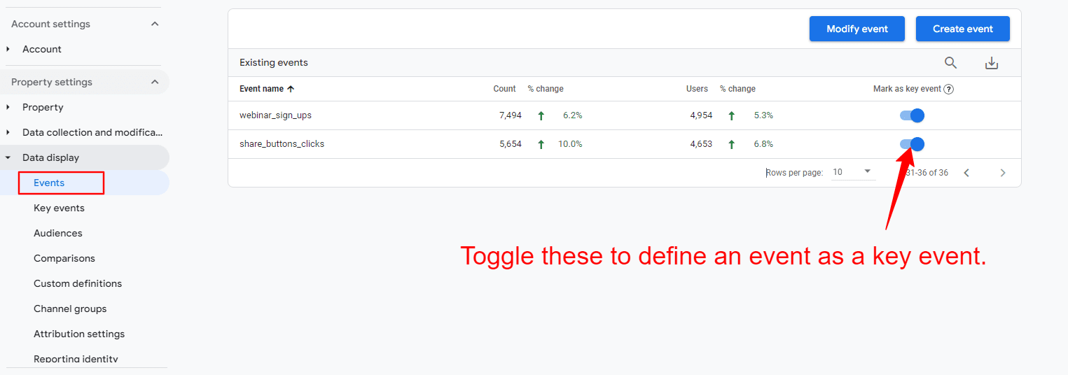
How to mark events as key events in GA.
How To Change The Default Engaged Session Timer In GA4
As a marketer, you may want to adjust the default 10-second timer for engaged sessions based on your project needs.
For example, if you have a blog article, you may want to set the timer as high as 20 seconds, but if you have a product page where users typically take more time to explore details, you might increase the timer to 30 seconds to better reflect user engagement.
To change:
Navigate to Data streams and click on the stream.
In the slide popup, navigate to Configure tag settings.
In the second slide popup, click Show more at the bottom.
Click on the Adjust session timeout setting.
Change Adjust timer for engaged sessions to the value of your choice.
Here is the detailed video guide on how to adjust the timer for engaged sessions:
What Is A Good Bounce Rate?
So, it’s not as straightforward as saying, “Example.com has a bounce rate of 43 percent, and example2.com has a bounce rate of 20 percent; therefore, example2.com performs better.”
For example, if you search [what’s on at the cinema…], then land on a website and have to dig through five pages of the site to find what’s showing, the website might have a low bounce rate but will have a poor user experience.
In this case, that’s misleading if you consider a low bounce rate good.
On top of that, what use is there in measuring the bounce rate for the whole website when you have lots of different templates that are laid out and designed in different ways, and you track ‘key events,’ aka conversions, differently?
In most cases, this shows that your marketing is effective and well-targeted, and visitors are engaging with your content and wanting to know more.
Remember, bounce rate is not a ranking factor, but when users navigate deeper into your pages, it is an engagement ranking signal that Google may take into account, according to what Google’s Pandu Nayak said during hearings.
That said, it may make sense to track the number of sessions with two or more pageviews in GA4, which you may want to consider as a KPI when reporting.
How To Set Up A Custom Audience With Multiple Pageviews Per Session
If you want to know how many visitors you have who have more than two page views in a session, you can easily set it up in GA4.
To do that:
Navigate to Admin.
Under Data display, navigate to Audiences.
Click the New Audience blue button on the top right corner.
Click Create custom audience.
Set up a name for your audience.
Select scope to “Within the same session.”
Select session_start.
Click And and select “page_views” with the parameter with “Event count” greater than one.
You simply tell it to add to my audience all users who viewed more than two pages within the same session. Here is a quick video guide on how to do that.
You can set up audiences with any granularity, like sessions with exactly two or three pageviews and greater than three pageviews.
Later, you can filter your standard reports using your custom audiences.
How To Do Bounce Rate Reporting And Audit
Next time your boss or client asks you, “Why is my bounce rate so high?” – first, send them this article.
Second, conduct an in-depth bounce rate audit to understand what’s going on.
Here’s how I do it.
Bounce Rate by Date Range
Look at bounce rates on your website for a particular period. This is the most simple reporting on bounce rate.
To do that:
Navigate to Explorations on the right-side menu.
Click ‘Blank’ report.
From Metrics choose “Bounce rate.”
Set Values to a “Bounce rate.”
Under Settings (2nd column), choose visualization type “Line chart.”
Select the date period of your choice.
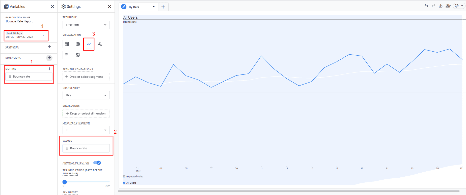
How to set up a bounce rate report for the entire website by date range.
If you see spikes in the chart, it may indicate a change you made to the website that influenced the bounce rate.
How To Analyze Bounce Rate On A Page Level
When running a lead generation campaign on many different landing pages, evaluating which pages convert well or poorly is vital to optimize them for better performance.
Another example use case of page-level bounce reports is A/B testing.
To do that:
Navigate to Explorations on the right-side menu.
Click Blank report.
From Metrics, choose Bounce rate and Sessions.
From Dimensions, choose Landing page + query string.
Under Settings (second column), choose visualization type ‘Table.”
Set Rows to a “Landing page + query string.”
Set Values to a “Bounce rate: and “Sessions.”
Set the filter to include pages with more than 100 sessions ( to ensure the data you’re mining is statistically significant).
Select the date period of your choice.
Tip: You don’t need to create a new blank exploration report; instead, add another tab to the same report and change only the configuration.
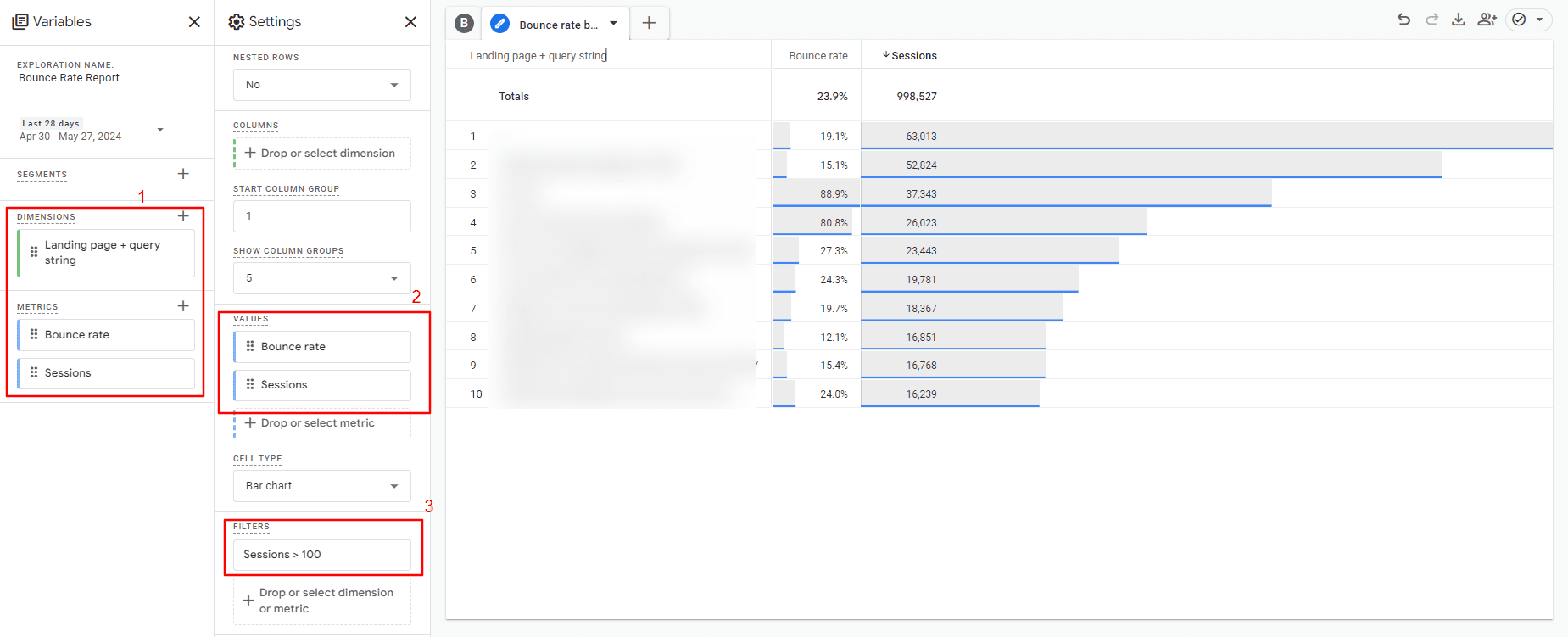
How to set up page level-bounce rate report.
If we don’t filter by sessions number, you’ll be looking at bounce rates on some pages with only one or two sessions, which doesn’t tell you anything.
Once you’ve done the above, repeat the process per channel to gain an even more rounded understanding of what content/source combinations produce the most or least engaged visits.
How To Analyze Your Bounce Rates By Traffic Channel
Bounce rates can be wildly different depending on the source of traffic.
For example, it’s likely that search traffic will produce a low bounce rate while social and display traffic might produce a high bounce rate.
So you also have to consider bounce rate on a channel level as well as on a page level.
The bounce rate from social and display is almost always higher than “inbound” channels for these reasons:
When a user is on social media looking through their news feed, they are (often) not actively looking for what we are promoting.
When a user sees a banner ad on another website, they are (often) not actively looking for what we are promoting.
However, for inbound channels like organic and paid search, it’s logical that the bounce rate is lower as these users are actively searching for what you are promoting.
So, you capture their attention during the “doing” phase of their buyer’s journey (depending on the search term in question).
To dig deeper into each one:
From Metrics, choose Bounce rate and Sessions.
From Dimensions, choose Session default channel group.
Under Settings (second column), choose visualization type Table.
Set Rows to a Session default channel group.
Set Values to a Bounce rate and Sessions.
Select the date period of your choice.
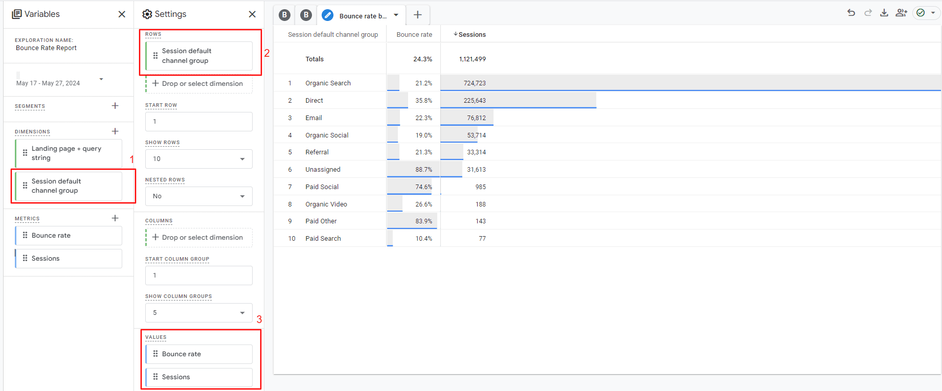
How to set up a bounce rate report by traffic channels.
A little homework: Try to plot a line graph based on the bounce rate for your organic traffic.
Now, you can dig deeper into the data and look for patterns or reasons that one page or set of pages/source or set of sources has a higher or lower bounce rate.
Compile the information in an easy-to-read format, ping it to the powers that be, and head for a congratulatory coffee.
Do You Have The Right Intent?
Sometimes, you’ll find pages that rank in search engines for terms that have more than one meaning.
For example, a recent one I discovered was a page on a website I manage that ranks first for the search term ‘Alang Alang’ (the name of a villa), but Alang Alang is also the name of a film.
The villa page had a high bounce rate, and one reason for this is that some of the visitors landing on that page were actually looking for the film, not the villa.
By doing keyword and competition research to see what results your target keywords produce, you can quickly understand if you have any pages that rank well for terms that could be intended for other topics.
When you identify such pages, you have three options:
Completely change your keyword targeting.
Remove the page from the SERPs.
Overhaul your title and meta description, so searchers know explicitly what the page is about before they click.
How To Increase Website Engagement
Now you’ve figured out what’s going wrong, you’re all set to make some changes.
All of this depends on your study’s findings, so not all of these points are relevant to every scenario, but this should be a good starting point.
Most importantly track custom events as “key events” (conversions) so things like newsletter sign-ups result in Google Analytics classifying that as a non-bounce even if the user didn’t visit a second page.
Is High Bounce Rate Bad?
Hopefully, you now understand why bounce rate isn’t simply “high” or “low”. It depends on many factors, and there is no single answer to the question, “Is high bounce rate bad?”
If you defined your ‘key events’ (conversions) and GA4 settings correctly for your goals, a high bounce ( +90% ) rate is definitely concerning because it means your visitors don’t engage enough with your webpages.
But if you have GA4 on default settings, you can never rely on data because of the reasons we discussed above.
Never assume anything. Do your research and make sure you configure your GA4 account properly to track ‘key events.’
Razorfish launched a new technology called R-Index that measures disparate online and offline customer interactions (including for paid and owned interactions) and generates prescriptive insights on consumer sentiment, brand performance and business impact. R-Index turns otherwise disconnected data into strategic insights on consumer journeys and brand sentiment.
R-Index is based on a custom algorithm that leverages Google Cloud, Big Query, and a suite of machine learning and Vertex AI, working together to analyze what customers are doing at every step and providing actionable insights about customer insights and learning how to engage with customers better.
What Is R-Index About?
I interviewed Razorfish to get a better idea of what R-Index is and why it’s an important tool for brands.
I asked Razorfish about what’s being measured:
“R-Index helps measure brand performance, consumer sentiment, and business impact. It includes a brand’s experience touchpoints across the consumer journey, including paid and owned interactions.”
The press release notes how there’s an abundance of data about “moments that matter” but that its inherent disparate quality makes it challenging to get a holistic picture of what it all means and extract meaning from it. So I asked them to elaborate on that.
“The holistic journey looks different for different consumers and consumer journeys. R-Index aims to capture how consumers start their journeys through purchase and loyalty, and distill how resonant each of these touchpoints are along the journey into a single, easy-to-use metric.
A moment that matters is a specific engagement that a consumer has with any of our experience touchpoints, whether that’s marketing, going to a website, etc. These are the moments where we see more engagement based on our observations. They can be different across consumers and segments.
As we analyze what the consumer is doing across the full journey, we’re identifying touchpoints that are resonating more and helping brands refine and optimize those experiences. This could be increasing the frequency, delivering a more personalized message, or focusing on a specific touchpoint. But with R-Index, we’re capitalizing on this behavioral data and using it to serve consumers better.”
What are the concrete real-world “touchpoints” you are referring to?
“Real-world touchpoints include call data, CRM information, web traffic, mobile app clicks, ad traffic or offline interactions like TV. As the number of avenues for consumers to interact with a brand continues to increase, data from those sources is continuing to fragment and shift further into silos.
Similarly, despite recent delays, third-party cookies will continue to deprecate and newer regulations will further the challenges in data collection, making it vital for brands to be able to access and process any and all data options into one source.
When you think about how traditional measurement tools have looked at performance (ex: acquisition and how that works across specific channels, paid media, or television) they aren’t really connected to measuring the actual sentiment or perception of consumers and how these translate into specific business value for brands.
And sentiment descriptions really differ from brand to brand, as some labels that are considered “negative” for one brand might not be the same for another.
R-index is meant to aggregate all the different touchpoints that a consumer could theoretically interact with and get to a perspective of what’s actually driving either positive sentiment and resonance for consumers or what areas need to be optimized for better experiences.”
Tell me more about the insights and how R-Index provides more a “nuanced view”?
“R-Index is a simpler tool to get the insights that are needed to help a brand optimize overall performance, dive into the specific drivers of that performance for a brand, and make those experiences more resonant and relevant for their core consumers. R-Index provides more insights into what’s truly driving positive and helpful consumer experiences, and driving resonance for brands across the entire marketing mix and marketing investment.
Even if you have specific segments of consumers, they can behave very differently based on how they’re interacting with the touchpoints. While the aim is not to drill down to any one specific customer, it can provide improved segment understanding to make each touchpoint more appropriate and personalized.
There are many measurement solutions in the market that can look at channel performance or sentiment performance in a silo, but R-Index is putting everything together in one place. R-Index has the components of being more dynamic, being able to scale and being able to plug into a number of different tools and AI capabilities to provide predictive optimized recommendations at scale.
The combination and connectivity of the data being pulled, the AI capabilities, and rigorous testing of the tool is helping drive the more nuanced views of insights that provide prescriptive strategic recommendations and analyses of data with greater detail. The definition and understanding of a brand’s audience segments will be deeper than ever before.
R-Index is prescriptive, providing automated insights and recommendations, and allows for drill-down insights at granular levels for components that make up the index score.
R-Index’s capabilities go beyond simply understanding what ads work to understanding how nuances across media investment, macroeconomic data, etc., impact overall consumer perceptions and interactions with brands, and how to best refine experiences to be resonant to consumers with those insights in mind.”
A Powerful Tool For Actionable Insights
R-Index is a powerful marketing insight tool that measures brand performance, consumer sentiment, and business impact and provides prescriptive recommendations to help make marketers and marketing teams improve consumer experiences and business outcomes.
However, it can also be misapplied, misunderstood, or improperly established for use as a key metric.
It is important to revisit conversions, conversion rates, and the use of the metric periodically.
It is even more important for any new initiative to have the metric well defined and understood before positioning it as a key KPI.
In this guide, I’m going to dive deeply into what conversion rate is, how to calculate it, why that’s important, and ways to improve it.
What Is Conversion Rate?
Google provides one of the more concise definitions of conversion rate:
“Conversion rates are calculated by simply taking the number of conversions and dividing that by the number of total ad interactions that can be tracked to a conversion during the same time period.”
Now, let’s get into what it all means.
Conversions
Unlike some business and marketing metrics, understanding conversion rates require some self-definition.
It starts with defining what a conversion is – which can mean different things for varying types of brands and organizations.
You can have more than one type of conversion. As a goal, you can have it factored into a marketing funnel or customer journey. Or, it could be a firm financial metric your business hinges on.
Step one is to clearly define what a conversion is for you.
One of the most common definitions I see relates to someone becoming a lead for a business that is focused on driving leads via its website.
Another applies to ecommerce businesses, where the conversion is the completed sale transaction.
Other common definitions include certain engagement metrics for businesses that rely on ad revenue generated by page views.
Secondary types of conversions get into events, engagement, and other things like email signups that help support funnels, customer journeys, and overall sales processes.
Conversion Rate
Conversion rate is a %.
In high-level terms, it tells you the % of how many people came to your site who took the conversion goal action you defined.
Some sources provide benchmarks for specific industries or areas to help you understand a good conversion rate and offer some objectivity.
I’m not telling you to copy your competitors, but I think if you want to value conversion rate, you need internal and external research to validate where you stand and where you want to be.
Match this up with your persona research, target audiences, marketing funnels, and customer journeys.
You likely know what you want your site visitors and audience to do.
How many of them do you want to do it? How big is the universe of your target audience? What is realistic regarding the number of total visitors you think you can get?
Find answers to these questions along with mapping out your conversion goals and conversion rate goals.
How Do You Calculate Conversion Rate?
Conversion Rate Formula
The formula to calculate the conversion rate is straightforward:
Conversions / Visits* = Conversion Rate
*I have to include an asterisk, though, as some definitions might not be as straightforward.
You could also call these “clicks” or “sessions” or look at them more granularly.
My definition here can be adapted based on the language and definitions used by your analytics platform and your other KPIs.
An example in calculating conversion rate for my site (a marketing agency providing services to clients) with the inputs and calculation:
August 2022 website visits: 1,122.
August 2022 contact form submissions (my conversions): 61.
It can be a common conversion goal like a lead form submission, something more secondary, or something more obscure.
That part can be somewhat custom or variable for you as well.
You can look at it as clicks to a website from a specific channel or ad campaign.
You can get really granular with the segmentation of your data, source and channel filtering, and even with the definitions themselves.
That becomes especially variable or custom if you’re tracking specific actions that lead up to a conversion goal and how granular you want to be with it.
Make sure the definition of what you’re counting as a conversion and what you’re counting as the total audience (clicks, visits, or some other “total” metric) is mapped out in a meaningful way.
Why Do I Need To Be Able To Calculate Conversion Rate?
First, where do you measure and track conversion rate? You can use Google Analytics, other analytics suites, or any data you must manually calculate.
Google Analytics
If you’re relying on Google Analytics (GA), you’ll want to ensure you have your “Goals” set up properly and test them. Conversions are reported based on the goals you configure.
Out of the box, Google has no context as to what a conversion is for you and no ability to calculate a conversion rate off of it.
If you use GA, dive into conversion goal configuration and testing to ensure things are in a good place before you trust the metrics you see (if you inherited the setup) or move forward with any measurement and improvement plan.
And, speaking of mapping out – tracking and measurement are critical.
You want to ensure that your tech stack and tools can help you properly track visits, conversions, and the overall conversion rate in alignment with your definitions and goals.
Plus, you’re able to then segment at the levels you want to with examples, including:
By conversion type (if you have more than one).
All website traffic.
By source or channel.
By pages/actions/events in the session.
By campaign or initiative.
There are many more segments and ways to filter and slice up conversions and conversion rate reporting.
You want to be able to calculate the conversion rate and get into the details with segments of traffic and your audience to help understand where you can improve.
What Is a Good Conversion Rate?
Calculating conversion rates and having the data is one thing; using it to make improvements is where the real work starts.
Improving Conversion Rates
You can look for improvement in two broad areas, and I strongly recommend evaluating both.
One is sources of traffic and the influences that drive visitors to your site.
That includes advertising, referrals, and any awareness activities and campaigns you have that generate traffic.
The other area consists of what influences the traffic that has already arrived at the site – things like UX/UI evaluation, review of messaging, calls to action, and ways that users navigate through and engage with the site.
In the case of the traffic you’re sending to the site, you can look at targeting, ad creative, and keywords you’re organically ranking for – the ways that ad targeting and creative provide the first impression or directly funnel traffic into the site.
There are a variety of optimization and refinement tactics to shift your focus to higher quality traffic and aim to increase conversion rate by getting more qualified visitors from external sources that you influence.
Beware, though, that you need to have a good idea of your customer journey and not knock out traffic that is awareness focused or at the top of the funnel (e.g., traffic tied to thought leadership).
Increasing the conversion rate is important, but make sure you segment well enough to not inadvertently stop targeting the top of the funnel, awareness-level visitors, and sources.
Conversion Rate Optimization
Now, onto looking inward at the traffic you already have.
This is where most people start digging into CRO tactics. Web analytics can help you see where people exit, bounce, and stop short of getting to your conversion actions.
Beyond that, great heat mapping and CRO tools will give you insights into UX and UI issues and how people truly engage with your site versus how you intended in your design.
By focusing on CRO and putting a strategy into place, you can evaluate everything from site speed to content, messaging, and UI.
I strongly encourage you to do so.
Conclusion
Conversion rate continues to be a valuable marketing metric.
Understanding it, defining it for your organization, measuring it, and improving it are all important.
Whether you have a small business or enterprise-level website, you likely care about specific conversion goals.
In short – for conversions and conversion rate – understand, define, measure, and improve it.
Yes, we all want more traffic. And maybe a static conversion rate is fine if you add more traffic.
However, wouldn’t you like more traffic and a higher conversion rate?
It is possible to have both, and crucial to understanding what levers to pull to influence it.
More resources:
Featured Image: eamesBot/Shutterstock
FAQ
What is the significance of conversion rate in online marketing?
Conversion rate is a crucial metric for assessing the effectiveness of online marketing strategies. It represents the percentage of visitors who complete a desired action, such as making a purchase or signing up for a newsletter. Understanding this rate helps businesses evaluate the success of their marketing efforts and identify areas for improvement. Accurate measurement and analysis of conversion rates can lead to better targeting of marketing campaigns, improved user experiences, and increased return on investment (ROI).
What are some effective strategies for improving conversion rates?
Improving conversion rates involves optimizing both the sources of traffic and the user experience on your site. Key strategies include:
Refining ad targeting and creative to attract more qualified traffic.
Enhancing site usability and navigation to make it easier for visitors to complete desired actions.
Testing and updating calls to action (CTAs) to ensure they are compelling and clear.
Employing A/B testing to compare different versions of landing pages and identify the most effective design and messaging.
Using analytics and heat mapping tools to gain insights into user behavior and address any barriers to conversion.
Why is it important to periodically revisit and redefine conversion metrics?
Periodically revisiting and redefining conversion metrics is essential to ensure they remain aligned with evolving business objectives and market conditions. As your business grows and changes, the definitions of conversions and the goals associated with them may need adjustments. Regularly updating these metrics helps maintain their relevance and ensures that your marketing strategies continue to drive meaningful results. This practice also allows for the incorporation of new insights and technologies, keeping your approach current and effective.
This post was sponsored by Piwik PRO. The opinions expressed in this article are the sponsor’s own.
This year, Google will finally phase out Universal Analytics 360, requiring paid users to switch to Google Analytics 360.
This is not something you can skip or postpone, and the clock is ticking.
The new analytics differ significantly from the previous version, and you can’t migrate data between them, so the transition can be challenging for organizations.
Since you’ll be starting from scratch, now is a good time to explore other options and determine if there are better solutions for your needs.
The three main areas to consider when deciding if you want to stay with Google or move to another platform are: the migration process, privacy and compliance, and ease of use.
When Is Google Universal Analytics 360 Sunsetting?
July 1, 2024 is when Google will phase out Universal Analytics 360.
What Should I Do Next?
Google encourages you to migrate to Google Analytics 360 as quickly as possible.
If you don’t, you could:
Lose critical advertising capabilities.
Lose the ability to export historical data.
Face delays in setting up Google Analytics 360.
How To Migrate To Your Next Analytics Platform
Moving to a new platform is much more than just implementation; it is vital to plan your migration properly. Below are five steps to help you through the entire process.
Step 1. Evaluate Your Stack & Resources
Before you switch analytics tools, take the time to evaluate your entire stack, not just the tool you’re changing. Ensure that your stack is up-to-date and meets your current business needs. Migrating to a new analytics vendor almost always requires more people and more time than originally estimated. It’s a good occasion to remove redundant tools from your stack; it might also allow you to integrate with new ones that can help you run your analytics and collect data more comprehensively.
Step 2. Tidy Your Data
Over time, data collection may get messy, and you find yourself tracking data that isn’t relevant to your business. A migration gives you a chance to clean up your data taxonomy. Ensure that your new tool allows you to use the same categories of data as the previous one. Pay close attention to any data that needs to be collected automatically, like location data (country, region, city), and device details (device type, browser). Finally, make sure the SDKs you need are supported by your new tool.
Step 3. Implement A New Platform
This step involves setting up the tracking code that collects data about visitors to your website or app and making any necessary modifications. Remember to set up tags to gather more detailed data through events or connect third-party tools.
Speed Up The Transition: If you switch to Piwik PRO, you can use a migration tool to easily transfer your settings from Universal Analytics (GA3) and Google Tag Manager.
Step 4. Evaluate Tour New Data
Once you’re done implementing your new platform, you should run it parallel to your existing tool for a few months before finalizing the migration. During this time, you can audit your new data and correct any errors. In this manner, you can retain your historical data while simultaneously generating new data segments on the new platform.
Step 5. Provide Training For Your Team
All end users need training to comprehend the platform’s operations, retrieve necessary data, and generate reports. This step is frequently missed as it falls at the end of the project.
Upon finishing this step, you will be set to switch to your new platform fully. If you find the migration process challenging, consider getting help from outside sources. Some analytics vendors offer hands-on onboarding and user training, which accelerates product adoption.
Is Switching To Google Analytics 360 Worth The Hassle?
You might be thinking, “Migrating to the successor of UA 360 won’t be a walk in the park,” especially if you work for a large organization.
In addition to subscription and data migration costs, you may also need to train your staff or increase fees for external marketing agencies that will face new challenges.
While Analytics 360 has incredible use cases, there may be other tools that better suit your needs.
How To Pick A Replacement For Universal Analytics 360
To decide whether to choose a new platform or stick with Google, consider a few important factors:
Because GA 360 is a different software, your marketing and analytics departments will need to allocate extra resources to learn the new platform. You will also need the support of analysts, developers, and data architects to help you reconstruct reports based on the data architecture of the chosen platform. Choosing a solution with similar features and user experience to UA 360 can be a good option, because it saves resources, making onboarding faster and easier.
You will also need to redesign your entire customer journey, because the data model in GA360 has changed from sessions to events. This process can be more challenging and costly than choosing a session-based platform or one that offers you freedom of choice.
Another important consideration is the level of support offered by the vendor. This can greatly affect the quality of the migration and onboarding to a new platform. Although Google Analytics is currently the most popular tool for analyzing web traffic, the level of support it provides is limited. Other companies like Piwik PRO can offer more in this area, including personalized onboarding, product implementation, training, and dedicated customer support at every step.
Consideration 1: Think About Privacy & Compliance
Organizations around the world are increasingly concerned with data privacy and compliance. A 2023 Thomson survey found that 80% of business professionals acknowledge the importance of compliance as a crucial advisory function for their organizations. Gartner, on the other hand, predicts that, by 2025, 60% of large enterprises will use at least one privacy-enhancing computing (PEC) technique in analytics, business intelligence, and/or cloud computing.
This is due to a growing number of new regulations that place greater control over personal data at the forefront. The EU’s General Data Protection Regulation (GDPR) and the California Consumer Privacy Act (CCPA) are two of the most prominent examples. The landscape has been further complicated by events such as the Schrems II case, Brexit, and China’s Personal Data Protection Law. Data protection is also increasingly important in some sectors, such as healthcare, where regulations like HIPAA are mandatory.
If your company operates globally or has ambitions to do so, the first thing to consider is who has full ownership of the data, where the servers hosting the data are located, and who owns them. Google Analytics 360 only offers cloud deployment in an unknown location, which means that data might be transferred between data centers in the Americas, Europe, and Asia. This makes it difficult to know exactly where the data is stored and ownership is unclear. For now, the issue of data transfers between the US and the EU has been resolved by the EU-US Privacy Shield framework agreement, but the future stays unclear. Last year, NOYB, led by Max Schrems, announced that it would soon appeal this decision to the Court of Justice of the European Union (CJEU).
To meet privacy and compliance requirements in different countries and industries, choose a platform that allows you to customize your hosting plan and set specific parameters for data collection and analysis. Platforms like Piwik PRO Analytics Suite enable you to store your data on servers in Europe, the US, and Asia, based on your preferences. This translates into flexibility and security of your data.
Consideration 2: Ease Of Use & Integration
This may sound counterintuitive, but the new GA 360 might be too complex for many. While it offers numerous advanced functions for data analysts, it lacks features specifically designed for marketers. As a result, marketers may need help in configuring the system to efficiently use the data.
On the other hand, in GA 360, the data model shifts from session-based to event-based. This is especially important if your teams depend on UA 360 behavioral reporting, benchmarking, and e-commerce flow reports, as these features are unavailable in the new release. You also need to revise all the reports for all the stakeholders.
Conversely, Piwik PRO strongly emphasizes simplicity and enables marketers to quickly access the necessary data. Additionally, the data model combines both session-based and event-based structures. This approach ensures that you can start working with the data faster and deliver the reports that stakeholders are used to. Another big advantage of Piwik PRO is its model for working with raw data, which is a valuable source of knowledge about users and provides richer reporting in more contexts. Google Analytics does not provide raw data exports, so you have to use various services and tools to accomplish this. To be fair, however, exporting large raw data packets with Piwik PRO software may take longer than with Google solutions.
The new GA 360 is most effective when used mainly with products from the Google ecosystem. When considering data activation, Google Ads is the most suitable option. When it comes to Piwik PRO, you still have this option, but integrating with other solutions is much easier. The platform offers four modules: Analytics, Tag Manager, Consent Manager and Customer Data Platform (CDP). The CDP module, available in the paid plan, lets you create detailed customer profiles and categorize your data into various audience segments. You can activate them to provide a personalized experience and run effective campaigns across multiple channels.
The landscape of modern analytics is constantly changing. On the one hand, there are ongoing discussions about privacy and compliance regulations, while on the other, companies are trying out various methods to collect and analyze data. In the end, your choice of analytics platform will impact the performance of your marketing and sales efforts. So take the time to explore, and you may find other solutions that better suit your organization’s needs.
Piwik PRO is a solid choice to explore for your next primary analytics solution. Book a personalized demo of the Enterprise version and see the benefits of introducing Piwik PRO Analytics Suite in your organization.
You can use BigQuery with the GSC bulk data export to get some of the same benefits without requiring the help of a developer.
With BigQuery, you can efficiently analyze large volumes of data from the GSC bulk data export.
You won’t have real-time data retrieval; that’s available with the API in our scenario but you can rely on daily data imports which means that you are working with up-to-date information.
By leveraging BigQuery and the GSC bulk data export, you can access comprehensive search analytics data – that’s the part you hear everyone raving about on LinkedIn.
“It’s such a game changer and a great opportunity to learn SQL. We can finally bypass GSC and external SEO tools limitations. I was surprised to see how simple it was to retrieve data.”
A Structured Approach To Using BigQuery And Google Search Console (GSC) Data For Content Performance Analysis
The aim of this article is not to provide you with a long list of queries or a massive step-by-step blueprint of how to conduct the most intense audit of all time.
I aim to make you feel more comfortable getting into the groove of analyzing data without the limitations that come with the Google Search Console interface. To do this, you need to consider five steps:
Identify use cases.
Identify relevant metrics for each use case.
Query the data.
Create a looker studio report to help stakeholders and teams understand your analysis.
Automate reporting.
The issue we often face when getting started with BigQuery is that we all want to query the data right away. But that’s not enough.
The true value you can bring is by having a structured approach to your data analysis.
1. Identify Use Cases
It is often recommended that you know your data before you figure out what you want to analyze. While this is true, in this case, it will be limiting you.
We recommend you start by determining the specific purpose and goals for analyzing content performance.
Use Case #1: Identify The Queries And Pages That Bring The Most Clicks
“I believe that every high-quality SEO audit should also analyze the site’s visibility and performance in search. Once you identify these areas, you will know what to focus on in your audit recommendations.”
However, it is incredibly useful to recreate this with your own Google Search Console data. You can automate and replicate the process on a regular basis.
There are benefits to this:
It helps identify which pages are attracting a diverse range of search queries and which ones may be more focused on specific topics.
Pages with a high UQC may present opportunities for further optimization or expansion to capitalize on a wider range of search queries.
Analyzing the UQC per page can also reveal which position bands (e.g., positions 1-3, 4-10, etc.) display more variability in terms of the number of unique queries. This can help prioritize optimization efforts.
Understanding how UQC fluctuates throughout the year can inform content planning and optimization strategies to align with seasonal trends and capitalize on peak periods of search activity.
Comparing UQC trends across different time periods enables you to gauge the effectiveness of content optimization efforts and identify areas for further improvement.
One of the critical steps is finding pages that saw a decline in clicks and impressions quarter over quarter. She relies on Search Console data to do so.
Building this query would be great but before we jump into this, we need to assess the content risk.
If you calculate the percentage of total clicks contributed by the top 1% of pages on a website based on the number of clicks each page receives, you can quickly pinpoint if you are in the danger zone – meaning if there are potential risks associated with over-reliance on a small subset of pages.
Here’s why this matters:
Over-reliance on a small subset of pages can be harmful as it reduces the diversification of traffic across the website, making it vulnerable to fluctuations or declines in traffic to those specific pages.
Assessing the danger zone: A percentage value over 40% indicates a high reliance on the top 1% of pages for organic traffic, suggesting a potential risk.
This query provides valuable insight into the distribution of organic traffic across a website.
2. Identify Relevant Metrics
Analyzing your content lets you discern which content is effective and which isn’t, empowering you to make data-informed decisions.
Whether it’s expanding or discontinuing certain content types, leveraging insights from your data enables you to tailor your content strategy to match your audience’s preferences.
Metrics and analysis in content marketing provide the essential data for crafting content that resonates with your audience.
Use Case #1: Identify The Queries And Pages That Bring The Most Clicks
For this use case, you need some pretty straightforward data.
Let’s list it all out here:
URLs and/or queries.
Clicks.
Impressions.
Search type: we only want web searches, not images or other types.
Over a specific time interval.
The next step is to determine which table you should get this information from. Remember, as we discussed previously, you have:
searchdata_site_impression: Contains performance data for your property aggregated by property.
searchdata_url_impression: Contains performance data for your property aggregated by URL.
In this case, you need the performance data aggregated by URL, so this means using the searchdata_url_impression table.
Use Case #2: Calculating UQC
For this use case, we need to list what we need as well:
URL: We want to calculate UQC per page.
Query: We want the queries associated with each URL.
Search Type: We only want web searches, not images or other types.
We still need to pick a table, in this case, you need the performance data aggregated by URL so this means using the searchdata_url_impression table.
Use Case #3: Assessing The Content Risk
To calculate the “clicks contribution of top 1% pages by clicks,” you need the following metrics:
URL: Used to calculate the clicks contribution.
Clicks: The number of clicks each URL has received.
Search Type: Indicates the type of search, typically ‘WEB’ for web searches.
We still need to pick a table, in this case, you need the performance data aggregated by URL so this means using the searchdata_url_impression table. (Narrator voice: notice a trend? We are practicing with one table which enables you to get very familiar with it.)
3. Query The Data
Use Case #1: Identify The Queries And Pages That Bring The Most Clicks
Let’s tie it all together to create a query, shall we?
You want to see pages with the most clicks and impressions. This is a simple code that you can get from Marco Giordano’s BigQuery handbook available via his newsletter.
We have slightly modified it to suit our needs and to ensure you keep costs low.
Copy this query to get the pages with the most clicks and impressions:
SELECT url, SUM(clicks) as total_clicks, SUM(impressions) as total_impressions FROM `pragm-ga4.searchconsole.searchdata_url_impression`
WHERE search_type = 'WEB' and url NOT LIKE '%#%'
AND data_date = "2024-02-13"
GROUP BY url
ORDER BY total_clicks DESC;
It relies on one of the most common SQL patterns. It enables you to group by a variable, in our case, URLs. And then, you can select aggregated metrics you want.
In our case, we specified impressions and clicks so we will be summing up clicks and impressions (two columns).
Let’s break down the query Marco shared: SELECT statement
SELECT url, SUM(clicks) as total_clicks, SUM(impressions) as total_impressions: Specifies the columns to be retrieved in the result set.
url: Represents the URL of the webpage.
SUM(clicks) as total_clicks: Calculates the total number of clicks for each URL and assigns it an alias total_clicks.
SUM(impressions) as total_impressions: Calculates the total number of impressions for each URL and assigns it an alias total_impressions.
FROM clause
FROM table_name`pragm-ga4.searchconsole.searchdata_url_impression`: Specifies the table from which to retrieve the data.
table_name: Represents the name of the table containing the relevant data.
Important to know: replace our table name with your table name.
WHERE clause
WHERE search_type = ‘WEB’ and url NOT LIKE ‘%#%’: Filters the data based on specific conditions.
search_type = ‘WEB’: Ensures that only data related to web search results is included.
url NOT LIKE ‘%#%’: Excludes URLs containing “#” in their address, filtering out anchor links within pages.
data_date = “2024-02-13”: This condition filters the data to only include records for the date ‘2024-02-13’. It ensures that the analysis focuses solely on data collected on this specific date, allowing for a more granular examination of web activity for that day.
(Narrator voice: we recommend you select a date to keep costs low.)
Important to know: We recommend you select two days before today’s date to ensure that you have data available.
GROUP BY clause
GROUP BY url: Groups the results by the URL column.
This groups the data so that the SUM function calculates total clicks and impressions for each unique URL.
ORDER BY clause
ORDER BY total_clicks DESC: Specifies the ordering of the result set based on the total_clicks column in descending order.
This arranges the URLs in the result set based on the total number of clicks, with the URL having the highest number of clicks appearing first.
This query is still more advanced than most beginners would create because it not only retrieves data from the right table but also filters it based on specific conditions (removing anchor links and search types that aren’t exclusively WEB).
After that, it calculates the total number of clicks and impressions for each URL, groups the results by URL, and orders them based on the total number of clicks in descending order.
This is why you should start by your use case first, figuring out metrics second and then writing the query.
Copy this SQL to get the queries in GSC with the most clicks and impressions:
SELECT query, SUM(clicks) as total_clicks, SUM(impressions) as total_impressions FROM `pragm-ga4.searchconsole.searchdata_url_impression`
WHERE search_type = 'WEB'
AND data_date = "2024-02-13"
GROUP BY query
ORDER BY total_clicks DESC;
This is the same query, but instead of getting the URL here, we will retrieve the query and aggregate the data based on this field. You can see that in the GROUP BY query portion.
The problem with this query is that you are likely to have a lot of “null” results. These are anonymized queries. You can remove those by using this query:
SELECT query, SUM(clicks) as total_clicks, SUM(impressions) as total_impressions FROM `pragm-ga4.searchconsole.searchdata_url_impression`
WHERE search_type = 'WEB'
AND is_anonymized_query = false
AND data_date = "2024-02-13"
GROUP BY Query
ORDER BY total_clicks DESC;
Now, let’s go one step further. I like how Iky Tai, SEO at GlobalShares went about it on LinkedIn. First, you need to define what the query does: you can see the high-performing URLs by clicks for a selected date range.
The SQL query has to retrieve the data from the specified table, filter it based on a date range, not a specific date, calculate the total number of impressions and clicks for each URL, group the results by URL, and order them based on the total number of clicks in descending order.
Now that this is done, we can build the SQL query:
SELECT
url,
SUM(impressions) AS impressions,
SUM(clicks) AS clicks
FROM
`pragm-ga4.searchconsole.searchdata_url_impression`
WHERE
data_date BETWEEN DATE_SUB(CURRENT_DATE(), INTERVAL 3 DAY) AND DATE_SUB(CURRENT_DATE(), INTERVAL 1 DAY)
GROUP BY
url
ORDER BY
clicks DESC;
Before you copy-paste your way to glory, take the time to understand how this is built:
SELECT statement
SELECT url, SUM(impressions) AS impressions, SUM(clicks) AS clicks: Specifies the columns to be retrieved in the result set.
url: Represents the URL of the webpage.
SUM(impressions) AS impressions: Calculates the total number of impressions for each URL.
SUM(clicks) AS clicks: Calculates the total number of clicks for each URL.
FROM clause
FROM searchconsole.searchdata_url_impression: Specifies the table from which to retrieve the data.
(Narrator voice: You will have to replace the name of your table.)
searchconsole.searchdata_url_impression: Represents the dataset and table containing the search data for individual URLs.
WHERE clause
WHERE data_date BETWEEN DATE_SUB(CURRENT_DATE(), INTERVAL 3 DAY) AND DATE_SUB(CURRENT_DATE(), INTERVAL 1 DAY): Filters the data based on the date range.
data_date: Represents the date when the search data was recorded.
BETWEEN: Specifies the date range from three days ago (INTERVAL 3 DAY) to yesterday (INTERVAL 1 DAY).
DATE_SUB(CURRENT_DATE(), INTERVAL 3 DAY): Calculates the date three days ago from the current date.
DATE_SUB(CURRENT_DATE(), INTERVAL 1 DAY): Calculates yesterday’s date from the current date.
Important to know: As we said previously, you may not have data available for the previous two days. This means that you could change that interval to say five and three days instead of three and one day.
GROUP BY clause
GROUP BY url: Groups the results by the URL column.
This groups the data so that the SUM function calculates impressions and clicks for each unique URL.
ORDER BY clause
ORDER BY clicks DESC: Specifies the ordering of the result set based on the clicks column in descending order.
This arranges the URLs in the result set based on the total number of clicks, with the URL having the highest number of clicks appearing first.
Important note: when first getting started, I encourage you to use an LLM like Gemini or ChatGPT to help break down queries into chunks you can understand.
Use Case #2: Calculating UQC
Here is another useful Marco’s handbook that we have modified in order to get you seven days of data (a week’s worth):
SELECT url, COUNT(DISTINCT(query)) as unique_query_count FROM `pragm-ga4.searchconsole.searchdata_url_impression`
WHERE search_type = 'WEB' and url NOT LIKE '%#%'
AND data_date BETWEEN DATE_SUB(CURRENT_DATE(), INTERVAL 10 DAY) AND DATE_SUB(CURRENT_DATE(), INTERVAL 3 DAY)
GROUP BY url
ORDER BY unique_query_count DESC;
Screenshot from Google Cloud, February 2024
This time, we will not break down the query.
This query calculates the Unique Query Count (UQC) per page by counting the distinct queries associated with each URL, excluding URLs containing ‘#’ and filtering for web searches.
It does that for an interval of seven days while taking into account data may not be available for the two previous days.
The results are then sorted based on the count of unique queries in descending order, providing insights into which pages attract a diverse range of search queries.
Use Case #3: Assessing The Content Risk
This query calculates the percentage of total clicks accounted for by the top 1% of URLs in terms of clicks. This is a far more advanced query than the previous ones. It is taken straight from Marco’s Playbook:
WITH PageClicksRanked AS (
SELECT
url,
SUM(clicks) AS total_clicks,
PERCENT_RANK() OVER (ORDER BY SUM(clicks) DESC) AS percent_rank
FROM
`pragm-ga4.searchconsole.searchdata_url_impression`
WHERE
search_type = 'WEB'
AND url NOT LIKE '%#%'
GROUP BY
url
)
SELECT
ROUND(SUM(CASE WHEN percent_rank <= 0.01 THEN total_clicks ELSE 0 END) / SUM(total_clicks) * 100, 2) AS percentage_of_clicks
FROM
PageClicksRanked;
This SQL query is more complex because it incorporates advanced techniques like window functions, conditional aggregation, and common table expressions.
Let’s break it down:
Common Table Expression (CTE) – PageClicksRanked
This part of the query creates a temporary result set named PageClicksRanked.
It calculates the total number of clicks for each URL and assigns a percentile rank to each URL based on the total number of clicks. The percentile rank is calculated using the PERCENT_RANK() window function, which assigns a relative rank to each row within a partition of the result set.
Columns selected:
url: The URL from which the clicks originated.
SUM(clicks) AS total_clicks: The total number of clicks for each URL.
PERCENT_RANK() OVER (ORDER BY SUM(clicks) DESC) AS percent_rank: Calculates the percentile rank for each URL based on the total number of clicks, ordered in descending order.
Conditions
search_type = ‘WEB’: Filters the data to include only web search results.
AND url NOT LIKE ‘%#%’: Excludes URLs containing “#” from the result set.
Grouping
GROUP BY url: Groups the data by URL to calculate the total clicks for each URL.
Main Query
This part of the query calculates the percentage of total clicks accounted for by the top 1% of URLs in terms of clicks.
It sums up the total clicks for URLs whose percentile rank is less than or equal to 0.01 (top 1%) and divides it by the total sum of clicks across all URLs. Then, it multiplies the result by 100 to get the percentage.
Columns selected
ROUND(SUM(CASE WHEN percent_rank <= 0.01 THEN total_clicks ELSE 0 END) / SUM(total_clicks) * 100, 2) AS percentage_of_clicks: Calculates the percentage of clicks accounted for by the top 1% of URLs. The CASE statement filters out the URLs with a percentile rank less than or equal to 0.01, and then it sums up the total clicks for those URLs. Finally, it divides this sum by the total sum of clicks across all URLs and multiplies it by 100 to get the percentage. The ROUND function is used to round the result to two decimal places.
Source
FROM PageClicksRanked: Uses the PageClicksRanked CTE as the data source for calculations.
(Narrator voice: this is why we don’t share more complex queries immediately. Writing complex queries immediately requires knowledge, practice, and understanding of the underlying data and business requirements.)
In order to write such queries, you need:
A solid understanding of SQL syntax: SELECT statements, GROUP BY, aggregate functions, subqueries and window functions to start.
Practice! Writing and optimizing SQL queries does the trick. So does working on datasets and solving analytical problems! Practice means taking an iterative approach to experiment, test and refine queries.
Having a good cookbook: Setting aside good queries you can tweak and rely on.
Problem-solving skills: To find the right approach, you have to be able to break down complex analytical tasks into manageable steps. That’s why we started with the five-step framework.
A performance mindset: You want to improve query performance, especially for complex queries operating on large datasets. If you don’t, you could end up spending a lot of money in BigQuery.
4. Create Looker Studio Dashboards
Once this is done, you can use Looker Studio to build dashboards and visualizations that showcase your content performance metrics.
You can customize these dashboards to present data in a meaningful way for different stakeholders and teams. This means you aren’t the only one accessing the information.
We will dive into this portion of the framework in another article.
However, if you want to get started with a Looker Studio dashboard using BigQuery data, Emad Sharaki shared his awesome dashboard. We recommend you give it a try.
Image from Emad Sharaki, February 2024
5. Automate Reporting
Once you have done all this, you can set up scheduled queries in BigQuery to automatically fetch GSC data present in the tables at regular intervals.
This means you can automate the generation and distribution of reports within your company.
The one tip we will share here is that you should schedule queries after the typical export window to ensure you’re querying the most recent available data.
In order to monitor the data freshness, you should track export completion times in BigQuery’s export log.
You can use the reporting automation to enable other teams when it comes to content creation and optimization. Gianna Brachetti-Truskawa, SEO PM and strategist, supports editorial teams by integrating reports directly into the CMS.
This means editors can filter existing articles by performance and prioritize their optimization efforts accordingly. Another automation reporting element to consider is to integrate with Jira to connect your performance to a dashboard with custom rules.
This means that articles can be pulled to the top of the backlog and that seasonal topics can be added to the backlog in a timely manner to create momentum.
Going Further
Obviously, you will need more use cases and a deeper understanding of the type of content audit you want to conduct.
However, the framework we shared in this article is a great way to ensure things stay structured. If you want to take it further, Lazarina Stoy, SEO data expert, has a few tips for you:
“When doing content performance analysis, it’s important to understand that not all content is created equal. Utilize SQL Case/When statements to create subsets of the content based on page type (company page, blog post, case study, etc.), content structure patterns (concept explainer, news item, tutorial, guide, etc), title patterns, target intent, target audiences, content clusters, and any other type of classification that is unique to your content.
That way you can monitor and troubleshoot if you detect patterns that are underperforming, as well as amplify the efforts that are paying off, whenever such are detected.”
If you create queries based on these considerations, share them with us so we can add them to the cookbook of queries one can use for content performance analysis!
Conclusion
By following this structured approach, you can effectively leverage BigQuery and GSC data to analyze and optimize your content performance while automating reporting to keep stakeholders informed.
Remember, collecting everyone else’s queries will not make you an overnight BigQuery pro. Your value lies in figuring out use cases.
After that, you can figure out the metrics you need and tweak the queries others created or write your own. Once you have that in the bag, it’s time to be a professional by allowing others to use the dashboard you created to visualize your findings.
Your peace of mind will come once you automate some of these actions and develop your skills and queries even more!
Celebrate the Holidays with some of SEJ’s best articles of 2023.
Our Festive Flashback series runs from December 21 – January 5, featuring daily reads on significant events, fundamentals, actionable strategies, and thought leader opinions.
2023 has been quite eventful in the SEO industry and our contributors produced some outstanding articles to keep pace and reflect these changes.
Catch up on the best reads of 2023 to give you plenty to reflect on as you move into 2024.
The July 1 migration deadline for Google Analytics 4 (GA4) has passed, and perhaps you’re still feeling unsteady working in the platform, still have some setup to do, or are in the Jumpstart queue.
If you’re a reluctant GA4 user or haven’t had the time to get comfortable with it, stick with me as I distill some of the key differences between Universal Analytics (UA) and GA4, highlight what’s new and improved, and share bookmark-worthy resources to amp up your expertise.
Whether you’re at an SMB, enterprise, or agency, here are seven tips to help you work faster and get more out of GA4.
1. Know Why GA4 Is So Different From Universal Analytics
This may not seem like a tip, but understanding why GA4 came to be and why it’s a departure from UA is key to learning to work with it successfully.
GA4 accounts for these two key shifts:
Browsing behavior that now happens across devices and platforms.
Privacy changes which mean less user data is observable via cookies, and more data is aggregated to protect user anonymity.
Universal Analytics was built for a time before these shifts, and its methodology was fast becoming outdated and obsolete.
GA4 is designed to measure across the web and apps via data streams.
While UA reported on individual user sessions, GA4 uses an event-based model that enables unified measurement across user journeys.
This is why dimensions and metrics naming conventions often differ and why comparing GA4 and UA reporting can be difficult.
Even if you don’t have both a website and an app, you’ll benefit from GA4 because it doesn’t rely on third-party cookies for measurement.
2. Set Up For Success
If you’ve been Jumpstarted or migrated yourself but aren’t sure you’ve completed all the steps to customize your property, consider the following.
For advertisers, be sure to confirm your Google Ads links imported, validate that your goals and conversions migrated, and that you’re bidding to the right conversions and audiences in Google Ads.
You can also quickly bring your UA events into GA4 by selecting the “Collect Universal Analytics events” in your GA4 tag settings.
This will create a single GA4 event type that records Category/Action/Label as parameters. You can confirm this works by looking at the Events section under Configure.
The GA4 Setup Assistant can help you set up your property. This tool will continue to evolve into a more personalized and comprehensive setup flow in GA4 for all users.
And be sure to check out the Setup Guide, which walks through the key steps and concepts for setting up a robust GA4 property for your business, including critical steps for advertisers.
3. Get Your Bearings Before You Dive In
Perhaps like you, my first encounters with GA4 were…uncomfortable, to say the least.
That is until I spent some time learning and took the Skillshop courses, which provided a solid overview of the foundational concepts and structure of GA4.
Whether you’re a beginner or have been working in GA4 for a while, here’s a roundup of Google resources that can help you work faster and smarter:
Skillshop: If you’re feeling at all uneasy in GA4, I highly recommend starting with the Skillshop modules to understand the key concepts and account structures in GA4.
Analytics for beginners & SMBs: If you’re new to Analytics, this is a helpful next stop. It walks through setup, reporting, and more.
Analytics for marketers & analysts: This is a guide for those with more digital marketing experience and goes into some advanced capabilities.
Mini Guides: Bookmark this page for a quick entry point to dive deeper into each aspect of GA4.
Metrics: GA4 vs. UA: One of the bigger hurdles to becoming comfortable in GA4 is knowing the metrics and how they do and don’t compare to UA. This handy comparison cheat sheet is a headache stopper.
Reporting comparison: This table shows what data is and isn’t available in reports, explorations, the Google Analytics Data API, and BigQuery Export.
For more, check out the new learning hub at google.com/analytics/learn with customized learning paths, videos, a link to join the Google Analytics community Discord, and more.
Coming soon: You’ll be able to get help finding the info you need right in the UI with a brief page description and valuable actions you can take.
A new help panel will be available on most pages in GA4 by clicking the light bulb icon in the upper right corner.
4. Master The Features GA4 Offers That UA Didn’t
There are several new and improved features in GA4 to give you more in-depth insights, more audience capabilities, and save you time.
Here’s a rundown of some of the new and improved features in GA4 designed to help novice and advanced users alike get the insights they need.
These (SMB-friendly) Features Are New For GA4
Business Objectives
Now when you specify your business objective, that signal is used to automatically surface a tailored set of reports relevant to your goal, such as lead generation, online sales, and brand awareness.
You can also find the Business objectives collection in the report Library at any time and add some or all of those reports to your property.
Customized Home Page
While UA showed the same data points to everyone, the new GA4 home page leverages product usage and user signals to customize the experience for you.
Analytics Intelligence
This set of features uses machine learning and rules you set to surface automated and custom analytics insights in several places in GA4 to notify you of any significant changes or emerging trends in your data.
Fun Tip: You can type navigational or insights questions directly in the Search bar.
Or if you click on it, you’ll see “Ask Analytics Intelligence” suggestions at the bottom, and clicking “More suggestions” will bring up a whole sidebar of questions to get a range of insights in a flash.
Enhanced Event Measurement
No coding required!
With enhanced measurement, you can enable events directly in the GA4 interface to measure interactions with your content, such as form interactions, downloads, and video engagement page scrolls.
Cross-device/Platform Audiences
Because GA4 is built for cross-device measurement, it captures and unifies more touch points across the user journey – and can use this data to enhance your advertising audiences.
Predictive Audiences
In UA, Audiences were assembled only based on past behavior without inferences. GA4 uses AI to build predictive audiences, such as users predicted to make a purchase in the next seven days.
Note that predictive analytics models do require sufficient data, and you can learn more about predictive metrics and eligibility requirements here.
Analytics Audience Builder In Google Ads
In UA, you could create Audiences and import them into Ads, but with GA4, you can create regular and predictive audiences in Ads when you link the accounts.
There’s no need to change accounts to leverage audiences in both products.
These Improvements Bring More Advanced Capabilities To GA4
User-ID
In UA, User-ID was used only in special views and reports. In GA4, User-ID is used throughout reporting to give you the most accurate, user-centric view of customer behavior and journeys.
Explorations
Previously only available in UA 360, explorations (accessible from Explore in the left-hand navigation) let you dive deeper than the standard reports to better understand customer behavior and your key business metrics.
Custom Funnel Reports
Previously only available in UA 360, custom funnels allow you to see the steps users take to complete a task and evaluate how many users drop off between each step on your website and/or app.
You can save funnel explorations to the report Library for quick reference.
BigQuery Export
Previously only available in UA 360, the BigQuery event export is now available to all GA4 users.
You can include specific data streams and exclude specific events for each property to control the export volume and BigQuery costs.
GMP Integrations
Previously only available in UA 360, now you can integrate DV360, Ad Manager, and other Google Marketing Platform products with GA4.
App Ecosystem Integrations
Deep integrations with Firebase, Play, App Campaigns, AdMob, and Ad Manager in GA4 can give you a clearer understanding of user behavior and monetization in your apps.
5. Customize Without Code
A huge plus for resource-strapped businesses is the ability to create and modify events in GA4 without having to make any coding changes.
With the Google tag implemented, you can easily create and edit events in GA4. This Help Center page has more details, examples, and video tutorials.
GA4 can go beyond Category, Action, Label, Page Views, and Sessions and collect dozens of standard events and any events you customize yourself.
This high level of customization makes GA4 incredibly versatile.
For example, with the report builder, you can create reports that visualize virtually any combination of dimensions and metrics available.
You can then assign filters to reports so that teams in different regions or business units can get insights tailored to their needs.
6. Take Full Advantage Of Ads Integrations
For advertisers, GA4 offers a much more robust audience builder than UA.
To take full advantage of the audience-building capabilities in GA4, you need to link your Google Ads, Display & Video 360, or Search Ads 360 accounts to your Analytics property and enable personalized advertising.
You can then automatically capture, share, and activate tailored audiences in your campaigns.
Importing your conversions from GA4 can also provide important feedback to your campaigns and improve automated bidding performance.
Note that you can exclude events or user-scoped custom dimensions from being used for ads personalization in the GA4 interface if desired – no coding is needed.
The audiences you define are pre-populated based on the last 30 days of data and evaluated on an ongoing basis.
7. Understand Reporting Identity And Data Thresholding
I see a lot of questions (and frustration) about data thresholds in GA4 reporting.
We’ve established that privacy is a core tenet of GA4, which is why you may see data thresholds, depending on the data you’re reporting.
Let’s dig into this a bit.
GA4 can use four identity methods to unify user touchpoints across devices and platforms into a single user journey: User-ID, Google signals, Device-ID, and Modeling.
We’ll get into some more details below, but this is a helpful overview of Reporting Identity to refer back to later.
There are three reporting identity options:
Blended, which runs through each of the four methods, in the order above, to identify users.
Observed, which evaluates the first three identity methods but not behavior modeling.
Device-based, which, you guessed it, only uses device ID.
If you’re using either the Blended or Observed option with Google Signals enabled, your reports will be subject to data thresholds to protect your users’ anonymity.
An orange triangle icon in the top right corner of a reporting card indicates that thresholding has been applied and that data will only show when the minimum aggregation thresholds have been met.
Two Key Things To Note About Google Signals And Data Thresholding In GA4
You can switch reporting identity options at any time without impacting data collection or processing. That means you can keep Google Signals on for ads remarketing purposes and opt to see what reports reflect when you select Device-based, for example, which isn’t subject to data thresholds in reports with user counts. And then switch back any time!
Google signals data is also not exported to BigQuery. This is why you may see different user counts and event counts per user in BigQuery versus Analytics.
More New Features And Enhancements To Come
GA4 was built for a new era and will continue to evolve.
While it’s highly customizable, features like automated insights, more default reports, and the new personalized Home page are designed to help make GA4 more intuitive and useful.
Stay tuned for even more updates, particularly in the Advertiser Workspace, and more customization features for SMB customers.
And as you work more in GA4, you’re bound to have your own top tips to add to this list!
The Google Search Console Insights email that drops into your inbox each month can be a powerful tool for understanding your website’s performance and informing your SEO strategy.
While some people may just take a quick glance at the numbers and move on, your Search Console Insights reports can provide vital insights into how users are interacting with your site and reveal data to help you optimize your website strategy.
Let’s take a look at what Google Search Console Insights is and how these reports can help you.
What Is Google Search Console Insights?
Google Search Console Insights is a feature within Google Search Console (GSC) that presents an easy-to-understand group of reports to help you understand site performance.
It pulls data from GSC and Google Analytics into one place to compile the reports.
Search Console Insights offers five distinct performance views. Each gives a general overview, while also enabling users to drill down to top-performing pages and gain insights into specific search queries.
The Insights reports offer a remarkable amount of easily understood and actionable information in the form of straightforward snapshots of website search performance – ensuring that every website stakeholder can review and understand how well their content is performing.
How To Find The Search Console Insights Report
The link to Search Console Insights is not in the left-hand navigation where one might expect to see it.
The Insights reports can be accessed from the search console Overview page, in a link at the very top of the page.
Screenshot from Google Search Console, October 2023
Clicking through to the Search Console Insights page shows a page that looks like this:
Screenshot from Google Search Console, October 2023
The Search Insights homepage shows the following reports:
A link to the Achievements report.
Performance on Google.
Your Growing Content.
Your Most Popular Content.
How People Find You.
Insights Achievements Report
The top of the page contains a somewhat hidden link to the Achievements report. It’s easy to overlook.
The image of a trophy with the word Achievements is actually a link to the Achievements report.
Screenshot Of The Link To The Achievements Report
Screenshot from Google Search Console, October 2023
Clicking the link takes the user to the Achievements page, which lists milestones for the site.
There is also a link to a Search Console report containing more details.
Screenshot Of Achievements Report
Screenshot from Google Search Console, October 2023
The Achievement report shows data for the past 28 days against the background of data from the entire time data has been collected, archived as far back as 2019.
There are two reports in the Achievements section.
Achievements Report #1
The first report is an “in progress” Achievement report measured in clicks.
The In Progress report displays the number of clicks the site is currently attracting. A trend arrow shows whether the clicks are trending upwards or downwards.
For content trending downward, there is a link to a search console report showing which pages are trending downward.
Screenshot Of Link To Search Console
Screenshot from Google Search Console, October 2023
The In Progress report is useful for starting an investigation of why certain pages and search queries are underperforming compared to the previous 28-day period.
The Search Console report displays the underperforming webpages, number of clicks, clicks for the previous period, and the difference in clicks between the two periods in the comparison.
Achievements Report #2
The second report is called the Google Search Impact report.
This report shows the total number of clicks the site has attracted.
Performance On Google Report
Clicking back to the main Insights overview page, we see the Performance on Google report next.
The report is a graph that shows the daily fluctuations of site traffic in terms of clicks from Google.
The report shows the number of clicks for the past 28 days and an arrow pointing up or down, which indicates whether the clicks are trending up or down.
Your Growing Content Report
This report consists of a list of URLs corresponding to webpages receiving more traffic this period than the previous one.
The report lists the following information:
A list of 15 URLs of pages that are trending upward.
Number of clicks gained in comparison to the previous 28-day period.
A percentage that represents the percentage of increase from the previous period.
Top search queries associated with the webpage popularity growth.
The information provided in the Your Growing Content report can be used to identify whether a cyclical trend is driving the increase, an algorithmic change has improved rankings, marketing efforts have been successful, or content updates have provided positive validation.
Your Most Popular Content Report
The Most Popular Content report shows the 15 most popular pages from the entire website.
The data shown includes:
A list of 15 URLs of the most popular webpages.
A list of top search queries associated with each URL.
Total number of clicks to each popular webpage.
The Most Popular Content report is useful for understanding what topics the site is authoritative for.
If the homepage is one of the most popular pages, this could be a good or not-so-good thing.
The list of search queries in this report that are associated with the homepage is meaningful.
For example, it’s good if the top search queries are variations of the brand name because that’s a signal of popularity, that people love the site so much they’re searching for it by name.
However, if the top queries are non-brand keywords, then this could be a sign that maybe the inner pages need work to get them ranking for more topics.
A site with the majority of non-brand keyword traffic to the homepage isn’t necessarily doing poorly, particularly if the site is a local business.
How People Find You Report
This report shows data about the top search queries used to drive traffic to the website.
The report shows the most searched queries and the upward-trending search queries.
The data is accessible through a dropdown menu marked like this:
Most searched queries (past 28 days).
Most trending queries (past 28 days).
Screenshot Of Dropdown Menu
The Most Searched Queries section displays the following data:
Search query – The query used to find the site.
Clicks – Total number of clicks by users.
Avg. position – Average position in the search engine results pages (SERPs) for the query.
Top search queries – Queries that got the most clicks.
The Trending Search Queries section shows which queries are trending upwards, measured by clicks.
As with everything else, the data is a comparison to the previous 28 days.
Tip For Understanding The Reports
Search Insights contains hidden tips explaining the data you’re looking for and how to use it.
But the links are hidden behind a school graduation cap icon that is located in the top right-hand corner of each report.
Screenshot from Google Search Console, October 2023
Below is a screenshot of one of the informational popups:
Screenshot from Google Search Console, October 2023
What Can You Learn From Search Console Insights?
Search Console Insights is a helpful tool for anyone who wants to master their website’s search performance.
Whether you’re an SEO consultant conducting a site audit or a site owner looking for a performance snapshot, these reports shed light on your overall site health and trends in performance.
By highlighting important metrics and insights, Google Search Console Insights enables stakeholders – regardless of their SEO knowledge – to understand the trajectory of their website and make more informed decisions about their SEO strategy.
While the report is still in beta and not yet a final product, what is currently offered is valuable for all stakeholders who want to understand their website better and boost its performance in search.