The importance of accessibility in WordPress

WordPress and the community around it are very committed to making websites as accessible as possible. Websites should be accessible to every visitor and anyone should be able to use WordPress to create their website or application. To keep accessibility top of mind, there’s a dedicated Accessibility Team that provides expertise and further improves WordPress in this regard. Let’s dive into what accessibility means in the world of WordPress and what you can do to contribute to a more accessible web.

One of the cool things about WordPress is that it’s an open source project. One that invites people from all over the world to work on it. Behind it is a very diverse community of people that works towards creating a platform that anyone can use. So naturally, accessibility is a big theme in WordPress.

Accessibility Coding Standards

So how can you keep an eye on the accessibility of WordPress with so many different people contributing to the platform? This is where the Accessibility Coding Standards come in. Since 2016, these have been added to the Core Handbook as a part of the code standards for WordPress developers. This resource helps contributors make sure their code conforms to the Web Content Accessibility Guidelines (WCAG) 2.1, at level AA. This means WordPress will be making the product more accessible with every new update. 

A short explanation of WCAG 2.1, level AA

The Web Content Accessibility Guidelines (WCAG) 2.1 cover a wide range of recommendations to make online content more accessible. Accessible to a wider range of people with disabilities, including accommodations for blindness and low vision, deafness and hearing loss, limited movement, speech disabilities, photosensitivity, and combinations of these. And some accommodations for learning disabilities and cognitive limitations.

The Level AA is used as a reference for a legal standard in many countries worldwide. Level AA success criteria address concerns that are more complicated to address and impact smaller groups of people, but are still common needs with broad reach.

The next step: ATAG compliance

Right now, any new WordPress code needs to meet the WCAG 2.1, level AA. An additional goal that the community is working towards is ATAG compliance. ATAG stands for Authoring Tool Accessibility Guidelines, guidelines on how to create a tool for creating web pages that are both accessible and encourage the creation of accessible content. At the moment, WordPress is not ATAG compliant yet. However, the community has pledged to pursue features that are in line with achieving this goal.

Check the accessibility of your site

If you think your audience doesn’t profit from accessibility, think again. Not only does an accessible website grow your audience, but following these guidelines often makes your website more usable for all users. Talk to your developers. Check the accessibility of your site. If you’re using an old version of WordPress update to a newer version to benefit from the latest developments in accessibility.

Free accessibility tools for your site

Running your code through the W3C Validator every once in a while helps you determine if you’re using clean code. Usually, the recommendations this validator gives you, are easy to fix. And they might already make a huge difference in terms of accessibility.

Another great and very easy-to-use tool is WAVE. Just install the browser extension and see for yourself:

The WAVE extension analyses a variety of possible accessibility issues. In the screenshot above, you can see things like missing form labels and contrast issues. This WAVE analysis is done in seconds, it shows you where the problems are on your page and it tells you where your website can be improved for accessibility.

Contrast is also really easy to test and improve. Simply use the contrast tool in WAVE or go to the WebAIM contrast checker. If you’re interested in more tools that can help you, read our post on how to improve the accessibility of your website.

Progress, not perfection

After running your website through the accessibility checker or reading through all the guidelines, you might wonder whether it’s even worth the effort. But remember, every change to your website makes it a bit more accessible. Makes your potential audience bigger and your user experience better. It’s about taking accessibility seriously and handling the main issues first. Nobody’s perfect, but it is important to keep an open mind and be willing to improve your website.

Read more: How to improve the accessibility of your website »

Coming up next!

Make a great website menu for your users and SEO

Website menus are one of those things you take for granted — until you encounter a really bad one. In the ideal scenario, users get an instant overview of what a site has to offer, and they can reach all the important stuff with just one or two clicks. In the worst case, users end up frustrated and unable to find what they’re looking for. This post will walk you through the basics of menu design and help you understand which options will work best for your site.

Your website’s menu is important because it helps users navigate your site. Sure, sometimes a user will arrive on the page they were looking for straight from Google. But usually, your visitors will want to look at various pages on your site. Or they land on your homepage and will need to navigate to the right page from there. That’s why your menu should be available on every page, and ideally, you would even have a sticky menu. Meaning that it scrolls down with the content to make sure it’s always in view. That way it doesn’t matter where your users are: they’ll always be able to find what they need.

Besides the essential navigation function of a menu, it’s also a neat way of letting users know what your site has to offer. You can think of it like a banner on each page, saying “This is what we do”. Make the most of that opportunity!

A great site menu should include links to the most important parts of your website. So it’s up to you to figure out what to put in it. But whatever content you decide to include, it’s essential to keep your menu usable.

One of the worst things you can do is overload your menu with too many links. This will make it look cluttered, and users will need to work hard to find what they need. Depending on your choice of menu design, some of the links could end up inaccessible if you have too many. For instance, if you’re using a drop-down menu, users might struggle to access links that appear off-screen.

Do: be selective or use alternative navigation options

The best option is to be selective about what you include in your menu, but for larger or more complex sites this won’t be possible. Luckily, there are lots of other solutions to a crowded menu. One solution is to create hub pages or categories, and add these to your menu instead. Then users can navigate to the relevant category or hub, and find their way to more specific content from there.

A second solution is to add sub-menus; these are additional menu options which only appear when the user hovers or clicks on a particular menu area. Sub-menus can be handy, but they can also become cluttered and difficult to use. So if you do use sub-menus, do so in moderation.

The third option is to include a search bar as part of your navigation menu. That way, if a user can’t see what they’re looking for in your menu, they can search your site for what they need. A search bar is a great feature to include, whether your menu is too cluttered or not. But do take some time to configure your search function well, because otherwise it won’t really help.

Tip: Yoast SEO Premium includes an Algolia integration you can use to improve your site search results. Using it will help push your most important content to the top of the results. Give it a go!

It’s easy to forget about mobile users when you’re using a desktop computer to build your website. But that’s the last thing you want to do, especially when it comes to your site menu design. A menu that looks good and works well on desktop might be completely unusable on a phone or tablet. Now that more and more people are using mobile devices to go online, it’s really important to consider menu design for both desktop and mobile.

There are two options for creating a menu that works on both desktop and mobile. You could add a responsive menu with a layout that adapts to the screen size being used. Alternatively, you can create a specific menu for the mobile version of your site. Whichever solution you choose, test it out on a few different screen sizes to make sure the end result is user-friendly.

There are loads of different menu styles to choose from. Hamburger menus, drop-down menus, and sidebar menus are a few well-known examples. There are also some very abstract and creative menus out there. However, the way that you implement these styles has a big impact on the overall impression and usability.

Here are some of the more standard options:

If you have a simple website and only one or two online goals, it makes sense to opt for a minimalist menu design. For example, Behance is a ‘network for showcasing and discovering creative work’, so it doesn’t need a complicated menu. They only include 3 menu options: ‘Discover’, ‘Livestreams’, and ‘Jobs’. This lets the user focus on the search field and the creative works being displayed instead.

Some sites use a more minimalist menu style to cater to their mobile users. A hamburger menu (which looks like this: ☰) is a popular minimalist choice for mobile sites as it takes up a very small amount of screen space. For instance, on the mobile version of Joolz.com there are three simple icons to help users navigate: search, shopping cart, and a hamburger menu. Clicking on the hamburger menu expands it to show a list of their product categories. Solutions like this work really well on mobile devices.

An image of a minimalist style site menu on Joolz.com

Classic menus are probably the simplest to work with. These focus on selecting the main categories or areas of the site and use buttons with text labels to guide users to the right place. A horizontal navigation bar is the most common type of classic menu. Sometimes menus like this have a few drop-down options below the main menu items, too. WordPress.org uses a classic menu design on its desktop site. Two of the menu items have a drop-down button to show more options: ‘Support’ and ‘Get Involved’.

An image of a classic style menu on wordpress.org

Another classic menu style is the sidebar. You can see this kind of menu in action on Google Maps. Usually, these kinds of menus can be opened using a hamburger menu button and closed again using the ×-button. This is a great way to offer full-screen content, as the menu is hidden most of the time.

An image showing the expanded sidebar menu in Google Maps

Mega menus are a kind of drop-down menu, but instead of having a single column of links under each main menu item, there is space for multiple columns. These menus are popular with larger and more complex sites, as they offer space for many more links than other menu styles. So in theory, you can be less picky about which links to include. Right?

Well actually, this supposed benefit can be the downfall of mega menus. Even though all the links can fit in there, including too much content in your menu can be overwhelming for users. That being said, if you limit yourself to a moderate amount of menu links, a mega menu can be a great option for your site.

On asana.com you can see they’re using a mega menu with a manageable number of links below each main menu item:

An image of the mega menu on asana.com

An example of a very full mega menu can be found on the World Food Program desktop site. In this case, the drop-down menu shows a list of countries, so users will still be able to navigate this menu quite easily. But just imagine if all these links were about different topics. Then users would struggle to find what they need, as if they were rummaging around in a messy drawer.

An image showing a very full mega menu on the World Food Program website

Other navigation options

You can do a lot with your site menu, but it’s not the only navigation option. Many sites add extra navigation links to their site header or footer. You’ll often see options to log in or change the site language in these spaces. However, if you do choose to add footer links you must disable infinite scrolling, or your users will never be able to reach the footer.

Another possibility is to create a sitemap page that users can access. This shows a structured list of all your site’s pages. These are becoming less popular than they once were, but they can still be a powerful tool for site navigation.

Does your site menu influence SEO? Sure it does! You’re unlikely to get a lot of internal linking benefit from adding items to your menu. But there are other ways your menu can benefit your SEO, and that benefit has to do with how users experience your site.

If users can’t find what they’re looking for, they’re likely to leave more quickly and not come back to your site again. Google can pick up on those kinds of signals. So a great menu can help your SEO, albeit in an indirect way.

As a general rule, it’s a good idea to keep your menu as simple as possible. Especially for smaller sites and those just starting up, a classic or minimalist-style menu should work great for you. If you have an enormous site you’ll need to think harder about what your users need to see, and how best to display that content.

Once you have a design you’re happy with, it won’t hurt to ask a few people to try it out and give you their feedback. If you’re really serious about making your site menu usable, you could carry out task-based user testing. Either way, make sure your website menu works for your users and provides them with a great experience!

Read more: Holistic SEO: Improve every aspect of your website »

Coming up next!

Optimize your site with the accessibility checklist

Accessibility helps you open up your content to a wider audience, so more people are able to access your site. A great resource to help get you started is this list of accessibility checks made by the World Wide Web Consortium (W3C). In this post, we’ll highlight a few important checks, so make sure you read the rest of the checklist as well. Let’s optimize your website for every visitor!

What is accessibility and why is it important?

Accessibility is making sure as many people as possible can use your site. Makes sense, right? After all, you’ve created a website because you want to reach your audience. And by following the checklist, you make sure you’re reaching everyone.

If you don’t, there might be people who can’t access information on your site. You’d be neglecting a huge part of your audience and in turn, missing out on a bunch of engagement and SEO opportunities. So, let’s get to work and check off these accessibility checks!

Provide a text equivalent

For every non-text element, you should provide a textual equivalent. That goes for things like images, but also for everything ranging from image map regions and animated GIFs to stand-alone audio files and video. This can be done with alt or longdesc tags, for instance.

For videos, it can be done by adding closed captions to your videos. If you upload your videos to YouTube, you can let YouTube automatically generate closed captions. Still, it’s good to run through them and check if they’re correct.

Same goes for TikTok and Instagram reels. Most social media provide automatic captioning, so be sure to use them! And don’t forget to change the alt tags or closed captions when the non-textual part changes.

Mind your colors and contrast

For people who are colorblind or have a visual impairment, certain color combinations and contrast simply don’t work. They won’t be able to read your text. That’s why you should always check if your website’s contrast and colors work together.

Example of good and bad color contrast

The quick and easy method? Convert your website to grayscale. That way, you’ll quickly see what’s readable and what isn’t. You can also use online tools to check the contrast of a web page. Plus, we have a post on accessibility tools, where we mention more in-depth accessibility checks for color and contrast.

Flickering

Did you know that if content flashes more than three times per second, it’s potentially dangerous? It might cause photo-epileptic seizures for some people. But it’s also straining on the eyes in general. That’s why you should avoid using flickering like this with animated gifs, blinking text, etc. And if you must use it, make sure that users can disable the flickering.

Make sure your website can be used with a keyboard interface

This accessibility check is especially important for people who have little or no use of their hands, or who don’t have hands at all. They’ll rely on a keyboard to navigate your website.

Keyboard users generally use the tab key to navigate through interactive elements like links, buttons, and fields for putting in text. A sighted keyboard user (someone who can see) must be able to see that they’ve focused on something with the tab key. This focus is typically indicated by a border or highlight around the element. So make sure that your site clearly shows this too!

A screenshot of the Yoast homepage. There is a black outline of the title Yoast SEO for Shopify.
When you use the tab key on our site, a black outline shows what you’ve focused on

Try and use your site with tab only! See if it’s easy, and if it’s not, please make sure you fix it.

Allow users to control time limits

You can probably imagine that navigating a website with a keyboard instead of a cursor isn’t always as fast. So, tasks with a time limit can be stressful for keyboard users. And not just them, but people with motor disabilities or generalized anxiety disorder, and people who take longer to read or have low vision may also find time limits hard to navigate.

That’s why you should allow users to control the time limits, or at the very least give them a warning at least 20 seconds before their time expires. If possible, allow them to get an extension.

Use clear and simple language

The checklist says: use the clearest and simplest language appropriate for a site’s content. Don’t try to make it overly complicated. And be mindful of abbreviations (screen readers can’t understand those) and idioms! While it might make sense for you as a native speaker, it doesn’t always translate well. For example, if we were to write “now comes the monkey out of the sleeve”, which is a Dutch idiom, you probably have no idea that we mean someone finally shows what they are truly like.

Illustration of a white man with a monkey on his arm. Text on the image says: now the monkey comes out of the sleeve.
Image from stuffdutchpeoplelike.com

Writing clearly is obviously not just good for your site’s accessibility, but also for your SEO and user experience in general. To help you, we’ve created the readability analysis in our plugin. This analysis will help you write better texts. It scans your text and tells you for example if your paragraphs are too long, or you’re using the passive voice too much.

Help your users to avoid mistakes

Let’s say you offer a service where people need to fill in their personal information, or people can take a quiz on your site to find out what product suits their wishes. It doesn’t matter how great your explanation beforehand is, people will still make mistakes. What matters is what you tell people when they’ve made a mistake.

Tell your users what they did wrong and give them an easy-to-understand suggestion on how to do it correctly. Don’t use difficult language. What if someone chose the wrong option? If possible, make sure users can reverse their actions. Otherwise, give them the opportunity at the end of the survey/quiz/etc. to review and confirm or correct their answers.

Read more: Writing accessible content: 4 checks you can do with Yoast SEO and the block editor »

What if you can’t change your site?

To put it bluntly: most of the accessibility checks mentioned in this post are not difficult. And luckily, most of the WordPress themes and other website builders are focused more on accessibility. Still, if your theme or site doesn’t cooperate while you’re implementing these awesome accessibility changes, then you should probably find a better theme for your site.

Conclusion: let’s get to work!

By thinking about accessibility, you’re actually thinking about design, the use of textual and multimedia content, and the structure of your site. So look at your colors and contrast, your alt tags and closed captions. And try to use your site with just your tab key! Let’s make sure that your website is accessible for everyone. 

Keep reading: Easy-to-use accessibility tools »

Coming up next!

Why accessibility is important (in the time of AI)

Nowadays, it’s easy to run a blog. Simply head to your generative AI tool of choice, insert a prompt, and you’re good to go. But is it really that simple? Spoiler: no. Generated content isn’t as original as something you’ve written yourself. And there’s another thing AI doesn’t take into account: accessibility. 

With over 100 million users, ChatGPT is an AI tool that most people know and use. And it’s easy to see why: within seconds, you can be a content writer too. No need to hire other people, which means you can spend your valuable money on other aspects of your business.

Except that’s not really how it works. A computer isn’t human. It doesn’t know your audience the way you do. You might prompt it to sound hip and relatable for people between 18 and 25 who are interested in gaming, but how nuanced will that text be? 

Besides, there’s one thing generative AI tools can’t help you with: accessibility. 

Know your audience – no, really

Did you know that 1.3 billion people have a disability? That’s 16% of the global population. Chances are at least some of your audience has a disability, too. So have you taken them into account? 

Because, let’s face it, AI tools haven’t. ChatGPT is a known perpetrator of biases, and other tools are no exception. They don’t concern themselves with diversity, because they’re not human. But you are. So, tell me: How many people in your audience have a visual impairment? How many are colorblind? Do you know? And, perhaps more importantly, do you care? 

Why accessibility matters

An alternative title would be ‘why you should care about other people’, because that’s what it boils down to. Do you want other people to have access to the same information that you do? Then, you’ll want to put in an effort into making your site, blog, and product accessible for everyone.

If that’s not enough reason, then think about your profits. Your clicks. Your traffic. If you haven’t catered to people with disabilities or visual impairment before, they’re essentially an untapped market. Consider people who are colorblind and can’t use your product, for example. By focusing on accessibility, you’ll create an app or product everyone can use. Isn’t that wonderful?

Can’t you have both?

I get it. Time is money, and by using generative tools, you’re saving both. So, is there no hope at all? If we’re looking at content, the answer is: yes, but. You can use AI tools to make it easier to write content. But you should use them as just that: tools. 

Let’s look at it this way: by writing content, generative AI will save you time. You won’t have to come up with blog post topics or struggle to write a single paragraph. Instead, you’ll have more time to review and edit and to ensure your content is easy to read for people with disabilities. That’s a win-win, isn’t it? 

A few quick tips

Let’s say you’ve generated a blog post. Now, you want to make sure it’s easy to read for people who use a screen reader, for example. Here’s a couple of things you should look out for: 

  • Keep your sentences short. It’s easier to keep track of the point you’re trying to make if your sentences are short. Between 20 and 25 words is perfect.
  • Don’t use acronyms or abbreviations. Screen readers won’t read those like a human would. They spell them out, letter by letter. If you’re writing for your business, this might not be a problem, because it looks more professional if you write it out.
  • Make sure images have Alt-Text or Alt Tags. Because that’s what screen readers will read aloud. So, use factually correct and accurate information to describe the images on your blog and site. 

If you need more tips, we’ve got a post that discusses how to write good alt texts. The post is about social media, but the information is useful for your site and blog as well.

Conclusion: don’t give AI too much power

Truth be told, the problem with AI tools is how much power people give them. We’ve said it before, and we’ll say it again: they’re tools. You’re meant to use them to your advantage, not let them run wild like a Roomba and trust that they’ll keep your house clean. 

Because just like a Roomba isn’t good at cleaning corners (because it’s a circle), generative AI tools can’t create diverse, personal, and accessible content. You’ve got to do at least some of the work yourself. And trust us, it’s worth it! 

Read more: Are we digging our own hole with generative AI? »

Coming up next!

target.com 2007
Ecommerce Is Going Back In Time & Here’s Why

Ecommerce is always changing but here is one big reason I see as to why.

How can you win in an extremely crowded space like LA traffic at 5 p.m. On a weekday. 


internet is like la traffic

I started building my first website using HTML in the late 90s. but let’s be honest no one wants to hear about me and building some websites. But the reason I brought it up is things were much simpler. We didn’t have the ability to create a lot of functions or fancy movement on websites back then. 

You might ask what this has to do with digital commerce today, well I can tell you. Back then we had one thing and that was extremely slow internet. So, to get a web page to load sometimes felt like ages. Large images were not an option complex design was also not an option. 

Now this affects the user experience dramatically. Our goal back then from the .com boom on was to make sites simple and could load quickly with a slow internet connection DSL.  

Now as Internet speeds increased our desire for cooler looking websites that had cooler functions or in our minds seems cooler took over. I mean there was some wild stuff that was happening in the mid-2000s.

One thing was for certain we still had a slow internet connection compared to nowadays. So the goal back then in e-commerce was to make sure your website loaded quickly and the only way to do that was to make sure that it didn’t have too much complexity. 

Back then we were fighting a slow internet connection or slow server speeds.

In 2007, the U.S. download speed average was 3.5 mbps

In 2022 U.S. internet download speed averages is 109 Mbps

Back then we were fighting a slow internet connection or slow server speeds. Today we are fighting a fast internet connection with extremely fast server speeds, but we are battling extremely short users’ attention spans.

BUT ITS REALLY THE SAME FIGHT!

So, in order to capture users’ imagination, we have to do it within a matter of seconds. So keep these facts in mind when you’re building your website today or you’re looking to optimize your performance today.

THE BIG TAKE AWAY IS LESS IS MORE!

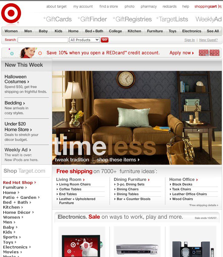
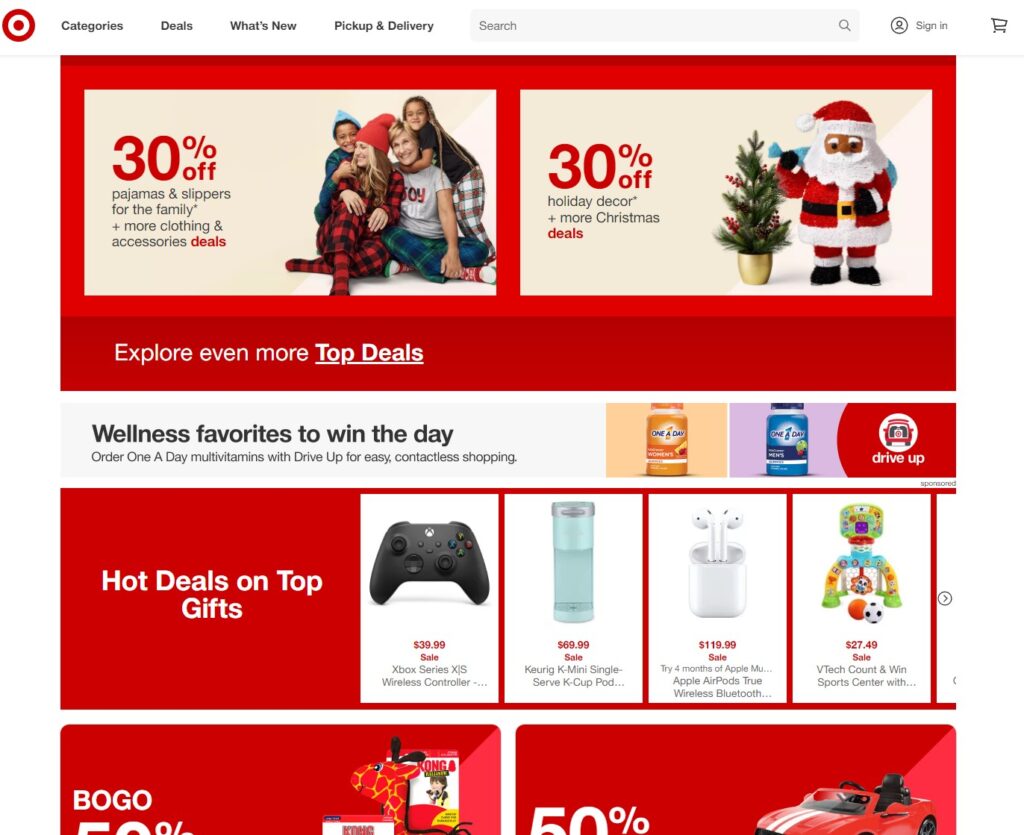
JUST LOOK AT TARGET.COM HOME PAGE IN 2007 COMPARED TO TODAY. THE BIG CHANGE I SEE IS A WHOLE LOT LESS OF EVERYTHING! 

BACK IN 2007

target.com 2007

TODAY

By Jeffry Graham