7 Inspirational Social Media Campaigns (Free Template)

With risk comes reward — especially if you stay true to your brand voice and purpose. Let these brand comebacks inspire your next tweet.

Ecommerce Management Advisors
Ecommerce Management Advisors
With risk comes reward — especially if you stay true to your brand voice and purpose. Let these brand comebacks inspire your next tweet.

Learn the TikTok tricks that will help you stand out on the For You page with unique and engaging content.

Creating your social media marketing strategy doesn’t need to be painful. Create an effective plan for your business in 9 simple steps.

Pro content creators go beyond making and publishing digital content. They use that content to build an audience and generate revenue.

Social commerce is what happens when savvy marketers take the best of eCommerce and combine it with social media.

Feeling overwhelmed by the numbers? We’ve got the easiest ways to calculate and increase your brand’s Instagram engagement rate.

Twitter CEO Elon Musk sets his sights on improving the website’s search functionality, enlisting the help of prolific hacker and long-time critic George Hotz.
In the span of a 12-week internship, Hotz promises to “fix” Twitter search and introduce all-new features, such as the ability to search within liked tweets.
As the first person in the world to jailbreak the iPhone, Hotz is no stranger to bringing new capabilities to existing platforms.
However, what’s most notable about Hotz joining Twitter is his prior criticism of Musk, refusing to work for Musk at Tesla, claiming he could develop a better self-driving car system.
It appears the two are putting their differences aside out of a mutual interest in building a better Twitter search engine.
Hotz volunteered his services in exchange for the cost of living in San Francisco, and Musk seemingly took him up on the offer:
Sure, let’s talk.
— Elon Musk (@elonmusk) November 16, 2022
that’s what Elon told me my job was, and I will try my hardest to do it. I have 12 weeks
also trying to get rid of that nondismissable login pop up after you scroll a little bit ugh these things ruin the Internet https://t.co/vZbSfEqlfW
— George Hotz 🐀 (@realGeorgeHotz) November 22, 2022
Now, Hotz is documenting the journey of implementing long-requested features that are commonplace in other search engines.
Like what?
For one, the ability to deliver relevant results that don’t contain the exact words used in a query.
True. I tried searching for this tweet exactly but spelled it somethig and got nothig. Will look into if there’s some easy way to improve this.
— George Hotz 🐀 (@realGeorgeHotz) November 21, 2022
Additionally, Hotz is crowdsourcing ideas for delivering more contextual autocomplete results when users type “from:” in the search box:
Not sure I have authority for this, but if amazing React coder/designer wants internship to help me fix search…or someone working @Twitter already
I want to type “from:” in the Search Twitter box and have it tokenize and autocomplete.
“from:” should not show me @TayFromCA pic.twitter.com/PHuhHg2hMT
— George Hotz 🐀 (@realGeorgeHotz) November 23, 2022
Hotz is enthusiastic about removing the sign-up prompt that appears when logged-out users scroll through search results.
After removing the popup, Hotz plans to implement a way for users to search within liked tweets:
After removing the popup, this is the second thing on my list. If both those can get done in the first two weeks, I think we are on track for great things.
Planned syntax is “liked_by:HANDLE”, similar to “from:HANDLE” https://t.co/SHG5VH0NtV
— George Hotz 🐀 (@realGeorgeHotz) November 22, 2022
Hotz also mentioned that Twitter’s advanced search feature should be featured more promptly, though he’s not in charge of UI updates.
Beyond those changes, what Hotz will do to “fix” Twitter search is mainly unknown. We’ll likely learn more as the days and weeks go on.
Stay up-to-date with the latest news on Musk’s Twitter with our continuously updated timeline of events.
Featured Image: rblfmr/Shutterstock

Google Analytics (GA) is a powerful tool that lets website owners learn how users interact with their webpages.
The amount of information we can get from Google Analytics is so in-depth that a theory has been circulating, for over a decade, that GA data is a ranking factor.
Is Google Analytics really powerful enough to influence Google search results?
Let’s take a closer look.
[Recommended Read:] Google Ranking Factors: Fact or Fiction
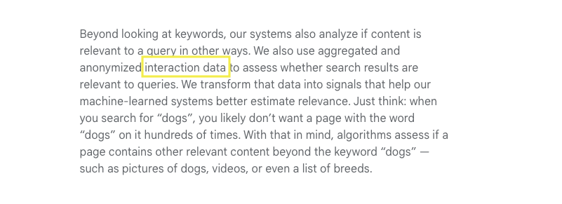
In Google’s How Search Works documentation, we can see that a webpage’s relevance is one of the many factors used to rank webpages.
Screenshot from Google’s How Search Works, June 2022The most basic relevancy signal is that the content contains the same words as the search query.
Additional information about how Google determines a page’s relevance is provided.
Beyond simple keyword matching, Google says, “We also use aggregated and anonymized interaction data to assess whether search results are relevant to queries. We transform that data into signals that help our machine-learned systems better estimate relevance.”
 Screenshot from Google’s How Search Works, June 2022
What is “interaction data,” and where does Google get it?
Some marketers hypothesize that these factors include metrics such as time on page, organic click-through rate, bounce rate, total direct traffic, percentage of repeat visitors, etc.
That makes sense because those are the metrics marketers are familiar with and understand to represent the interactive data Google may be looking for.
Marketers may also notice a correlation between the metrics improving as their position in the SERP improves.
Is it possible that we are somehow improving Google’s understanding of our website’s user experience using Google Analytics?
Like some sort of SEO bat signal?
Can we directly influence rankings by giving Google more “interaction data” to work with?
[Ebook:] Download The Complete Guide To Google Ranking Factors
While we don’t have direct access to Google’s algorithm, evidence shows Google Analytics as a ranking factor is not a plausible theory.
First, Google representatives have been clear and consistent in saying that they don’t use Google Analytics data as a ranking factor.
As recently as March 16, 2022, John Mu has responded to tweets about Google Analytics impacting rank.
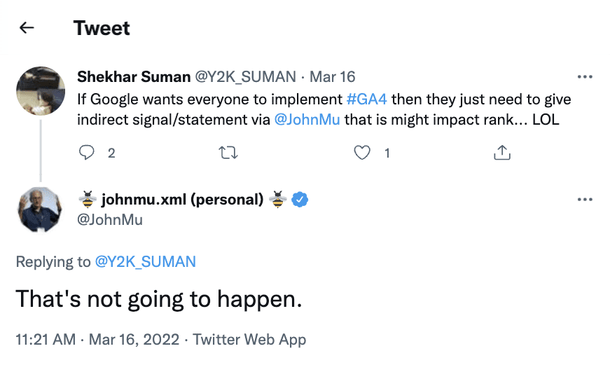 Screenshot from Twitter, June 2022
In jest, a marketer suggested if Google wanted people to use GA4, they could just say it would improve ranking.
John Mu replied, “That’s not going to happen.”
Google seems to continuously be batting down the idea that its analytics services influence ranking in any way.
Back in 2010, when we were tweeting to snag the top spot in results for a few moments, Matt Cutts said, “Google Analytics is not used in search quality in any way for our rankings.”
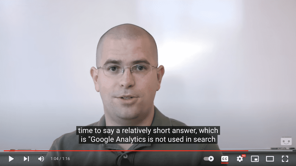 “Is Google Analytics data a factor in a page’s ranking?” Google Search Central, June 2022
And you don’t have to take Google’s word for it.
Here are three websites ranking in the top 10 for highly competitive keywords that do not have the Google Analytics tag on their site.
1. Ahrefs, an SEO tool, famously does not use Google Analytics.
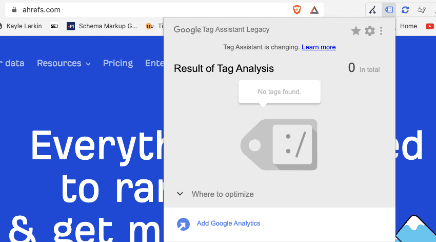 Screenshot by author, June 2022
Tim Soulo, CMO at Ahrefs, tweeted in December 2019, “Every time I tell fellow marketers that we don’t have Google Analytics at ahrefs.com, they react with ‘NO WAY!’”
 Screenshot from Twitter, June 2022
And the Ahrefs domain ranks in the top 10 positions for over 12,000 non-branded keywords.
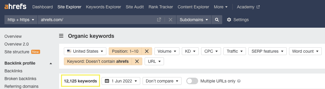 Screenshot from Ahrefs.com, June 2022
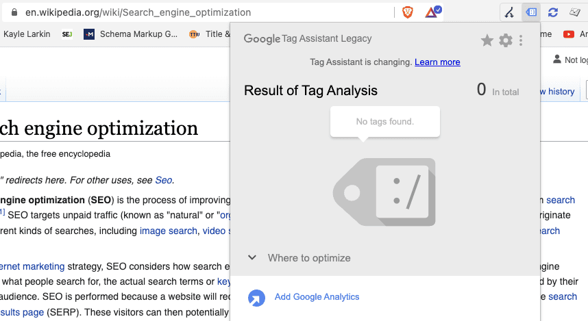
2. Another famous example is Wikipedia.
Wikipedia articles dominate Google search results, ranking very well for definition-type searches such as computer, dog, and even the search query “Google.”
And it ranks for all this with no Google Analytics code on the site.
 Screenshot by author, June 2022
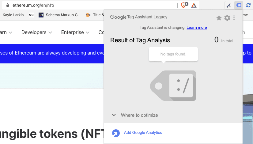
3. One more example is Ethereum.
Ethereum is ranking in the top 10 for [nft]. NFT is an enterprise-level keyword with over one million monthly searches in the United States alone.
Ethereum’s website does not have Google Analytics installed.
 Screenshot by author, June 2022
[Discover:] More Google Ranking Factor Insights

Google Analytics is a powerful tool to help us understand how people find our website and what they do once there.
And when we make adjustments to our website, by making it easier to navigate or improving the content, we can see GA metrics improve.
However, the GA code on your site does not send up an SEO bat signal.
The GA code is not a signal to Google, and it does not make it easier for Google to assess relevance (whether your webpage fulfills the user’s search query.)
The “bat signal” is for you.
Google Analytics is not a ranking factor, but it can help you understand whether you’re heading in the right or wrong direction.
Featured Image: Paulo Bobita/Search Engine Journal
![Ranking Factors: Fact Or Fiction? Let’s Bust Some Myths! [Ebook]](https://ecommerceedu.com/wp-content/uploads/2022/10/rf-ebook-download-banner-62e8c6126ffe8-sej.jpg)

Predictive analysis refers to the use of historical data and analyzing it using statistics to predict future events.
It takes place in seven steps, and these are: defining the project, data collection, data analysis, statistics, modeling, and model monitoring.
Many businesses rely on predictive analysis to determine the relationship between historical data and predict a future pattern.
These patterns help businesses with risk analysis, financial modeling, and customer relationship management.
Predictive analysis can be used in almost all sectors, for instance, healthcare, telecommunications, oil and gas, insurance, travel, retail, financial services, and pharmaceuticals.
Several programming languages can be used in predictive analysis, such as R, MATLAB, Python, and Golang.
R is a package of free software and programming language developed by Robert Gentleman and Ross Ihaka in 1993.
It is widely used by statisticians, bioinformaticians, and data miners to develop statistical software and data analysis.
R consists of an extensive graphical and statistical catalog supported by the R Foundation and the R Core Team.
It was originally built for statisticians but has grown into a powerhouse for data analysis, machine learning, and analytics. It is also used for predictive analysis because of its data-processing capabilities.
R can process various data structures such as lists, vectors, and arrays.
You can use R language or its libraries to implement classical statistical tests, linear and non-linear modeling, clustering, time and spatial-series analysis, classification, etc.
Besides, it’s an open-source project, meaning anybody can improve its code. This helps to fix bugs and makes it easy for developers to build applications on its framework.
R is an interpreted language, while MATLAB is a high-level language.
For this reason, they function in different ways to utilize predictive analysis.
As a high-level language, most current MATLAB is faster than R.
However, R has an overall advantage, as it is an open-source project. This makes it easy to find materials online and support from the community.
MATLAB is a paid software, which means availability may be an issue.
The verdict is that users looking to solve complex things with little programming can use MATLAB. On the other hand, users looking for a free project with strong community backing can use R.
It is important to note that these two languages are similar in several ways.
First, they are both open-source languages. This means they are free to download and use.
Second, they are easy to learn and implement, and do not require prior experience with other programming languages.
Overall, both languages are good at handling data, whether it’s automation, manipulation, big data, or analysis.
R has the upper hand when it comes to predictive analysis. This is because it has its roots in statistical analysis, while Python is a general-purpose programming language.
Python is more efficient when deploying machine learning and deep learning.
For this reason, R is the best for deep statistical analysis using beautiful data visualizations and a few lines of code.
Golang is an open-source project that Google launched in 2007. This project was developed to solve problems when building projects in other programming languages.
It is on the foundation of C/C++ to seal the gaps. Thus, it has the following advantages: memory safety, maintaining multi-threading, automatic variable declaration, and garbage collection.
Golang is compatible with other programming languages, such as C and C++. In addition, it uses the classical C syntax, but with improved features.
The main disadvantage compared to R is that it is new in the market – therefore, it has fewer libraries and very little information available online.
SAS is a set of statistical software tools created and managed by the SAS institute.
This software suite is ideal for predictive data analysis, business intelligence, multivariate analysis, criminal investigation, advanced analytics, and data management.
SAS is similar to R in various ways, making it a great alternative.
For example, it was first launched in 1976, making it a powerhouse for vast information. It is also easy to learn and debug, comes with a nice GUI, and provides a nice output.
SAS is more difficult than R because it’s a procedural language requiring more lines of code.
The main disadvantage is that SAS is a paid software suite.
Therefore, R might be your best option if you are looking for a free predictive data analysis suite.
Lastly, SAS lacks graphic presentation, a major setback when visualizing predictive data analysis.
Rust is an open-source multiple-paradigms programming language launched in 2012.
Its compiler is one of the most used by developers to create efficient and robust software.
Additionally, Rust offers stable performance and is very useful, especially when creating large programs, thanks to its guaranteed memory safety.
It is compatible with other programming languages, such as C and C++.
Unlike R, Rust is a general-purpose programming language.
This means it specializes in something other than statistical analysis. It may take time to learn Rust due to its complexities compared to R.
Therefore, R is the ideal language for predictive data analysis.
If you’re interested in learning R, here are some great resources you can use that are both free and paid.
Coursera is an online educational website that covers different courses. Institutions of higher learning and industry-leading companies develop most of the courses.
It is a good place to start with R, as most of the courses are free and high quality.
For example, this R programming course is developed by Johns Hopkins University and has more than 21,000 reviews:
YouTube has an extensive library of R programming tutorials.
Video tutorials are easy to follow, and offer you the chance to learn directly from experienced developers.
Another advantage of YouTube tutorials is that you can do them at your own pace.
YouTube also offers playlists that cover each topic extensively with examples.
A good YouTube resource for learning R comes courtesy of FreeCodeCamp.org:
Udemy offers paid courses created by professionals in different languages. It includes a combination of both video and textual tutorials.
At the end of every course, users are awarded certificates.
One of the main advantages of Udemy is the flexibility of its courses.
One of the highest-rated courses on Udemy has been produced by Ligency.
Google Analytics (GA) is a free tool that webmasters use to gather useful information from websites and applications.
However, pulling information out of the platform for more data analysis and processing is a hurdle.
You can use the Google Analytics API to export data to CSV format or connect it to big data platforms.
The API helps businesses to export data and merge it with other external business data for advanced processing. It also helps to automate queries and reporting.
Although you can use other languages like Python with the GA API, R has an advanced googleanalyticsR package.
It’s an easy package since you only need to install R on the computer and customize queries already available online for various tasks. With minimal R programming experience, you can pull data out of GA and send it to Google Sheets, or store it locally in CSV format.
With this data, you can oftentimes overcome data cardinality issues when exporting data directly from the Google Analytics user interface.
If you choose the Google Sheets route, you can use these Sheets as a data source to build out Looker Studio (formerly Data Studio) reports, and expedite your client reporting, reducing unnecessary busy work.
Google Search Console (GSC) is a free tool offered by Google that shows how a website is performing on the search.
You can use it to check the number of impressions, clicks, and page ranking position.
Advanced statisticians can connect Google Search Console to R for in-depth data processing or integration with other platforms such as CRM and Big Data.
To connect the search console to R, you must use the searchConsoleR library.
Collecting GSC data through R can be used to export and categorize search queries from GSC with GPT-3, extract GSC data at scale with reduced filtering, and send batch indexing requests through to the Indexing API (for specific page types).
How To Use GSC API With R
See the steps below:
Pulling queries via the API, in small batches, will also allow you to pull a larger and more accurate data set versus filtering in the Google Search Console UI, and exporting to Google Sheets.
Like with Google Analytics, you can then use the Google Sheet as a data source for Looker Studio, and automate weekly, or monthly, impression, click, and indexing status reports.
Whilst a lot of focus in the SEO industry is placed on Python, and how it can be used for a variety of use cases from data extraction through to SERP scraping, I believe R is a strong language to learn and to use for data analysis and modeling.
When using R to extract things such as Google Auto Suggest, PAAs, or as an ad hoc ranking check, you may want to invest in.
More resources:
Featured Image: Billion Photos/Shutterstock

The customer journey involves multiple interactions between the customer and the merchant or service provider.
We call each interaction in the customer journey a touch point.
According to Salesforce.com, it takes, on average, six to eight touches to generate a lead in the B2B space.
The number of touchpoints is even higher for a customer purchase.
Multi-touch attribution is the mechanism to evaluate each touch point’s contribution toward conversion and gives the appropriate credits to every touch point involved in the customer journey.
Conducting a multi-touch attribution analysis can help marketers understand the customer journey and identify opportunities to further optimize the conversion paths.
In this article, you will learn the basics of multi-touch attribution, and the steps of conducting multi-touch attribution analysis with easily accessible tools.
What do you want to achieve from the multi-touch attribution analysis?
Do you want to evaluate the return on investment (ROI) of a particular marketing channel, understand your customer’s journey, or identify critical pages on your website for A/B testing?
Different business objectives may require different attribution analysis approaches.
Defining what you want to achieve from the beginning helps you get the results faster.
Conversion is the desired action you want your customers to take.
For ecommerce sites, it’s usually making a purchase, defined by the order completion event.
For other industries, it may be an account sign-up or a subscription.
Different types of conversion likely have different conversion paths.
If you want to perform multi-touch attribution on multiple desired actions, I would recommend separating them into different analyses to avoid confusion.
Touch point could be any interaction between your brand and your customers.
If this is your first time running a multi-touch attribution analysis, I would recommend defining it as a visit to your website from a particular marketing channel. Channel-based attribution is easy to conduct, and it could give you an overview of the customer journey.
If you want to understand how your customers interact with your website, I would recommend defining touchpoints based on pageviews on your website.
If you want to include interactions outside of the website, such as mobile app installation, email open, or social engagement, you can incorporate those events in your touch point definition, as long as you have the data.
Regardless of your touch point definition, the attribution mechanism is the same. The more granular the touch points are defined, the more detailed the attribution analysis is.
In this guide, we’ll focus on channel-based and pageview-based attribution.
You’ll learn about how to use Google Analytics and another open-source tool to conduct those attribution analyses.
The ways of crediting touch points for their contributions to conversion are called attribution models.
The simplest attribution model is to give all the credit to either the first touch point, for bringing in the customer initially, or the last touch point, for driving the conversion.
These two models are called the first-touch attribution model and the last-touch attribution model, respectively.
Obviously, neither the first-touch nor the last-touch attribution model is “fair” to the rest of the touch points.
Then, how about allocating credit evenly across all touch points involved in converting a customer? That sounds reasonable – and this is exactly how the linear attribution model works.
However, allocating credit evenly across all touch points assumes the touch points are equally important, which doesn’t seem “fair”, either.
Some argue the touch points near the end of the conversion paths are more important, while others are in favor of the opposite. As a result, we have the position-based attribution model that allows marketers to give different weights to touchpoints based on their locations in the conversion paths.
All the models mentioned above are under the category of heuristic, or rule-based, attribution models.
In addition to heuristic models, we have another model category called data-driven attribution, which is now the default model used in Google Analytics.
How is data-driven attribution different from the heuristic attribution models?
Here are some highlights of the differences:
A common algorithm used by data-driven attribution is called Markov Chain. At the heart of the Markov Chain algorithm is a concept called the Removal Effect.
The Removal Effect, as the name suggests, is the impact on conversion rate when a touch point is removed from the pathing data.
This article will not go into the mathematical details of the Markov Chain algorithm.
Below is an example illustrating how the algorithm attributes conversion to each touch point.
The Removal Effect
Assuming we have a scenario where there are 100 conversions from 1,000 visitors coming to a website via 3 channels, Channel A, B, & C. In this case, the conversion rate is 10%.
Intuitively, if a certain channel is removed from the conversion paths, those paths involving that particular channel will be “cut off” and end with fewer conversions overall.
If the conversion rate is lowered to 5%, 2%, and 1% when Channels A, B, & C are removed from the data, respectively, we can calculate the Removal Effect as the percentage decrease of the conversion rate when a particular channel is removed using the formula:

Then, the last step is attributing conversions to each channel based on the share of the Removal Effect of each channel. Here is the attribution result:
| Channel | Removal Effect | Share of Removal Effect | Attributed Conversions |
| A | 1 – (5% / 10%) = 0.5 | 0.5 / (0.5 + 0.8 + 0.9) = 0.23 | 100 * 0.23 = 23 |
| B | 1 – (2% / 10%) = 0.8 | 0.8 / (0.5 + 0.8 + 0.9) = 0.36 | 100 * 0.36 = 36 |
| C | 1 – (1% / 10%) = 0.9 | 0.9 / (0.5 + 0.8 + 0.9) = 0.41 | 100 * 0.41 = 41 |
In a nutshell, data-driven attribution does not rely on the number or position of the touch points but on the impact of those touch points on conversion as the basis of attribution.
Enough of theories, let’s look at how we can use the ubiquitous Google Analytics to conduct multi-touch attribution analysis.
As Google will stop supporting Universal Analytics (UA) from July 2023, this tutorial will be based on Google Analytics 4 (GA4) and we’ll use Google’s Merchandise Store demo account as an example.
In GA4, the attribution reports are under Advertising Snapshot as shown below on the left navigation menu.
After landing on the Advertising Snapshot page, the first step is selecting an appropriate conversion event.
GA4, by default, includes all conversion events for its attribution reports.
To avoid confusion, I highly recommend you pick only one conversion event (“purchase” in the below example) for the analysis.
Screenshot from GA4, November 2022Under the Attribution section on the left navigation bar, you can open the Conversion Paths report.
Scroll down to the conversion path table, which shows all the paths leading to conversion.
At the top of this table, you can find the average number of days and number of touch points that lead to conversions.
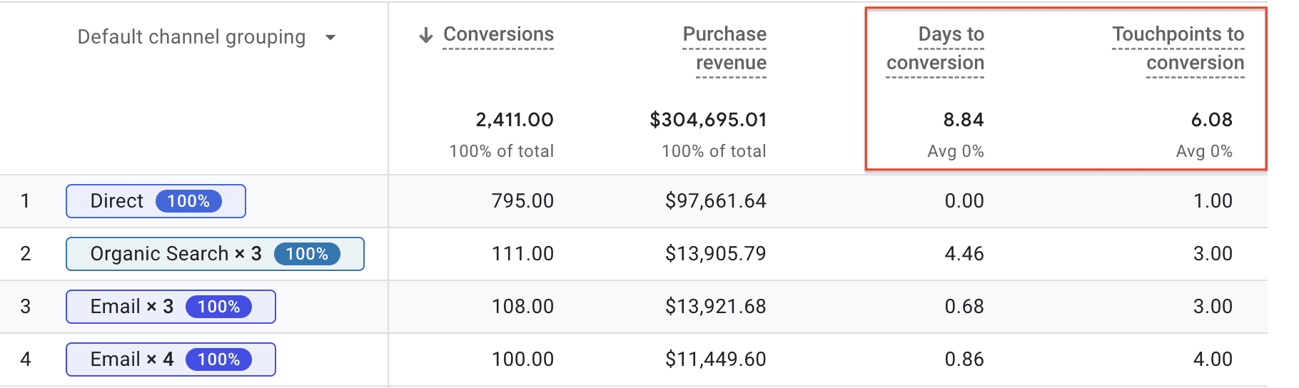 Screenshot from GA4, November 2022
 In this example, you can see that Google customers take, on average, almost 9 days and 6 visits before making a purchase on its Merchandise Store.
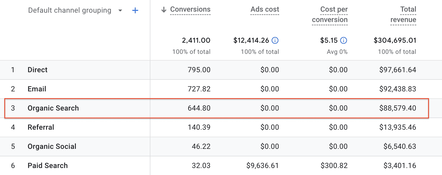
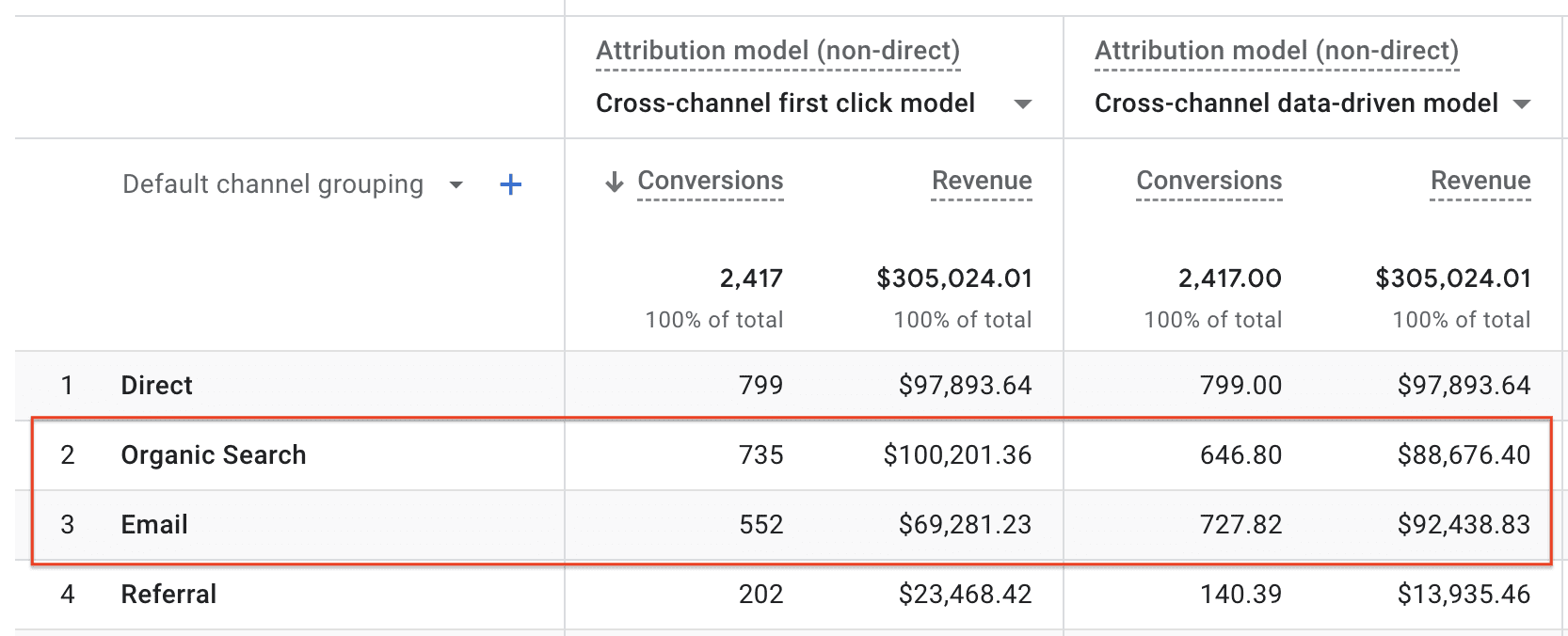
Next, click the All Channels report under the Performance section on the left navigation bar.
In this report, you can find the attributed conversions for each channel of your selected conversion event – “purchase”, in this case.
 Screenshot from GA4, November 2022
Now, you know Organic Search, together with Direct and Email, drove most of the purchases on Google’s Merchandise Store.
By default, GA4 uses the data-driven attribution model to determine how many credits each channel receives. However, you can examine how different attribution models assign credits for each channel.
Click Model Comparison under the Attribution section on the left navigation bar.
For example, comparing the data-driven attribution model with the first touch attribution model (aka “first click model” in the below figure), you can see more conversions are attributed to Organic Search under the first click model (735) than the data-driven model (646.80).
On the other hand, Email has more attributed conversions under the data-driven attribution model (727.82) than the first click model (552).
 Screenshot from GA4, November 2022
The data tells us that Organic Search plays an important role in bringing potential customers to the store, but it needs help from other channels to convert visitors (i.e., for customers to make actual purchases).
On the other hand, Email, by nature, interacts with visitors who have visited the site before and helps to convert returning visitors who initially came to the site from other channels.
A common question, when it comes to attribution model comparison, is which attribution model is the best. I’d argue this is the wrong question for marketers to ask.
The truth is that no one model is absolutely better than the others as each model illustrates one aspect of the customer journey. Marketers should embrace multiple models as they see fit.
Google Analytics is easy to use, but it works well for channel-based attribution.
If you want to further understand how customers navigate through your website before converting, and what pages influence their decisions, you need to conduct attribution analysis on pageviews.
While Google Analytics doesn’t support pageview-based attribution, there are other tools you can use.
We recently performed such a pageview-based attribution analysis on AdRoll’s website and I’d be happy to share with you the steps we went through and what we learned.
The first and most challenging step is gathering data on the sequence of pageviews for each visitor on your website.
Most web analytics systems record this data in some form. If your analytics system doesn’t provide a way to extract the data from the user interface, you may need to pull the data from the system’s database.
Similar to the steps we went through on GA4, the first step is defining the conversion. With pageview-based attribution analysis, you also need to identify the pages that are part of the conversion process.
As an example, for an ecommerce site with online purchase as the conversion event, the shopping cart page, the billing page, and the order confirmation page are part of the conversion process, as every conversion goes through those pages.
You should exclude those pages from the pageview data since you don’t need an attribution analysis to tell you those pages are important for converting your customers.
The purpose of this analysis is to understand what pages your potential customers visited prior to the conversion event and how they influenced the customers’ decisions.
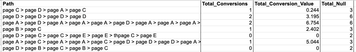
Once the data is ready, the next step is to summarize and manipulate your data into the following four-column format. Here is an example.
 Screenshot from author, November 2022
The Path column shows all the pageview sequences. You can use any unique page identifier, but I’d recommend using the url or page path because it allows you to analyze the result by page types using the url structure. “>” is a separator used in between pages.
The Total_Conversions column shows the total number of conversions a particular pageview path led to.
The Total_Conversion_Value column shows the total monetary value of the conversions from a particular pageview path. This column is optional and is mostly applicable to ecommerce sites.
The Total_Null column shows the total number of times a particular pageview path failed to convert.
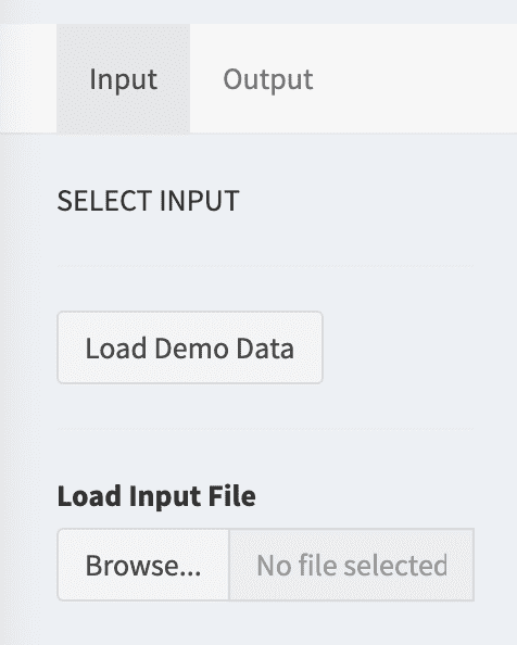
To build the attribution models, we leverage the open-source library called ChannelAttribution.
While this library was originally created for use in R and Python programming languages, the authors now provide a free Web app for it, so we can use this library without writing any code.
Upon signing into the Web app, you can upload your data and start building the models.
For first-time users, I’d recommend clicking the Load Demo Data button for a trial run. Be sure to examine the parameter configuration with the demo data.
 Screenshot from author, November 2022
When you’re ready, click the Run button to create the models.
Once the models are created, you’ll be directed to the Output tab, which displays the attribution results from four different attribution models – first-touch, last-touch, linear, and data-drive (Markov Chain).
Remember to download the result data for further analysis.
For your reference, while this tool is called ChannelAttribution, it’s not limited to channel-specific data.
Since the attribution modeling mechanism is agnostic to the type of data given to it, it’d attribute conversions to channels if channel-specific data is provided, and to web pages if pageview data is provided.
Organize Pages Into Page Groups
Depending on the number of pages on your website, it may make more sense to first analyze your attribution data by page groups rather than individual pages.
A page group can contain as few as just one page to as many pages as you want, as long as it makes sense to you.
Taking AdRoll’s website as an example, we have a Homepage group that contains just the homepage and a Blog group that contains all of our blog posts.
For ecommerce sites, you may consider grouping your pages by product categories as well.
Starting with page groups instead of individual pages allows marketers to have an overview of the attribution results across different parts of the website. You can always drill down from the page group to individual pages when needed.
Identify The Entries And Exits Of The Conversion Paths
After all the data preparation and model building, let’s get to the fun part – the analysis.
I’d suggest first identifying the pages that your potential customers enter your website and the pages that direct them to convert by examining the patterns of the first-touch and last-touch attribution models.
Pages with particularly high first-touch and last-touch attribution values are the starting points and endpoints, respectively, of the conversion paths. These are what I call gateway pages.
Make sure these pages are optimized for conversion.
Keep in mind that this type of gateway page may not have very high traffic volume.
For example, as a SaaS platform, AdRoll’s pricing page doesn’t have high traffic volume compared to some other pages on the website but it’s the page many visitors visited before converting.
Find Other Pages With Strong Influence On Customers’ Decisions
After the gateway pages, the next step is to find out what other pages have a high influence on your customers’ decisions.
For this analysis, we look for non-gateway pages with high attribution value under the Markov Chain models.
Taking the group of product feature pages on AdRoll.com as an example, the pattern of their attribution value across the four models (shown below) shows they have the highest attribution value under the Markov Chain model, followed by the linear model.
This is an indication that they are visited in the middle of the conversion paths and played an important role in influencing customers’ decisions.
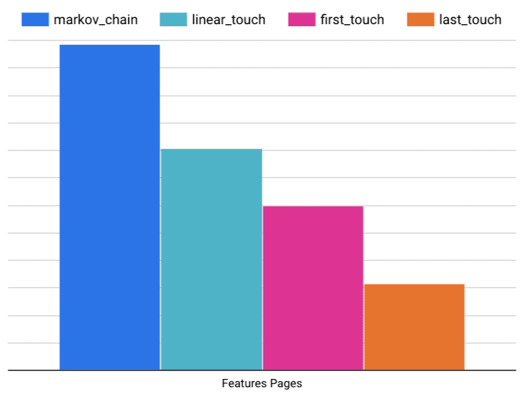 Image from author, November 2022
These types of pages are also prime candidates for conversion rate optimization (CRO).
Making them easier to be discovered by your website visitors and their content more convincing would help lift your conversion rate.
Multi-touch attribution allows a company to understand the contribution of various marketing channels and identify opportunities to further optimize the conversion paths.
Start simply with Google Analytics for channel-based attribution. Then, dig deeper into a customer’s pathway to conversion with pageview-based attribution.
Don’t worry about picking the best attribution model.
Leverage multiple attribution models, as each attribution model shows different aspects of the customer journey.
More resources:
Featured Image: Black Salmon/Shutterstock